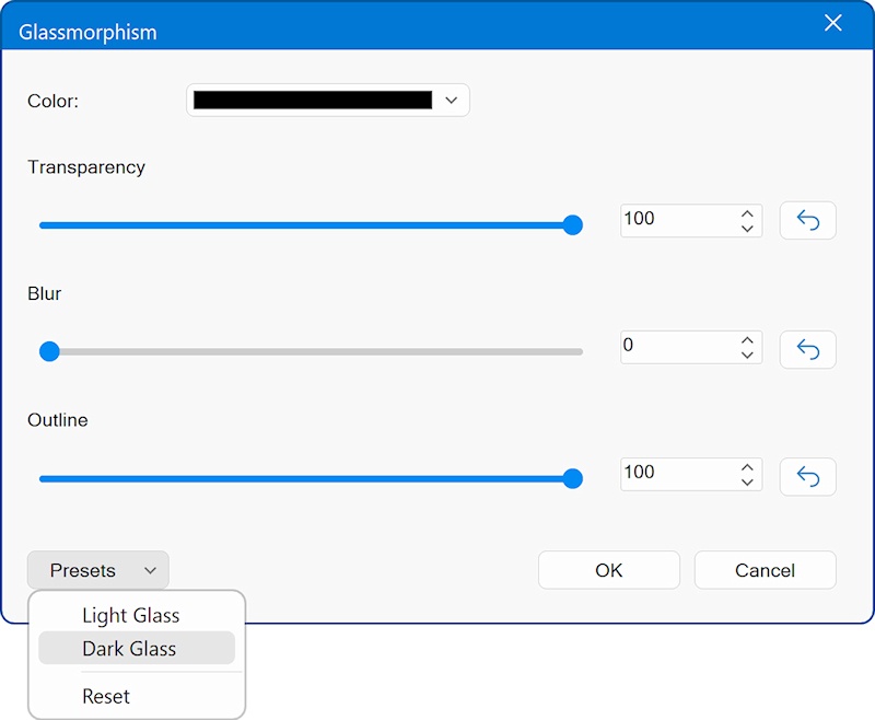
Glass Morphism
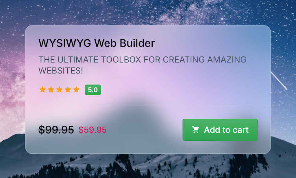
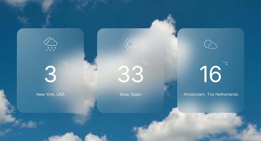
Glassmorphism in CSS is a design style that creates a frosted-glass look using transparency, blur, and layered backgrounds. In earlier versions of WYSIWYG Web Builder, achieving this effect required adjusting settings in several different property sections. Now, all glass-morphism controls are conveniently grouped in one place. These options let you configure the background color, transparency, outline, and backdrop blur to create the desired glass effect.
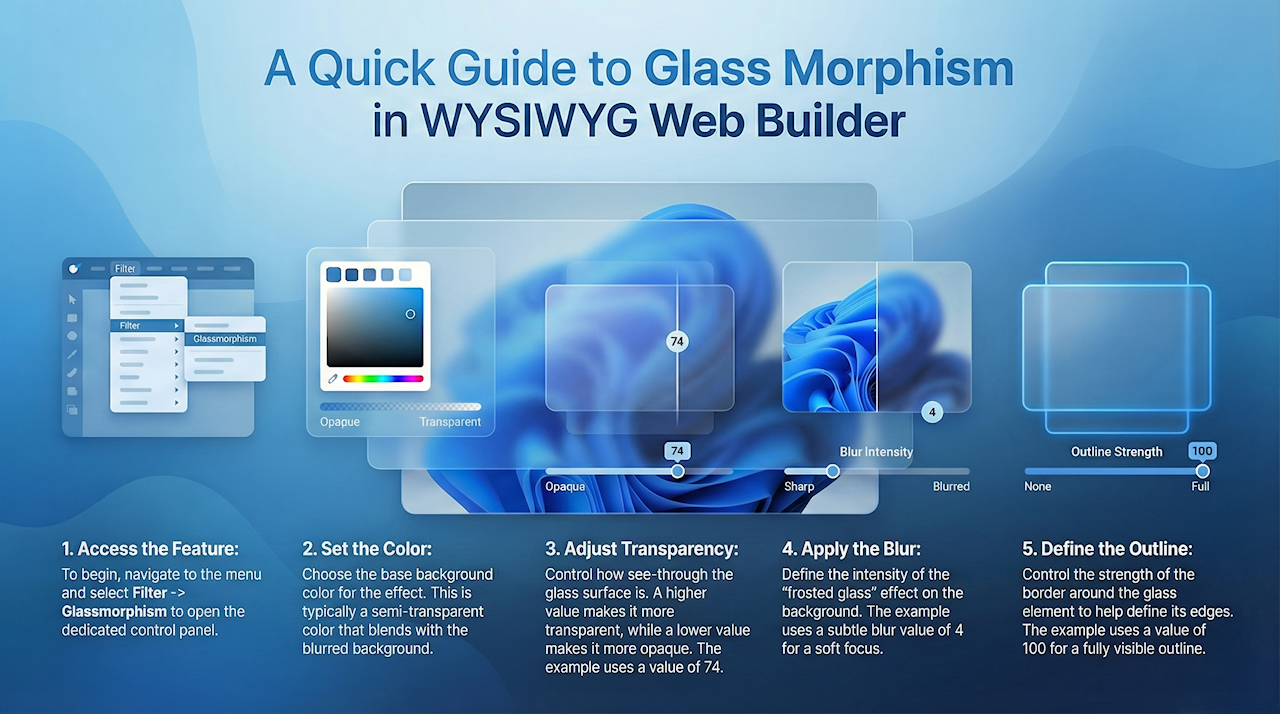
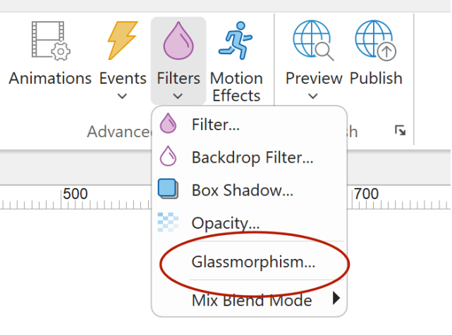
You can access the Glassmorphism properties via the menu Filter -> Glassmorphism.
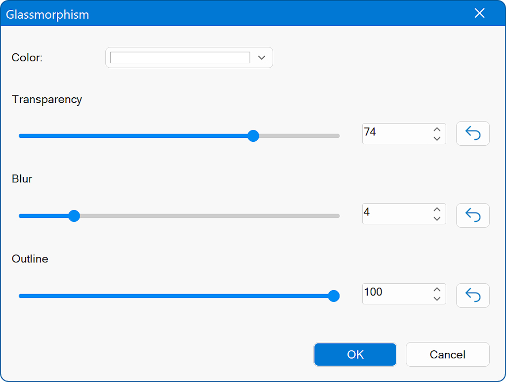
Color
Choose the base background color for the glass effect. This color is typically semi-transparent and blends with the blurred background behind the object.
Transparency
Controls how transparent the glass surface is.
A lower value makes the element more opaque.
A higher value makes it more see-through.
In the screenshot, the transparency is set to 74, which creates a fairly translucent appearance.
Blur
Defines the intensity of the backdrop blur, the amount of “frosted glass” effect applied to whatever is behind the element.
The screenshot shows a blur value of 4, giving a subtle softening effect.
Outline
Controls the strength of the outline or border around the glass element.
A value of 100 (as shown) creates a fully visible outline, which helps define the edges of the glass shape.
Presets
Use the Presets button to quickly apply predefined glass effect settings: Light Glass, Dark Glass, or Reset (no effect).