An introduction to CSS transitions
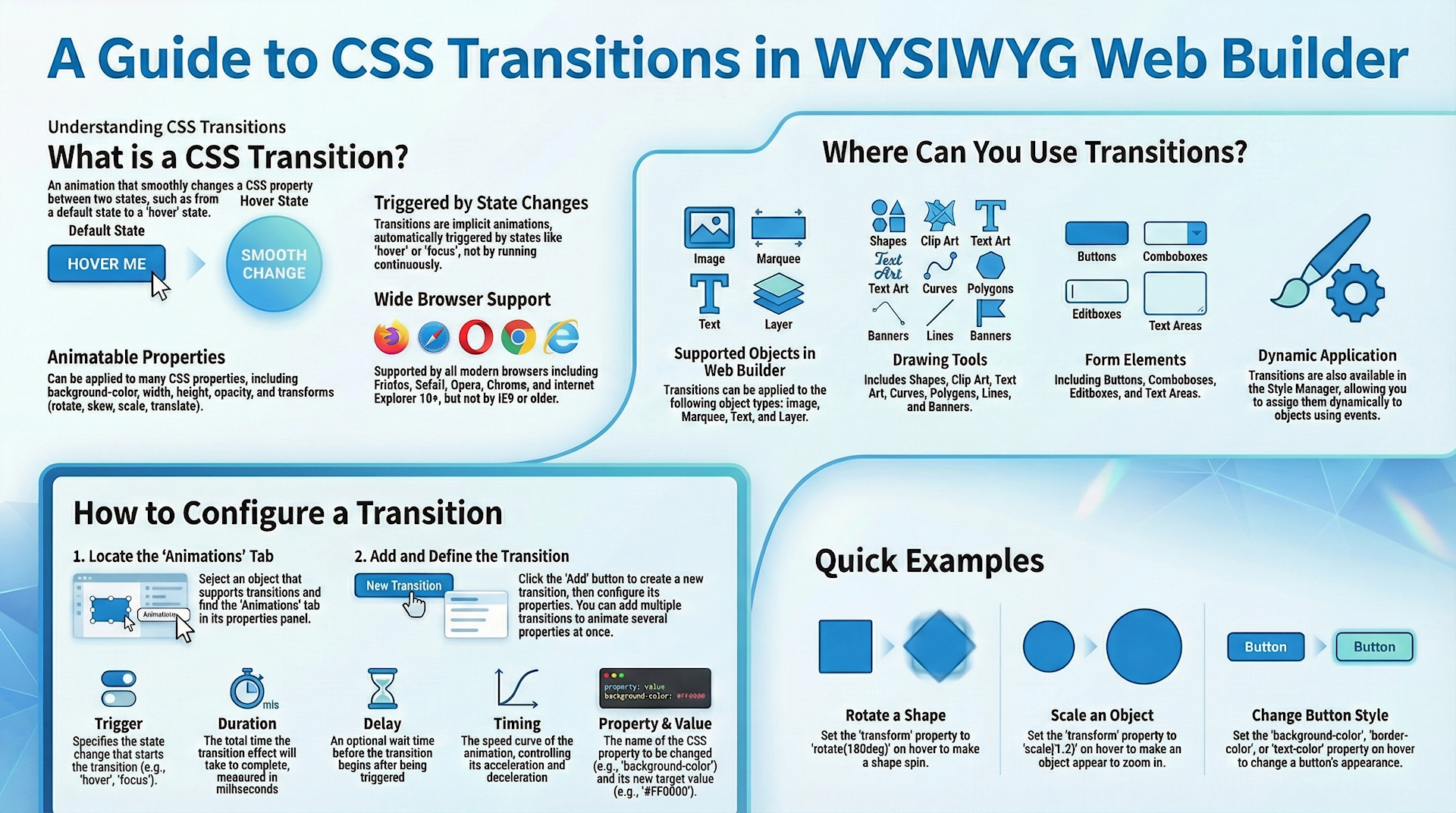
WYSIWYG Web Builder has built-in support for CSS3 transitions. Transitions are supported by all modern browsers. They will work in FireFox/Safari/Opera/Chrome/IE10 but not by Internet Explorer 9 or older.
A CSS3 transition is an animation that moves a property between two states. Transitions are an implicit animation, which means they are triggered by a state change like ‘hover’ or ‘focus’, unlike an animation which run continuously. Transition effects can be applied to a wide variety of CSS properties, including background-color, width, height, opacity, transforms (rotate, skew, scale, translate) and many more.
Transitions are also available in the Style Manager. So you can dynamically assign a transition to an object (through events -> set style).
Assign a transition to an object
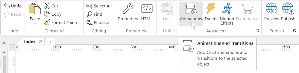
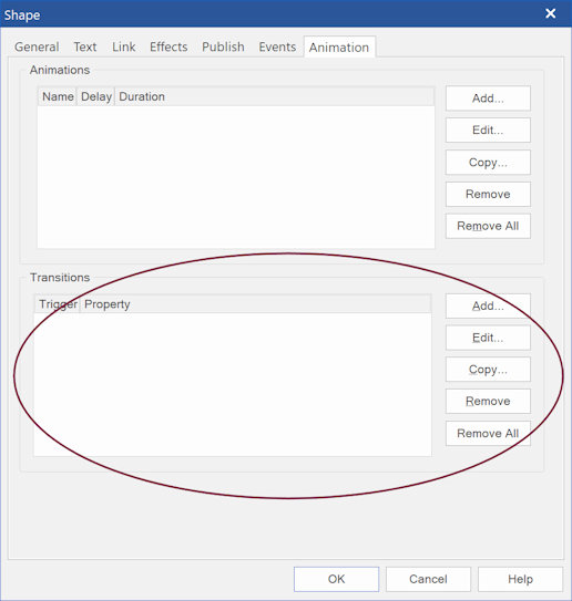
Objects that do support transitions have an Animations tab in their properties.
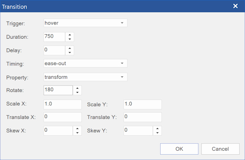
Click the Add button to add a transition to the object. Now you can set the properties of the transtion.
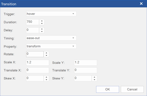
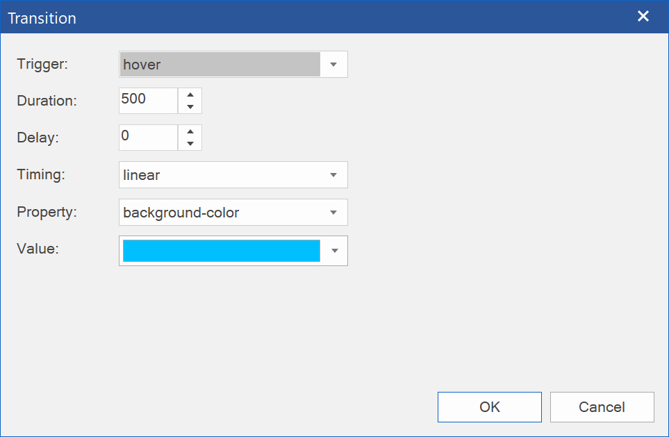
Trigger
Specifies which state change will trigger the transition. Commonly used triggers are 'hover' and 'focus'.
Duration
Specifies the duration of the transition in milliseconds.
Delay
Specifies when the transition will start.
Timing
The timing-function specifies the speed curve of the animation. See 'animation properties' for more details.
Property
Specifies the name of the CSS property to which the transition is applied.
Value
Specifies the new value of the CSS property.
You can add multiple transitions to an object. This makes it possible to animate multiple properties at the same time.
In the example above we set a shape to rotate 180 degrees on hover.

In this example the transform of the shape is set to scale * 1.2 on hover.

In this example, the background of a standard (form) button is set on hover.
Of course, you can also change the border color, text color, shadow etc.
Of course, you can also change the border color, text color, shadow etc.