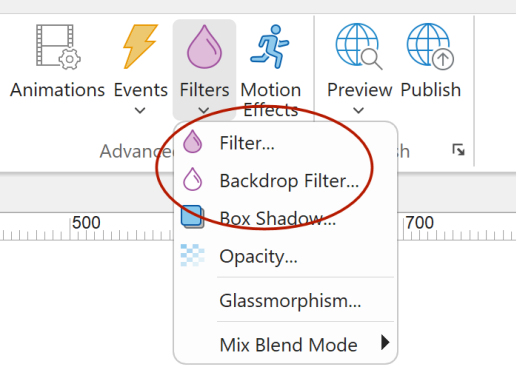
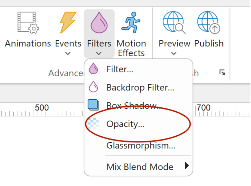
Filters
Filter properties allow you to apply visual effects, such as blur, grayscale, brightness, contrast, and more directly to an element.
In previous versions, filters were only accessible through the Transitions properties. In WWB21, we’ve added a dedicated section that lets you adjust filter values more easily and intuitively.
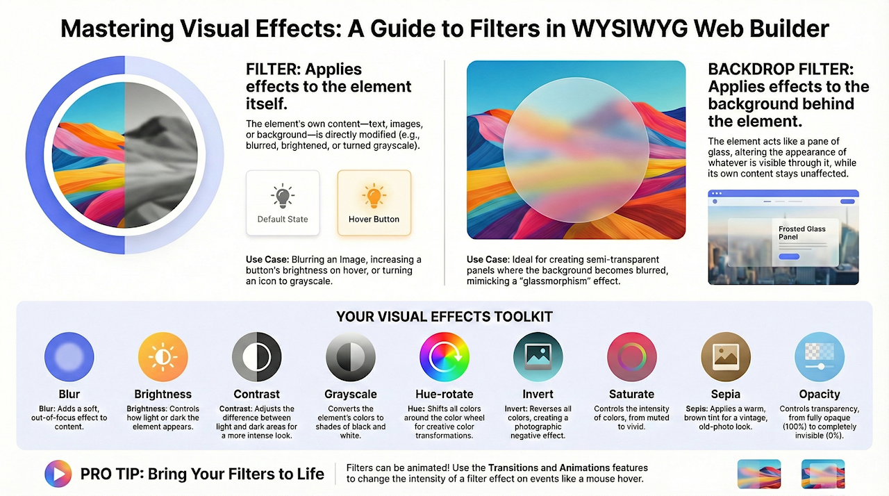
There are two types of filters: Filter and Backdrop Filter.
Filter affects the element itself, Backdrop filter affects what you see through the element (the background).
In previous versions, filters were only accessible through the Transitions properties. In WWB21, we’ve added a dedicated section that lets you adjust filter values more easily and intuitively.
There are two types of filters: Filter and Backdrop Filter.
Filter affects the element itself, Backdrop filter affects what you see through the element (the background).
Note
Although the interface is now simpler, these controls still modify the underlying transition properties in the background. The new filter options are essentially a user-friendly layer that makes this functionality easier to access and manage.
See also: An introduction to CSS transitions
Although the interface is now simpler, these controls still modify the underlying transition properties in the background. The new filter options are essentially a user-friendly layer that makes this functionality easier to access and manage.
See also: An introduction to CSS transitions
Filter
Filter applies visual effects to the element itself.
This means the element’s own content—such as text, images, or background—will be blurred, brightened, darkened, or otherwise modified.
Examples of effects: blur, brightness, contrast, grayscale, hue-rotate.
Example use case:
Blurring an image, making a button appear brighter, or turning an icon grayscale.
Backdrop Filter
Backdrop-filter applies visual effects to whatever is behind the element, not to the element’s own content.
The element acts like a lens or glass pane that affects the background through it.
Examples of effects: blur, brightness, contrast (same filter types, but applied to the background).
Example use case:
Creating a frosted-glass panel where the content behind the panel becomes blurred, while the panel’s text or icon stays sharp.
See also: Glass Morphism

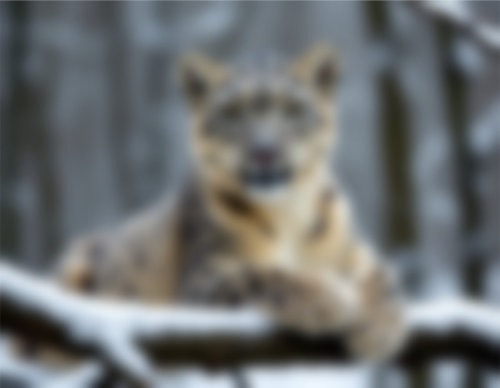
Blur
Adds a soft blur to the element, making its content appear out of focus.
Brightness
Controls how light or dark the element appears. Higher values make it brighter; lower values make it dimmer.

Contrast
Adjusts the difference between light and dark areas. Higher values create a more intense, high-contrast look.

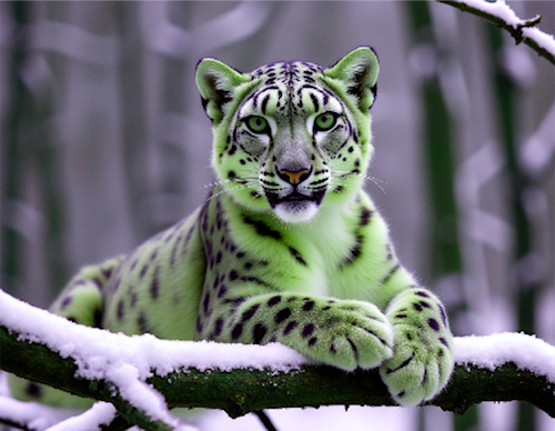
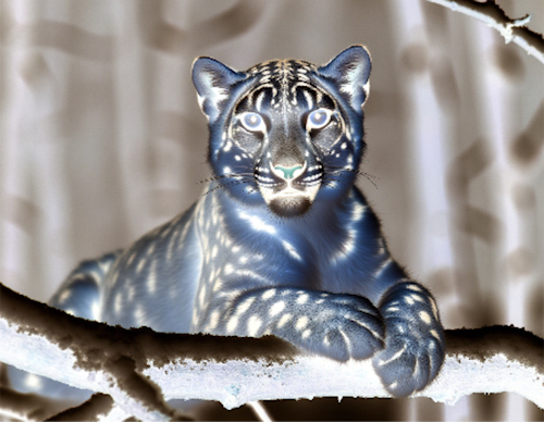
Grayscale
Converts the element’s colors toward black and white. Higher values increase the grayscale effect.

Hue-rotate
Shifts the colors of the element around the color wheel, creating color-rotation effects.
Invert
Reverses all colors in the element, producing a photographic negative effect.
Saturate
Controls the intensity of colors. Higher values make colors more vivid; lower values make them more muted.

Sepia
Applies a warm brown tint to the element, creating an old-photo or vintage look.

Opacity
Opacity controls how transparent an element is.
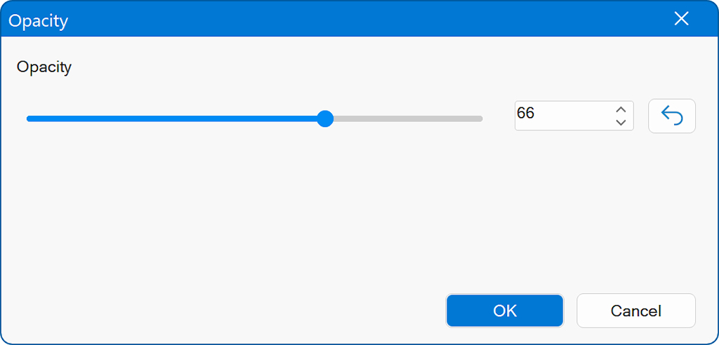
The slider and numeric field in the dialog allow you to fine-tune the exact level of transparency.
A lower opacity value makes the element more see-through.
A higher opacity value makes it more solid and visible.
At 100%, the element is fully opaque.
At 0%, it becomes completely transparent (invisible).
A lower opacity value makes the element more see-through.
A higher opacity value makes it more solid and visible.
At 100%, the element is fully opaque.
At 0%, it becomes completely transparent (invisible).
Note
Filters can also be animated. For example, on hover change the intensity of the effect.
See the Transitions and Animations tutorials for more details.
Filters can also be animated. For example, on hover change the intensity of the effect.
See the Transitions and Animations tutorials for more details.