Select Multi
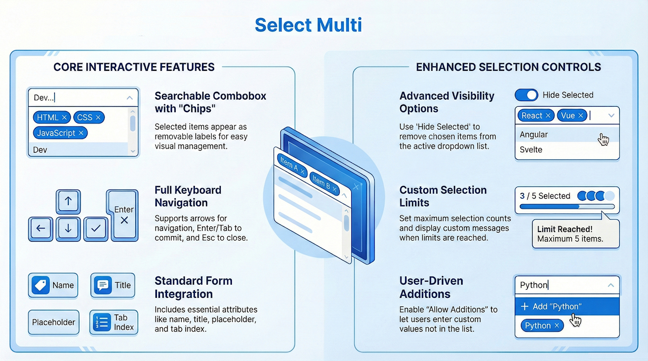
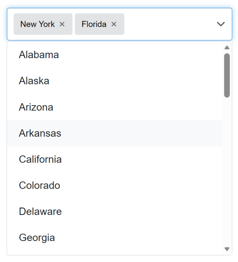
A Select Multi object implements a searchable multi-select combobox with removable labels (“chips”), keyboard support, and an optional clear action. Choose multiple values from a searchable dropdown. Selected items appear as removable labels. Supports keyboard navigation (↑/↓, Enter), Esc to close, and Tab to commit/close.
Optional features include a clear button, max selection limits, “hide selected” in the menu and user additions.

The Select Multi component provides all the standard features of a regular Select control, such as setting the name, title, tab index, placeholder, access key, and managing the list of items (add, edit, remove, import, but also includes enhanced options specifically designed for multi-selection behavior.
In addition to basic selection features, Select Multi allows you to customize how selected items (“chips”) behave and how the dropdown list responds. These extended options include:
Clearable
Allows users to remove all selected values with a single clear action.
Allow Additions
Enables users to enter and add custom values that are not already in the list.
Hide Selected
Removes already selected items from the dropdown list so users only see unselected options.
Maximum Selections
Limits the number of items a user can select; once the limit is reached, selection is restricted and a custom “Max items” message can be displayed.
Custom Messages
Define the text shown when no results are found or when the selection limit is exceeded.
Styling Options
Configure hover background, focus color, full-width behavior, and label appearance.
