An introduction to the Ribbon Interface
WYSIWYG Web Builder supports an "Office" style Ribbon Interface. This interface simplifies the use of WYSIWYG Web Builder and introduces many new ways to quickly change page and object properties. With drop down galleries, quick access to frequently used options and much more functionality, only a click away...
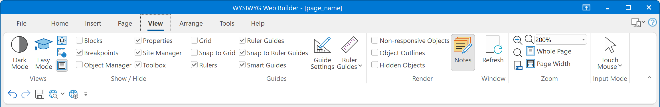
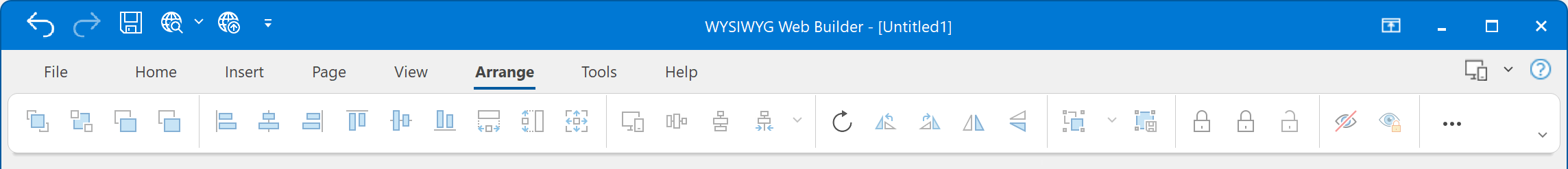
The Ribbon replaces traditional toolbars and menus with tabbed groups (Categories). The Ribbon commands are grouped by functionality. For instance all page tools are available in the 'Page' tab. In addition, Ribbon control provides smart layout maximally utilizing the available space. For example, if a Panel has been stretched and has no place to display all available controls, it becomes a menu button which can display sub-items on a popup menu.
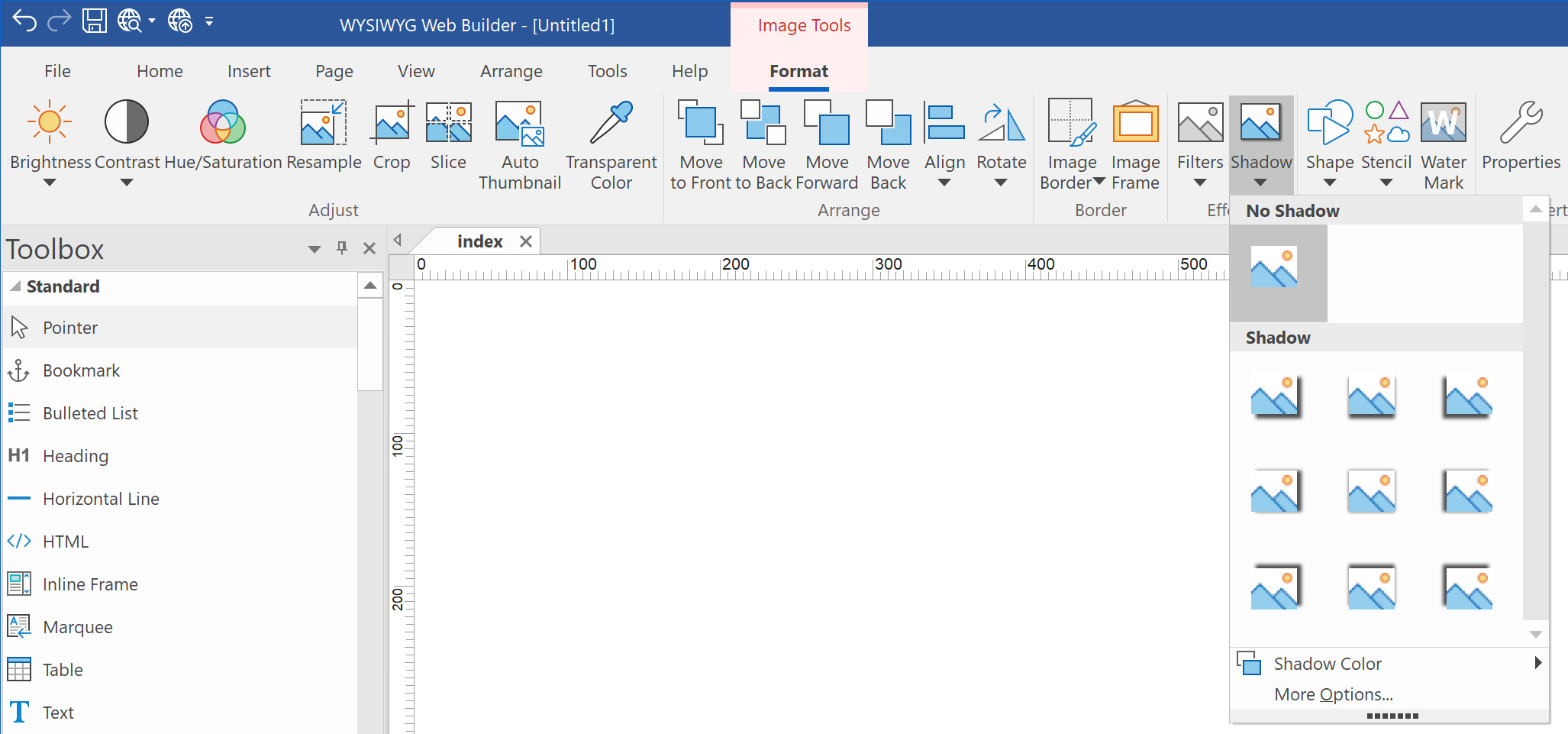
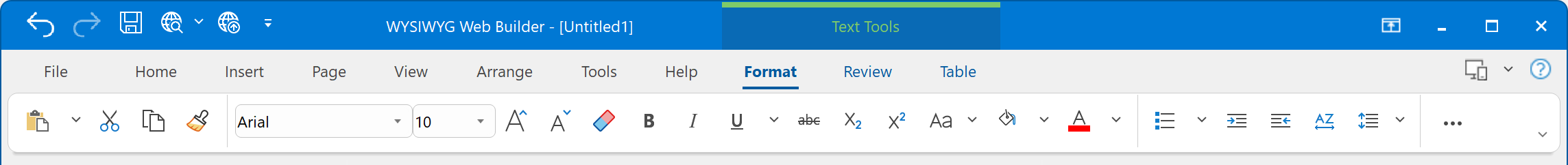
The Ribbon also supports contextual tabs which contain commands that are applicable to a selected object only. For instance when an image is selected, the Image tools will be displayed.
Note: The classic menus and toolbars are also available!
The Ribbon also supports contextual tabs which contain commands that are applicable to a selected object only. For instance when an image is selected, the Image tools will be displayed.
Note: The classic menus and toolbars are also available!
Access keys (Keyboard shortcuts)
Access keys provide a way to quickly use a command by pressing a few keystrokes, no matter where you are in the program.
Every command in a program that uses a Ribbon can be accessed by using an access key. You can get to most commands by using two to four keystrokes.
1) Press and release the ALT key.
The KeyTips are displayed over each feature that is available in the current view.
2) Press the letter shown in the KeyTip over the feature that you want to use.
3) Depending on which letter you pressed, you may be shown additional KeyTips. For example, if the Home tab is active and you pressed P, the Page tab is displayed, along with the KeyTips for the groups in that tab.
4) Continue pressing letters until you press the letter of the specific command or option that you want to use. In some cases, you have to first press the letter of the group that contains the command.
Tip: To cancel the action that you are taking and hide the KeyTips, press and release the ALT key.
Contextual Tabs
In contrast to core tabs, which contain various common Commands that are relevant regardless of workspace context, contextual tabs typically contain one or more Commands that are applicable to a selected object only. When an object is selected in the application workspace, the type and context of the object might require disparate Commands that do not make organizational or functional sense on one contextual tab. In these cases, multiple contextual tabs, which are contained within a Tab Group, may be required. For example, selecting text contained in a table cell might require two contextual tabs that expose both table and text functionality.
Galleries
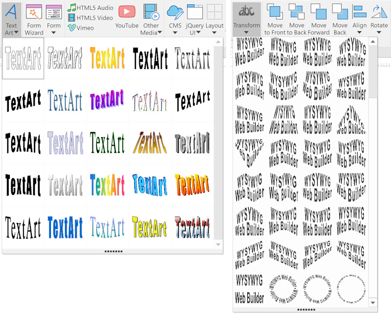
A Gallery provides a set of (usually) graphical and attractive formatting results, which will be applied to whatever objects are selected by the user in the application editing area. For example, the Text Art Insert gallery exposes some predefined Text Art styles. You can quickly select the style. After the Tex Art has been created you can change the path of the text with the Transform gallery.
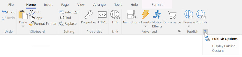
Launch Buttons
The Ribbon Launch Button is a small button located at the right bottom corner of a Ribbon Panel. This button is usually associated with a dialog related to the command group. For example, the launch button in the publish section will open the Publish Options.
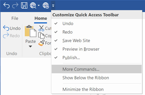
Quick Access Toolbar
The Ribbon includes a Quick Access Toolbar. The Quick Access Toolbar is a small, customizable toolbar that provides access to frequently used commands independent of which Ribbon tab is selected. By default, the Quick Access Toolbar is located in the title bar of the application window, but it can be configured to display below the Ribbon. You can also add buttons like Save, Publish or remove any of the existing ones by clicking 'More Commands'.
Simplified Ribbon
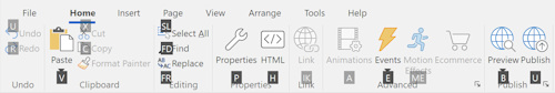
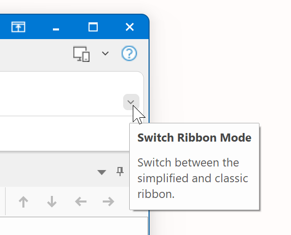
The Simplified Ribbon is a mix between the classic toolbar and ribbon. It shows the commands in a single line which not only brings a modern interface to WWB but also frees up space to show more of the page you are working on.
Because there is less space available, all buttons might not be visible. If you want to switch back to the classic ribbon where you can see more commands, simply click the downward pointing arrow in the lower right corner of the ribbon to expand it. Use this arrow control to switch between the simplified and classic ribbon.
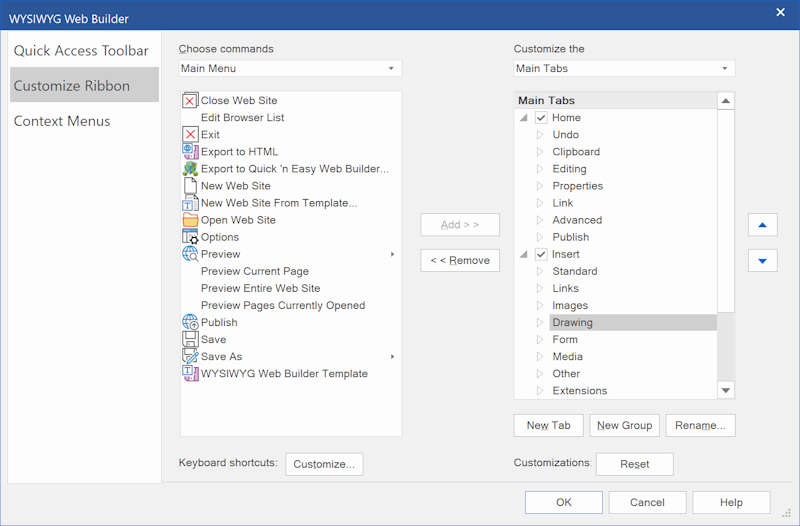
Customize the Ribbon
You can customize the Ribbon content, add each element (including groups and panels) to the Quick Access Toolbar (QAT), customize required commands using the customization dialog and modify keyboard accelerators.
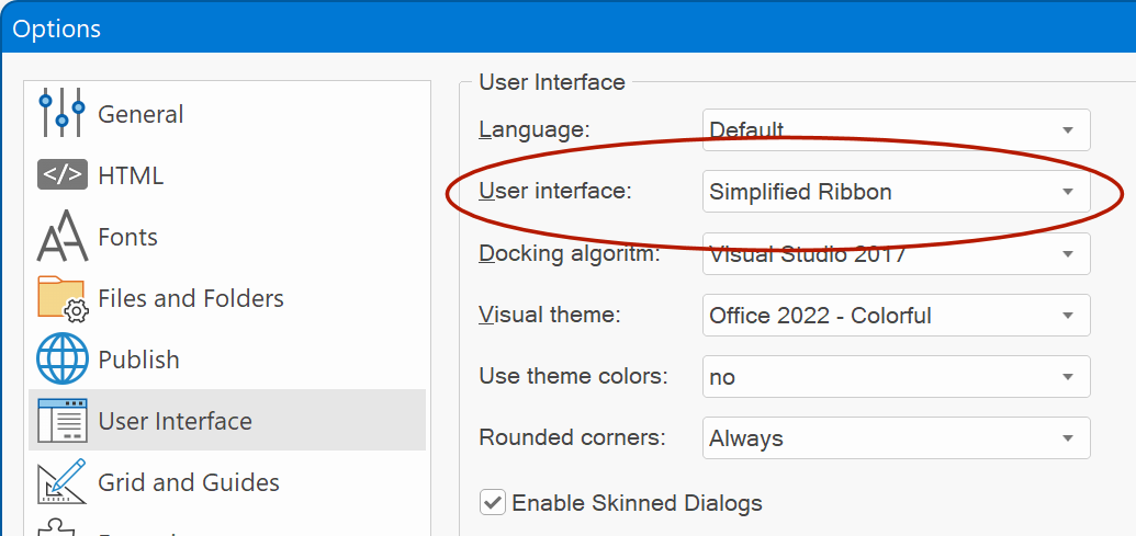
Switch to classic toolbars
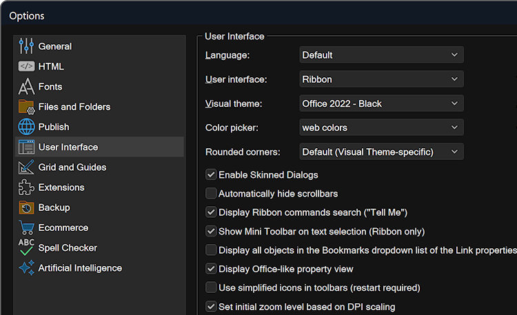
If you prefer the classic toolbars then these are still available too: Tools -> Options -> User Interface
Visual Theme
The software also supports several visual themes to change the appearance and colors of the user interface (light/dark/blue etc.)
Note that this also affects the colors and contrast of all icons in Ribbon, toolbars and toolbox.
Note that this also affects the colors and contrast of all icons in Ribbon, toolbars and toolbox.
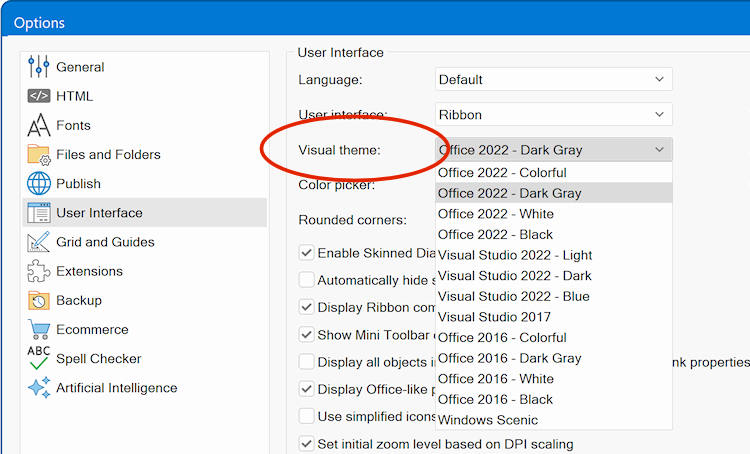
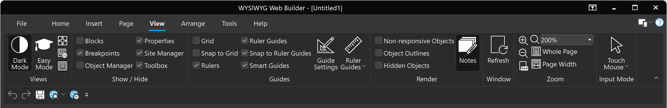
For example, dark mode.