Build Custom Mega Menus Using the Layer Menu
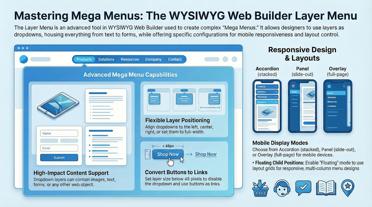
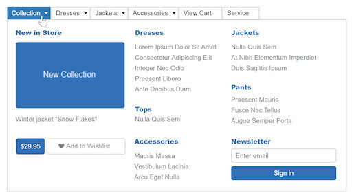
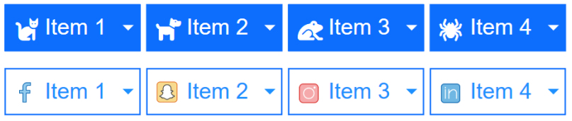
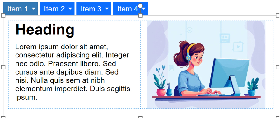
A Layer Menu is an advanced menu where the drop down menus are layers. This is great for creating advanced mega menus with images, text, form or any other object! The drop down layer can be positioned left, centered or at the right of the buttons. It is also possible to make the layer full width of the page. The menu also supports icons (Font Awesome, Material Icons, etc.) and custom images.
The main button can also have links (instead of displaying the layer), to make this possible make the layer size smaller than 48 pixel to remove the layer from the item.
Position children
By default, layers use absolute positioning, meaning each object on the layer has a fixed location that you can freely move within the container. However, absolutely positioned objects are not responsive. When the browser is resized or the menu is viewed on smaller screens, this can lead to clipping or overlapping elements.
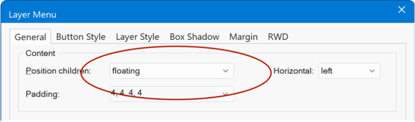
Setting Position children to Floating enables responsive, flexible content within menu layers. This mode supports padding, alignment options, and the use of layout grids. With a layout grid, you can easily build clean, structured multi-column designs that adapt to different screen sizes.
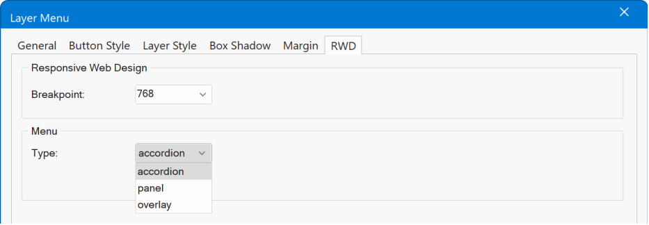
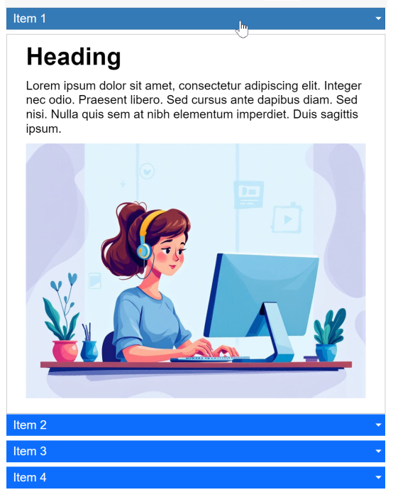
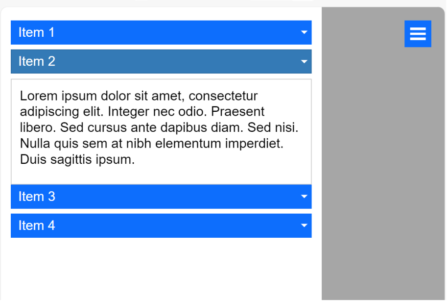
RWD
The RWD (Responsive Web Design) properties control how the menu will be displayed on mobile devices: Accordion, Panel or Overlay.
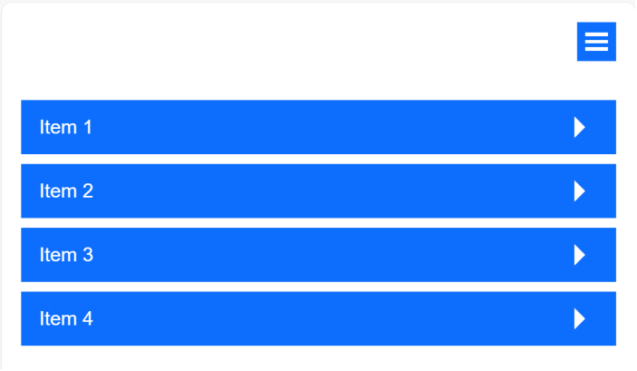
- Accordion, displays the layers in a stacked, accordion like layout.
- Panel, display a slide out panel at the left side of the browser window. The hamburger icon supports animations and you can set icon size and offset.
- Overlay, displays an overlay menu covering the full page with ‘drill down’ layers.
Use a Button as Link
A button can also just be a link instead of displaying the layer, to make this possible make the layer size of that specific button smaller than 48 pixel to disable the dropdown layer.
Examples
Here are a few other examples of Layer / Mega Menus.
https://www.wysiwygwebbuilder.com/support/wb21tryouts/wb21_layermenu_accordion.html
https://www.wysiwygwebbuilder.com/support/wb21tryouts/wb21_layermenu_extra1.html
https://www.wysiwygwebbuilder.com/support/wb21tryouts/wb21_layermenu_extra2.html
https://www.wysiwygwebbuilder.com/support/wb21tryouts/wb21_layermenu_accordion.html
https://www.wysiwygwebbuilder.com/support/wb21tryouts/wb21_layermenu_extra1.html
https://www.wysiwygwebbuilder.com/support/wb21tryouts/wb21_layermenu_extra2.html