Input Group
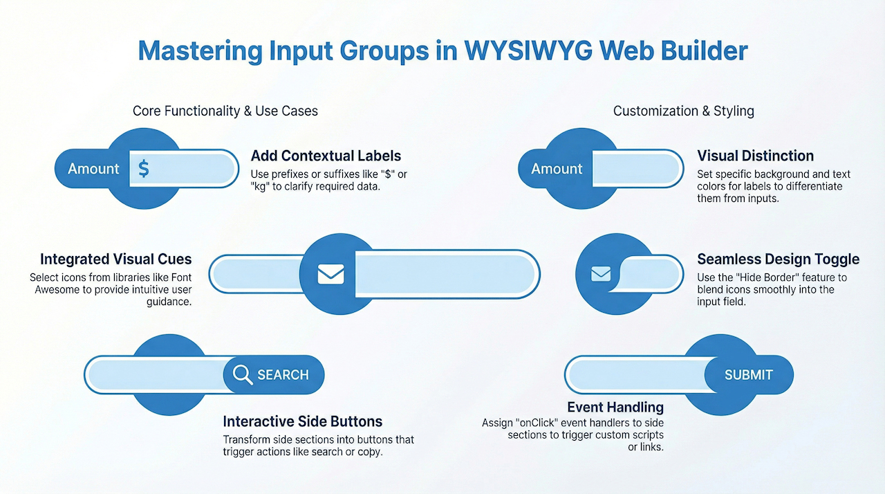
The Input Group component functions like a standard input/edit box but provides additional flexibility. It allows you to place text, icons, or buttons on either side or both sides of the input field. This is useful for:
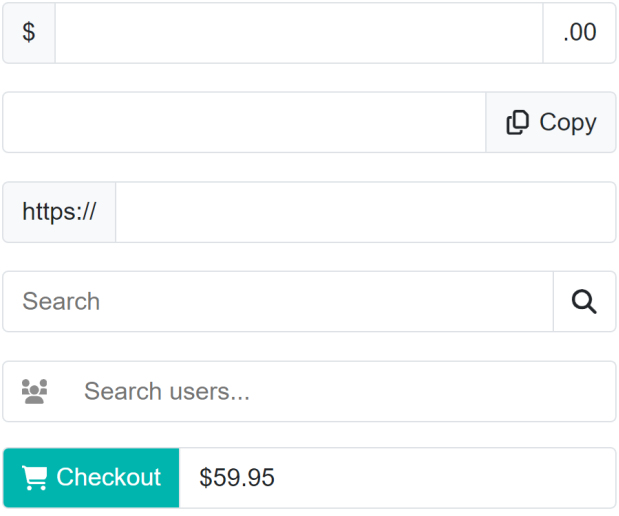
• Adding contextual labels such as $, https://, or kg
• Displaying icons to provide visual cues
• Adding buttons that act as links or trigger actions (e.g., copy, paste, search, etc.)
• Adding contextual labels such as $, https://, or kg
• Displaying icons to provide visual cues
• Adding buttons that act as links or trigger actions (e.g., copy, paste, search, etc.)
Text
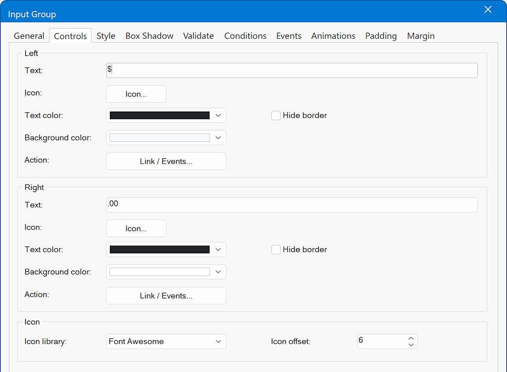
Specifies the text displayed inside the left or right section of the input group.
Use this to add prefixes (e.g., “$”) or suffixes (e.g., “.00”) to the input field.
Icon
Selects an icon to display beside the text.
Icons can be chosen from any supported icon library (e.g., Font Awesome, Material Icons).
Text Color
Defines the color of the text and/or icon displayed in the left or right section.
Background Color
Sets the background color for the selected section.
This allows you to visually distinguish prefixes or suffixes from the main input field when needed.
Hide Border
Enables or disables the separator line between the input field and the left/right section.
Useful when you want the prefix or suffix to visually blend with the input field. For example, when displaying only an icon or creating a seamless look.
Action
Allows you to assign functionality to the left or right section.
You can attach a link or define event handlers (such as onClick) to trigger other actions when the section is interacted with.