
Flex Grid
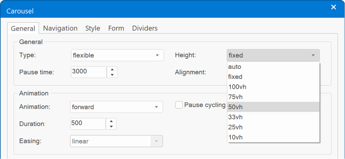
- Added new height options: 75vh, 33vh, 25vh and 10vh (vh = viewport height).
- Added support for events, animations, transitions and motion effects.
- Implemented responsive height. The height property can now have a different value in breakpoints.
Almost 18... (teaser)
"Pretty" template preview
This template uses a Flex Grid to create an irregular image grid.
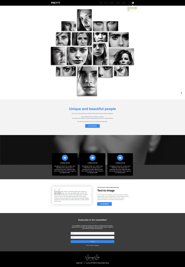
Preview:
https://www.wysiwygwebbuilder.com/support/wb18tryouts/wb18_pretty.html
Preview:
https://www.wysiwygwebbuilder.com/support/wb18tryouts/wb18_pretty.html
Carousel
Carousel
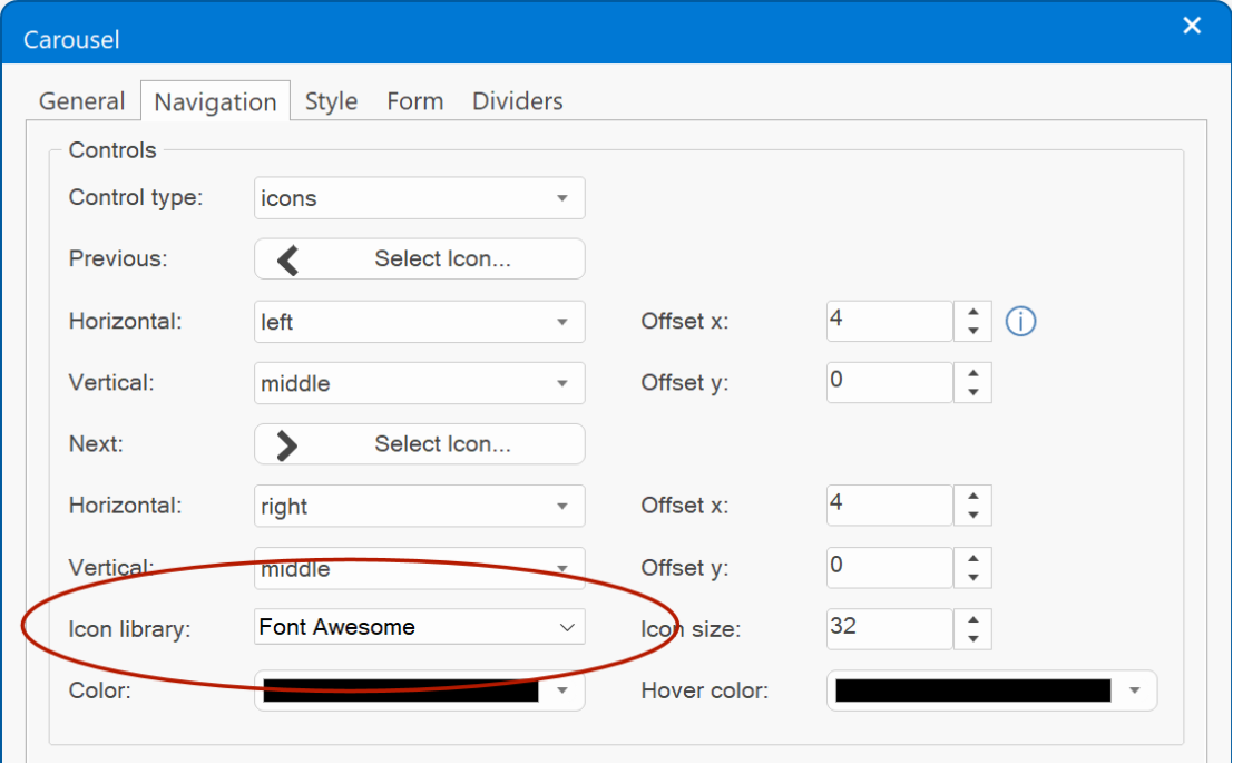
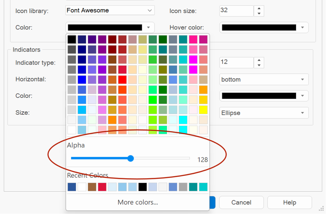
- Added the ability to use icon libraries for navigation controls. With properties for icon color, alpha value and icon size. Icons are published in SVG format. Also, all navigation properties are now on a separate property page.
Demo:
https://wysiwygwebbuilder.com/support/wb18tryouts/wb18_carousel.html
- Added new height options to flexible carousel: 75vh, 33vh, 25vh and 10vh (vh = viewport height).
- In flexible mode it's now also possible to set the position of the navigation controls (left, right, top, bottom and offset in percentages)
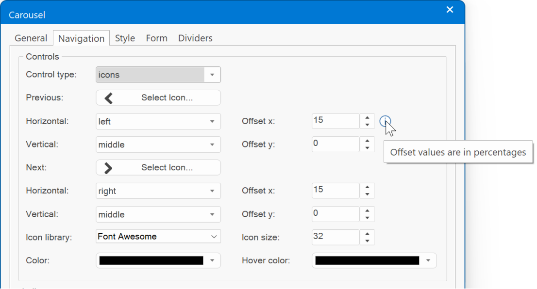
- Added the ability to the set the alpha value of the icon colors normal/hover. This can be useful, for example, to reduce the opacity of the icons when the mouse is not inside the navigation area.
- Carousel / flexible now uses Bootstrap 5. No longer depends on jQuery. https://getbootstrap.com/docs/5.2/components/carousel/
- If a Carousel is added to a page with flexible layout (a page that already has a layout grid, flexbox or flex grid) then the type is automatically set to 'flexible'.
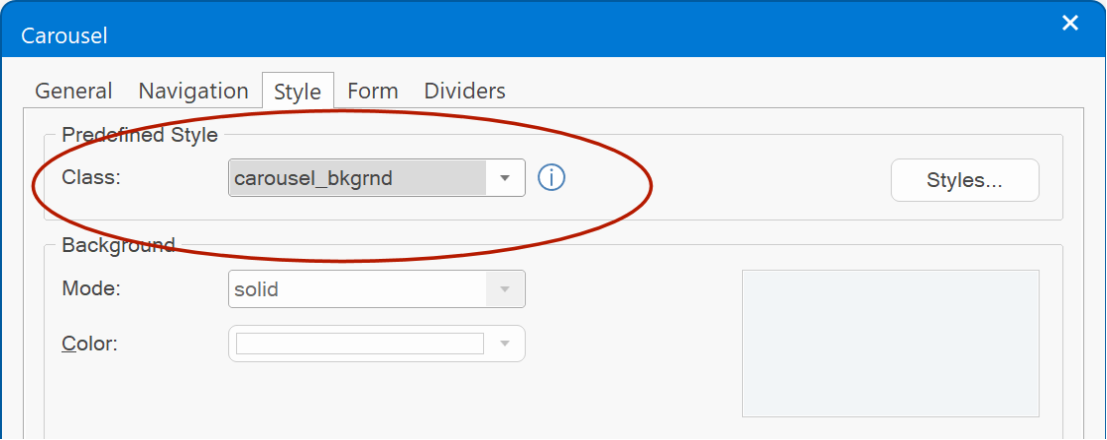
- 'Predefined style' is now also available in the Style section of the Carousel.
- Added the ability to use icon libraries for navigation controls. With properties for icon color, alpha value and icon size. Icons are published in SVG format. Also, all navigation properties are now on a separate property page.
Demo:
https://wysiwygwebbuilder.com/support/wb18tryouts/wb18_carousel.html
- Added new height options to flexible carousel: 75vh, 33vh, 25vh and 10vh (vh = viewport height).
- In flexible mode it's now also possible to set the position of the navigation controls (left, right, top, bottom and offset in percentages)
- Added the ability to the set the alpha value of the icon colors normal/hover. This can be useful, for example, to reduce the opacity of the icons when the mouse is not inside the navigation area.
- Carousel / flexible now uses Bootstrap 5. No longer depends on jQuery. https://getbootstrap.com/docs/5.2/components/carousel/
- If a Carousel is added to a page with flexible layout (a page that already has a layout grid, flexbox or flex grid) then the type is automatically set to 'flexible'.
- 'Predefined style' is now also available in the Style section of the Carousel.
Slideshow
Slideshow
- Added the ability to use icon libraries for navigation controls. With properties for icon color, alpha value and icon size. Icons are published in SVG format.
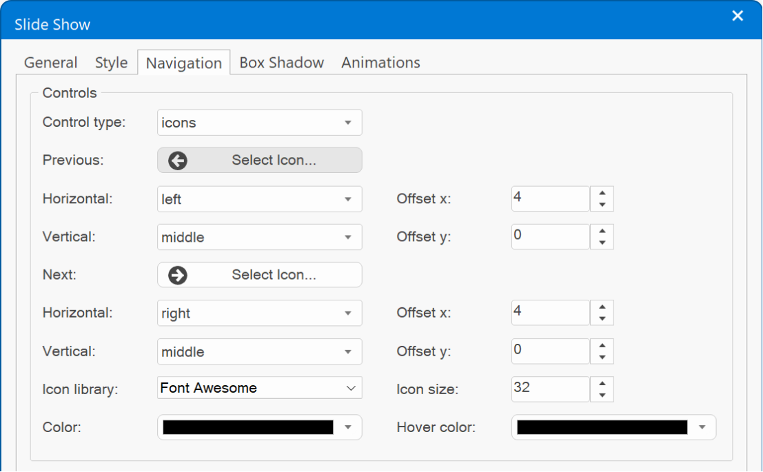
- Added the ability to use icon libraries for navigation controls. With properties for icon color, alpha value and icon size. Icons are published in SVG format.
Dialog
Dialog
- Added 'one-time popup' functionality via the 'Cookie Expire Days' property. A cookie is stored on the visitor’s browser to only show the dialog once across multiple visits. Use '0' to disable cookie functionality.
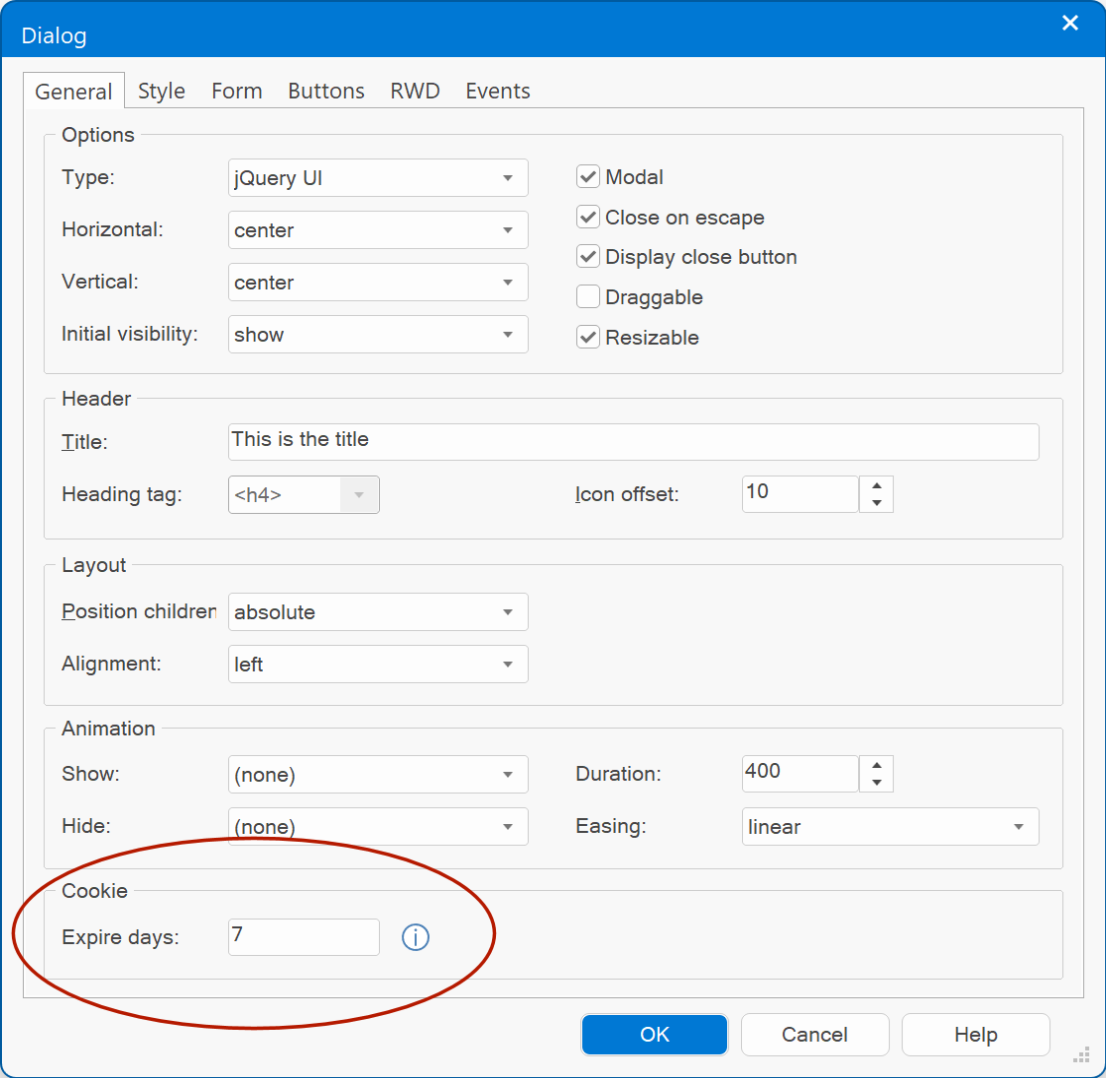
- Dialog now uses Bootstrap 5. No longer depends on jQuery. All code has been rewritten to remove the jQuery dependency. https://getbootstrap.com/docs/5.2/components/modal/
Demo:
https://wysiwygwebbuilder.com/support/wb18tryouts/wb18_dialog_cookie.html
- Added 'one-time popup' functionality via the 'Cookie Expire Days' property. A cookie is stored on the visitor’s browser to only show the dialog once across multiple visits. Use '0' to disable cookie functionality.
- Dialog now uses Bootstrap 5. No longer depends on jQuery. All code has been rewritten to remove the jQuery dependency. https://getbootstrap.com/docs/5.2/components/modal/
Demo:
https://wysiwygwebbuilder.com/support/wb18tryouts/wb18_dialog_cookie.html
Tabs
Tabs
- Tabs / Bootstrap type now uses Bootstrap 5. No longer depends on jQuery. https://getbootstrap.com/docs/5.2/compo ... tabs/#tabs
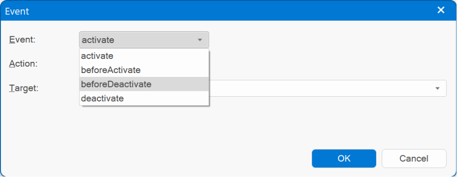
- Added 'deactivate' and beforedeactivate' events. These events will be triggered when a panel gets deactivated. This can be useful, for example, to hide other elements on the page.
Demo:
https://wysiwygwebbuilder.com/support/wb18tryouts/wb18_tabs.html
- Tabs / Bootstrap type now uses Bootstrap 5. No longer depends on jQuery. https://getbootstrap.com/docs/5.2/compo ... tabs/#tabs
- Added 'deactivate' and beforedeactivate' events. These events will be triggered when a panel gets deactivated. This can be useful, for example, to hide other elements on the page.
Demo:
https://wysiwygwebbuilder.com/support/wb18tryouts/wb18_tabs.html
Accordion
Accordion
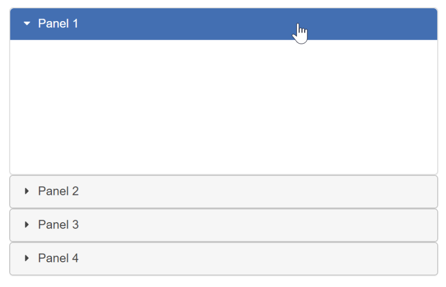
- Added 'deactivate' and beforedeactivate' events. These events will be triggered when a panel gets deactivated. See also the image under the ‘tabs’ section.
- Accordion now uses Bootstrap 5. No longer depends on jQuery. All code has been rewritten to remove the jQuery dependency.
https://getbootstrap.com/docs/5.2/components/accordion/
- Accordion arrows now use SVG images instead of PNG bitmaps. This makes coloring/theming the arrows easier and also improves the quality.
- Accordion (Bootstrap) full header is now clickable (instead of just the text)
Demo:
https://wysiwygwebbuilder.com/support/wb18tryouts/wb18_accordion.html
Simplified Ribbon
Simplified Ribbon
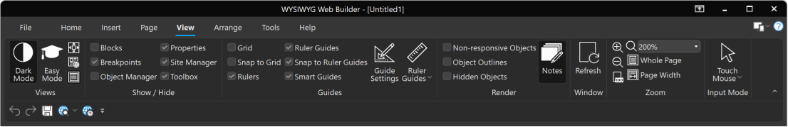
WWB18 has a new redesigned ribbon mode: Simplified Ribbon. The Simplified Ribbon is a mix between the classic toolbar and ribbon. It shows the commands in a single line which not only brings a modern interface to WWB but also frees up space to show more of the page you are working on.
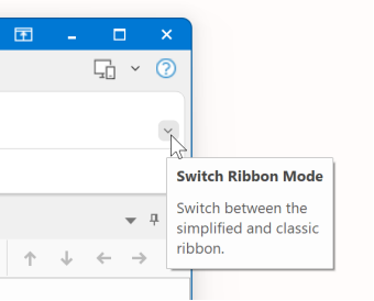
Because there is less space available, all buttons might not be visible. If you want to switch back to the classic ribbon where you can see more commands, simply click the downward pointing arrow in the lower right corner of the ribbon to expand it. Use this arrow control to switch between the simplified and classic ribbon.
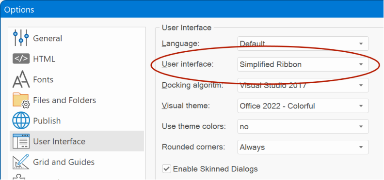
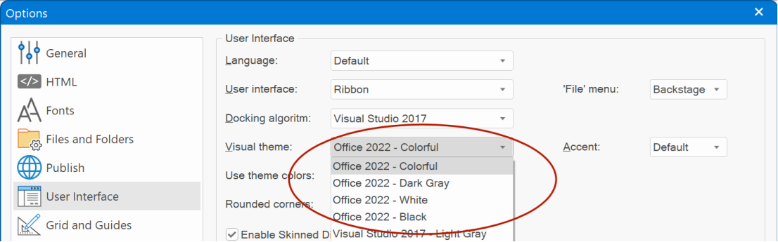
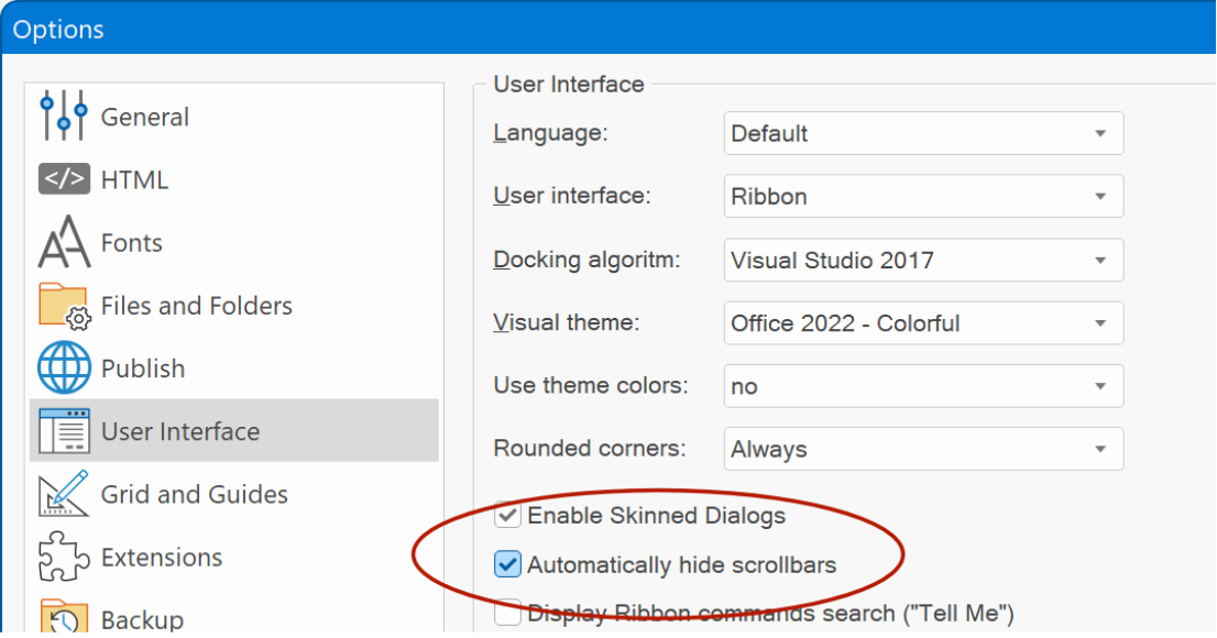
It's also possible to switch between ribbon, classic menubar/toolbars and simplified ribbon in Tools -> Options -> User Interface -> User interface
- Added Office 2022 inspired visual themes (Colorful, Dark Gray, White and Black).
WWB18 has a new redesigned ribbon mode: Simplified Ribbon. The Simplified Ribbon is a mix between the classic toolbar and ribbon. It shows the commands in a single line which not only brings a modern interface to WWB but also frees up space to show more of the page you are working on.
Because there is less space available, all buttons might not be visible. If you want to switch back to the classic ribbon where you can see more commands, simply click the downward pointing arrow in the lower right corner of the ribbon to expand it. Use this arrow control to switch between the simplified and classic ribbon.
It's also possible to switch between ribbon, classic menubar/toolbars and simplified ribbon in Tools -> Options -> User Interface -> User interface
- Added Office 2022 inspired visual themes (Colorful, Dark Gray, White and Black).
Page
Page
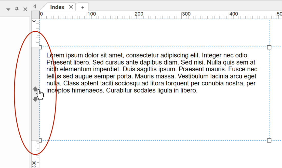
- Added a quick and easy way to rearrange floating layers (layout grids, flex containers etc.) via the vertical ruler bar. When a floating layer is selected, the ruler will show 'move up' and 'move down' arrows.
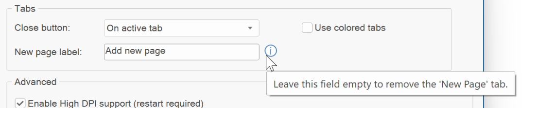
- Added 'New Page' tab to user interface. This adds a quick way to add new pages.
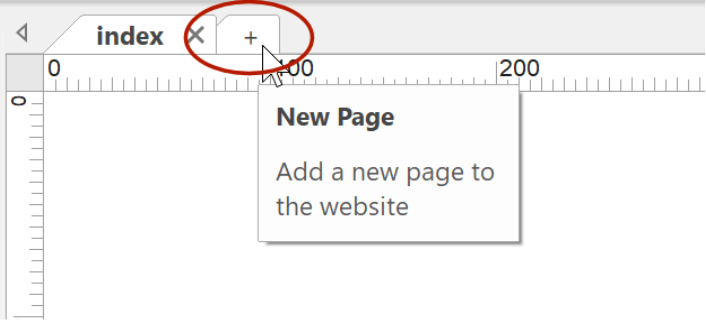
By default, the new page tab only contains the ‘+’ sign, but you can change the text of the tab in Tools -> Options -> User Interface. If you leave the field empty then the new page tab will be hidden.
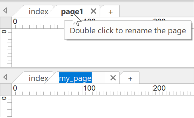
- Added the ability to rename the page by double clicking the tab.
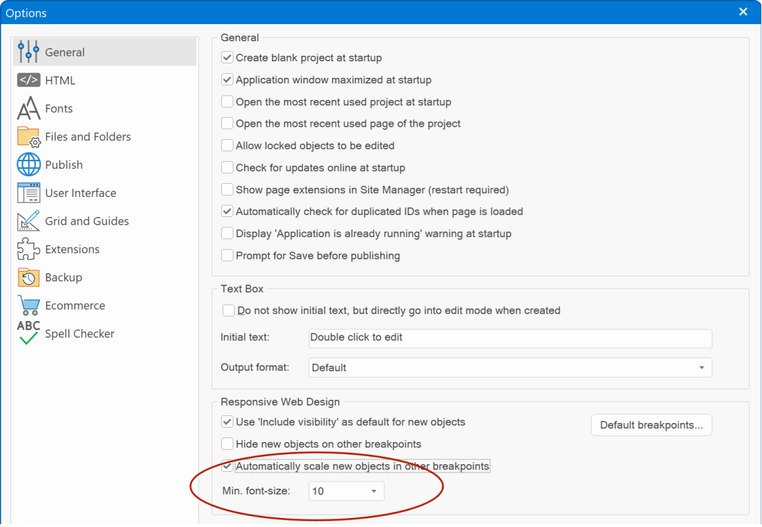
- Added the ability to set a minimum font size for 'Automatically scale new objects in other breakpoints'. Previously, if the base font size was small then the scaled font could become too small to read, so now it can be limited to a more practical size.
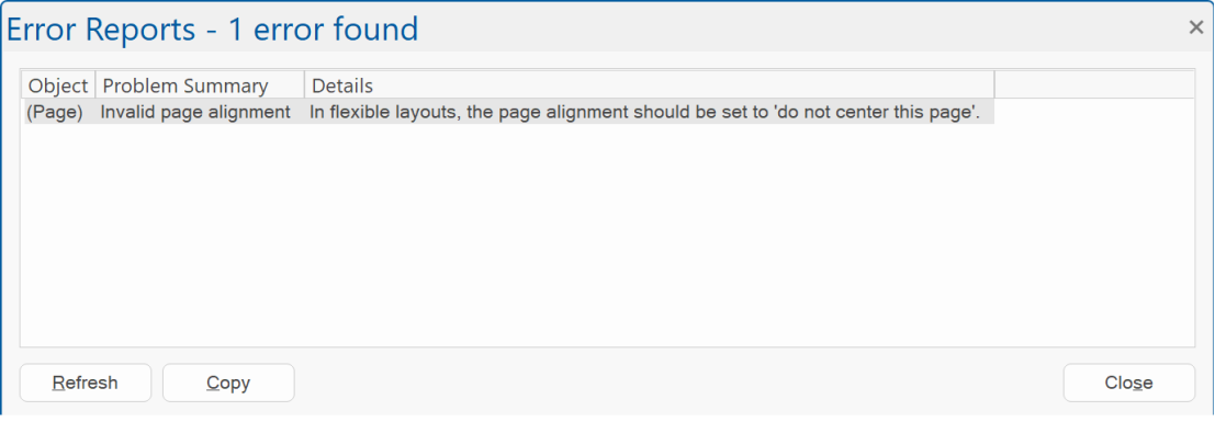
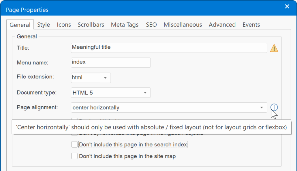
- Error Reports checks for invalid page alignment in flexible layouts. The page alignment in flexible layouts should be set to 'do not center this page'. Double click the error to open the Page Properties.
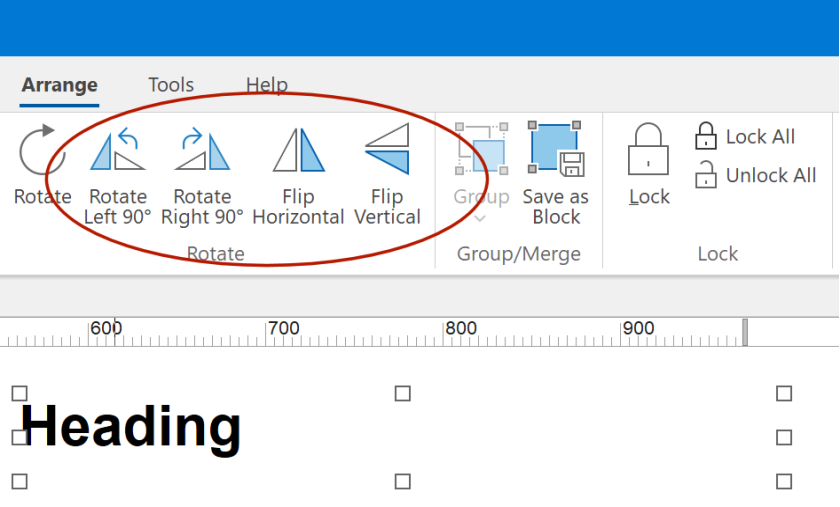
- Enabled 'Rotate Left 90', 'Rotate right 90' and flip commands for all rotatable objects. Previously these commands only worked for Shapes and Images.
- Added a quick and easy way to rearrange floating layers (layout grids, flex containers etc.) via the vertical ruler bar. When a floating layer is selected, the ruler will show 'move up' and 'move down' arrows.
- Added 'New Page' tab to user interface. This adds a quick way to add new pages.
By default, the new page tab only contains the ‘+’ sign, but you can change the text of the tab in Tools -> Options -> User Interface. If you leave the field empty then the new page tab will be hidden.
- Added the ability to rename the page by double clicking the tab.
- Added the ability to set a minimum font size for 'Automatically scale new objects in other breakpoints'. Previously, if the base font size was small then the scaled font could become too small to read, so now it can be limited to a more practical size.
- Error Reports checks for invalid page alignment in flexible layouts. The page alignment in flexible layouts should be set to 'do not center this page'. Double click the error to open the Page Properties.
- Enabled 'Rotate Left 90', 'Rotate right 90' and flip commands for all rotatable objects. Previously these commands only worked for Shapes and Images.
User Interface
User Interface
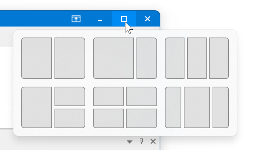
- Added support for Windows 11 Snap Layout. When the maximize/restore caption button is hovered, the layout popup menu will appear near this button.
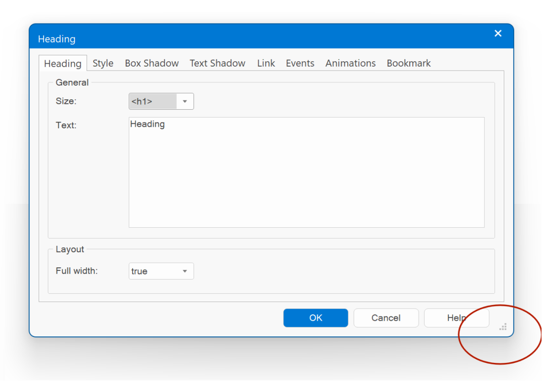
- Many property dialogs are now resizable. Also, the software will remember the window placement, so the next time you open the properties it will have the same position and size.
- Added the ability to automatically hide scrollbars in the workspace. When a scrollbar is inactive (the mouse cursor is not located inside it), only compact (thin) thumb box will be drawn. When you move the mouse inside the scrollbar, the bar will be fully drawn.
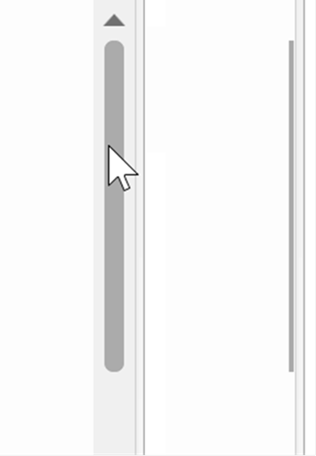
You can control this behavior in Tools -> Options -> User Interface -> Automatically Hide Scrollbars.
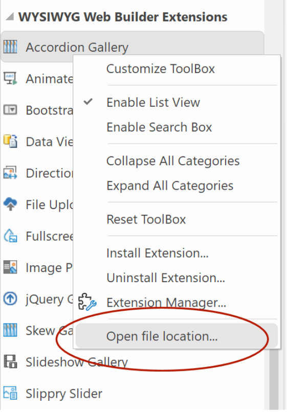
- Added ‘Open file location’ to the context menu of the Toolbox.
When an extension is selected, then this will open extensions folder in Windows Explorer.
- Added support for Windows 11 Snap Layout. When the maximize/restore caption button is hovered, the layout popup menu will appear near this button.
- Many property dialogs are now resizable. Also, the software will remember the window placement, so the next time you open the properties it will have the same position and size.
- Added the ability to automatically hide scrollbars in the workspace. When a scrollbar is inactive (the mouse cursor is not located inside it), only compact (thin) thumb box will be drawn. When you move the mouse inside the scrollbar, the bar will be fully drawn.
You can control this behavior in Tools -> Options -> User Interface -> Automatically Hide Scrollbars.
- Added ‘Open file location’ to the context menu of the Toolbox.
When an extension is selected, then this will open extensions folder in Windows Explorer.
Global Replace
Global Replace
- Added the ability to replace the 'class' property (style) for all pages/objects.
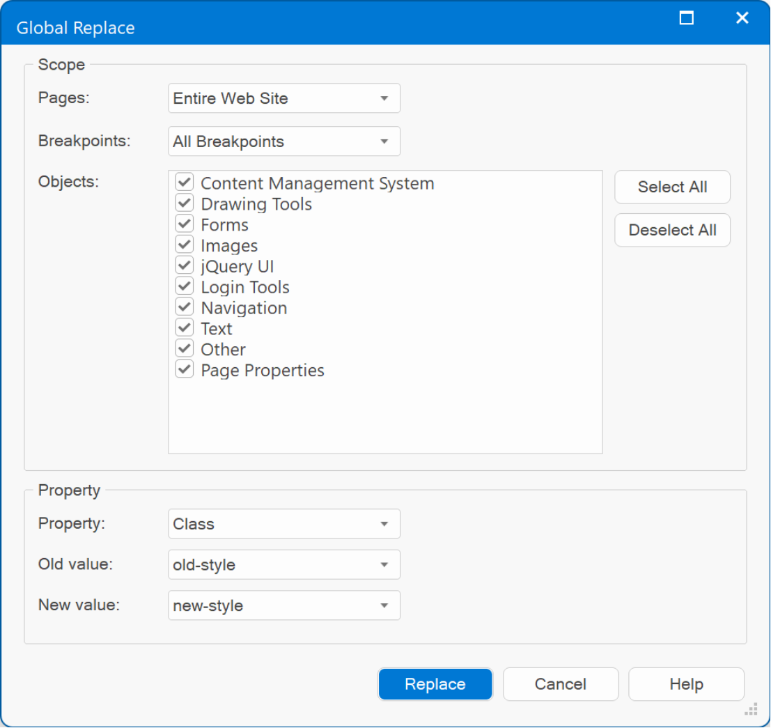
- Added the ability to replace the 'class' property (style) for all pages/objects.
"Barber Shop" template preview
This template was inspired by the website of my barber;)
Specially, the price list which uses flex containers to implement dotted lines with dynamic lengths (no script, just flexbox!).
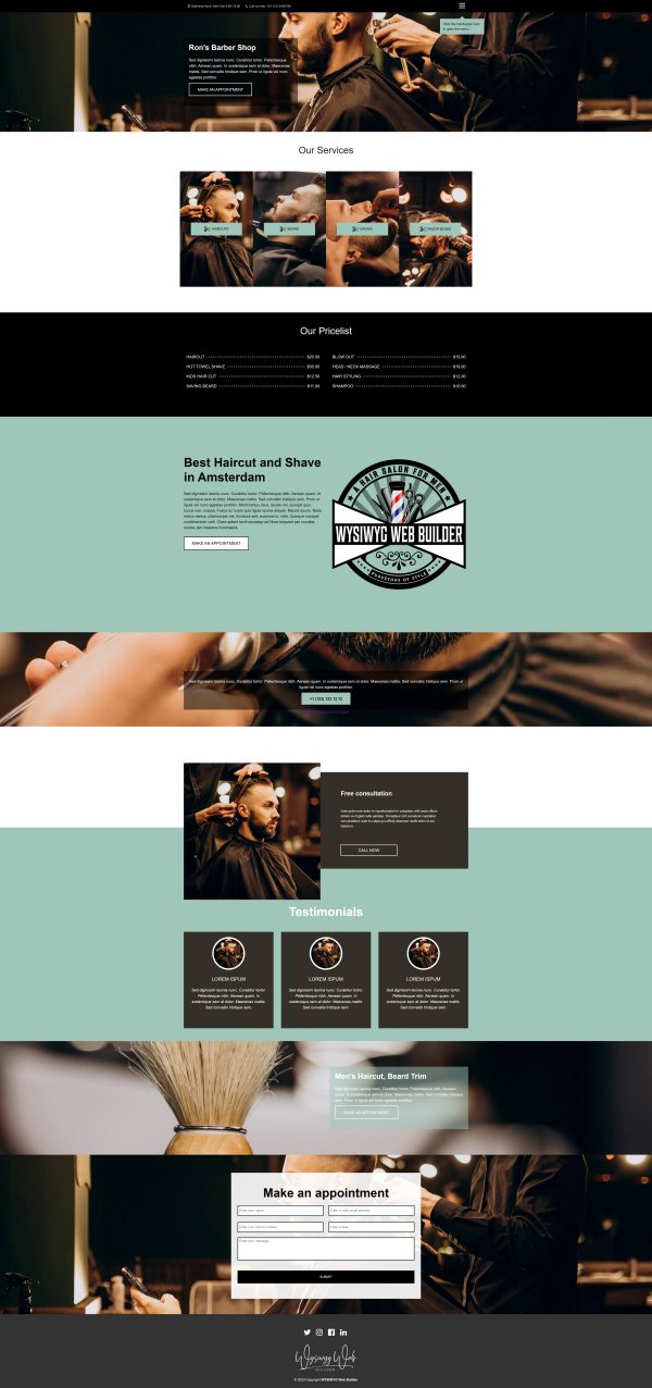
Preview:
https://www.wysiwygwebbuilder.com/support/wb18tryouts/wb18_barbershop.html
Specially, the price list which uses flex containers to implement dotted lines with dynamic lengths (no script, just flexbox!).
Preview:
https://www.wysiwygwebbuilder.com/support/wb18tryouts/wb18_barbershop.html
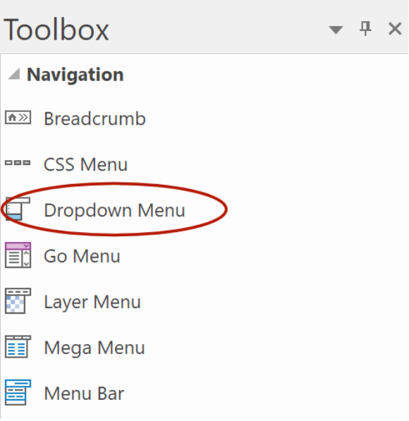
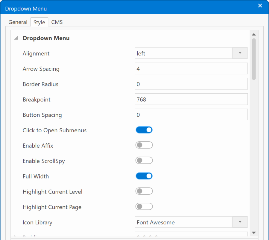
Dropdown Menu
Dropdown Menu
- Added 'Dropdown Menu' item in the toolbox. The dropdown menu is a simplified version of the themeable menu without jQuery. Dropdown Menu uses Bootstrap 5 and does not depend on jQuery (unlike the themeable menu).
Note: The themeable menu (with jQuery UI support) is now hidden in the Toolbox by default, but you can still access it via the Insert menu or manually add it back to the toolbox (via customize toolbox)
Demo:
https://www.wysiwygwebbuilder.com/support/wb18tryouts/wb18_styles_navigation.html
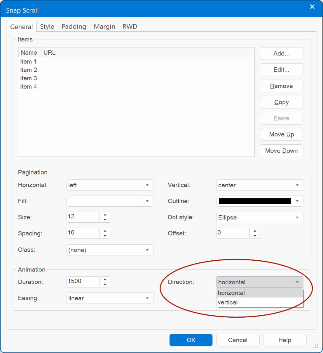
Snap Scroll
Snap Scroll
- Added support for horizontal scrolling!
Demo:
https://www.wysiwygwebbuilder.com/support/wb18tryouts/wb18_medieval_town.html
- Added support for horizontal scrolling!
Demo:
https://www.wysiwygwebbuilder.com/support/wb18tryouts/wb18_medieval_town.html
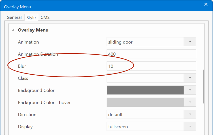
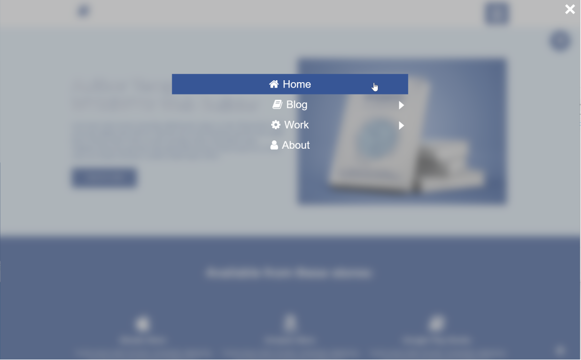
Overlay Menu
Overlay Menu
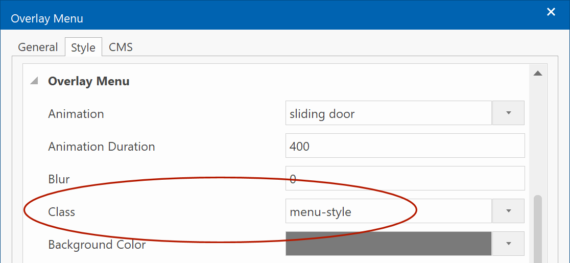
- Added 'Blur' property. This adds a backdrop blur filter to the overlay background.
Demo:
https://wysiwygwebbuilder.com/support/wb18tryouts/wb18_overlaymenu.html
- Added support for predefined styles.
Demo:
https://www.wysiwygwebbuilder.com/support/wb18tryouts/wb18_styles_navigation.html
- Added 'Blur' property. This adds a backdrop blur filter to the overlay background.
Demo:
https://wysiwygwebbuilder.com/support/wb18tryouts/wb18_overlaymenu.html
- Added support for predefined styles.
Demo:
https://www.wysiwygwebbuilder.com/support/wb18tryouts/wb18_styles_navigation.html
Panel Menu
Panel Menu
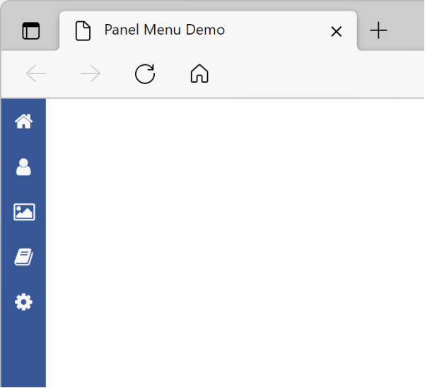
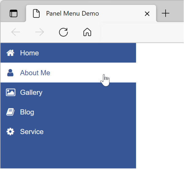
- Added 'Reveal' type (in addition to 'overlay' and 'push'). In reveal mode, the panel menu will initially show the icon only and when the mouse is over the menu, it will expand to its full width. Note that this only works when the menu is at the left/right edge of the page.
Demo:
https://wysiwygwebbuilder.com/support/wb18tryouts/wb18_panelmenu_reveal.html
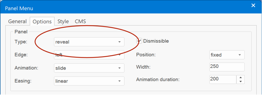
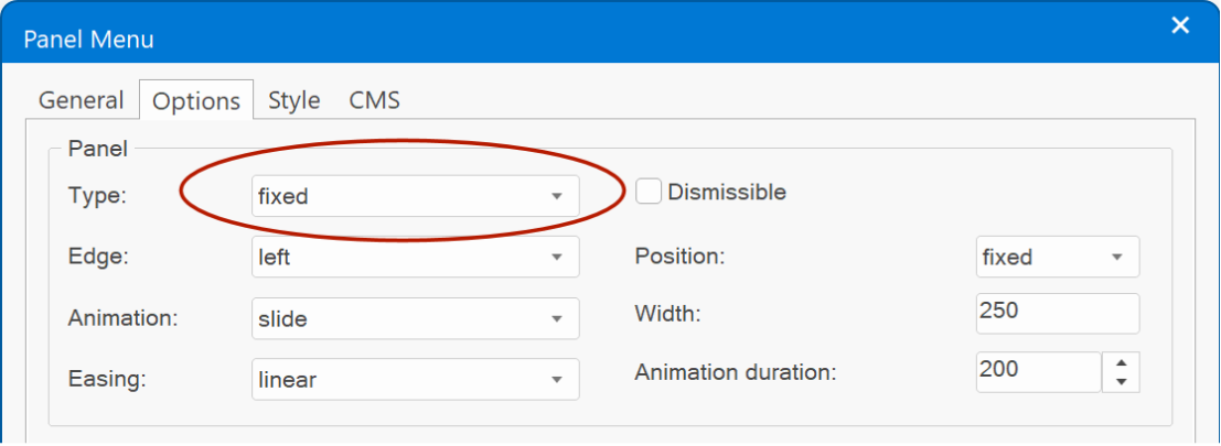
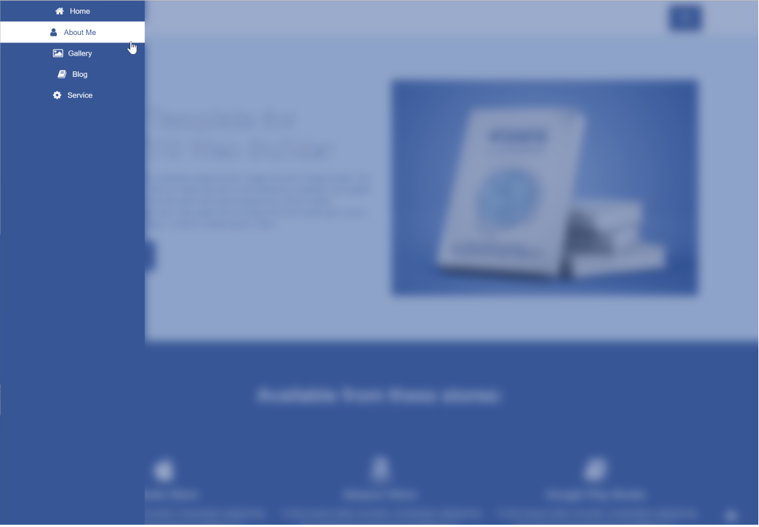
- Added 'Fixed' type (in addition to 'overlay', 'push' and 'reveal'). In fixed mode, the panel menu will always be visible. Note that this only works when the menu is at the left/right edge of the page.
Demo:
https://wysiwygwebbuilder.com/support/wb18tryouts/wb18_panelmenu_fixed.html
- Added 'Blur' property. This adds a backdrop blur filter to the overlay background.
Demo:
https://wysiwygwebbuilder.com/support/wb18tryouts/wb18_panelmenu.html
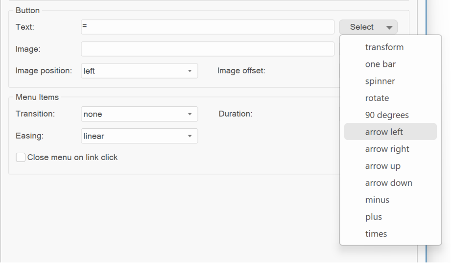
- Added dropdown menu to select the hamburger icon animation. (https://wysiwygwebbuilder.com/support/panelmenu-animations/index.html)
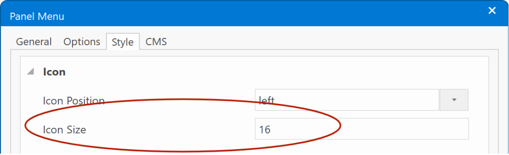
- Added the ability to set the size for icons in menu items. Previously the icon size was the same as the size of button icon. Now the icons can have a different size. Note: the spacing between the icon and text is determined by the padding.
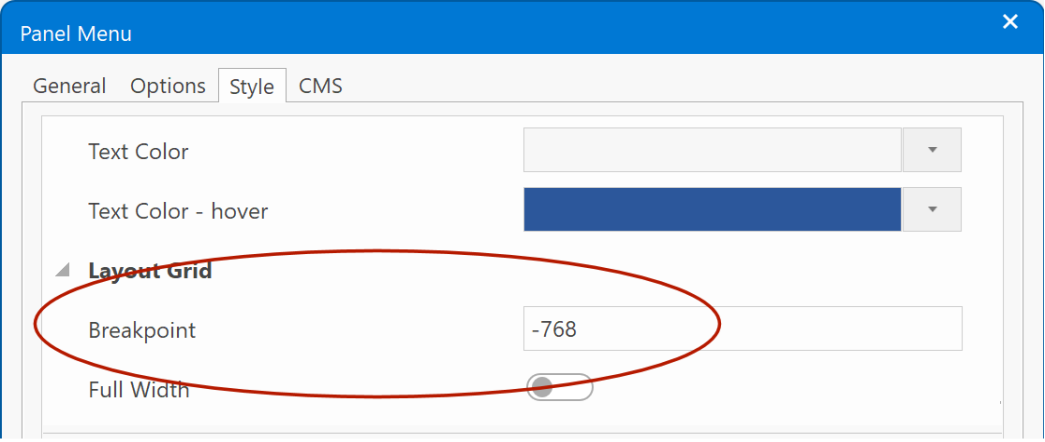
- It is now possible to hide the menu on smaller screens via the breakpoint property by specifying a negative value. For example, '-768' will hide the menu on screens smaller than 768 pixels.
- Added support for predefined styles.
Demo:
https://www.wysiwygwebbuilder.com/support/wb18tryouts/wb18_styles_navigation.html
- Added 'Reveal' type (in addition to 'overlay' and 'push'). In reveal mode, the panel menu will initially show the icon only and when the mouse is over the menu, it will expand to its full width. Note that this only works when the menu is at the left/right edge of the page.
Demo:
https://wysiwygwebbuilder.com/support/wb18tryouts/wb18_panelmenu_reveal.html
- Added 'Fixed' type (in addition to 'overlay', 'push' and 'reveal'). In fixed mode, the panel menu will always be visible. Note that this only works when the menu is at the left/right edge of the page.
Demo:
https://wysiwygwebbuilder.com/support/wb18tryouts/wb18_panelmenu_fixed.html
- Added 'Blur' property. This adds a backdrop blur filter to the overlay background.
Demo:
https://wysiwygwebbuilder.com/support/wb18tryouts/wb18_panelmenu.html
- Added dropdown menu to select the hamburger icon animation. (https://wysiwygwebbuilder.com/support/panelmenu-animations/index.html)
- Added the ability to set the size for icons in menu items. Previously the icon size was the same as the size of button icon. Now the icons can have a different size. Note: the spacing between the icon and text is determined by the padding.
- It is now possible to hide the menu on smaller screens via the breakpoint property by specifying a negative value. For example, '-768' will hide the menu on screens smaller than 768 pixels.
- Added support for predefined styles.
Demo:
https://www.wysiwygwebbuilder.com/support/wb18tryouts/wb18_styles_navigation.html
Responsive Menu
Responsive Menu
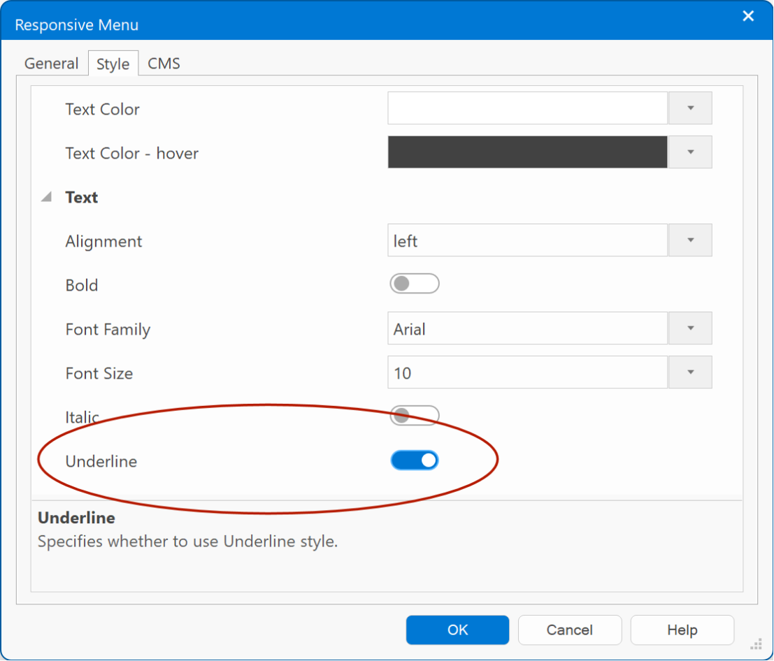
- Added 'Underline' property.
- Added support for predefined styles.
Demo:
https://www.wysiwygwebbuilder.com/support/wb18tryouts/wb18_styles_navigation.html
- Added 'Underline' property.
- Added support for predefined styles.
Demo:
https://www.wysiwygwebbuilder.com/support/wb18tryouts/wb18_styles_navigation.html
CSS Menu
CSS Menu
- Added 'space between' size mode. The items are evenly distributed. The spacing between each pair of adjacent items is the same.
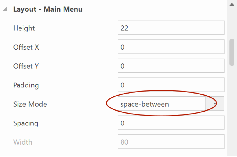
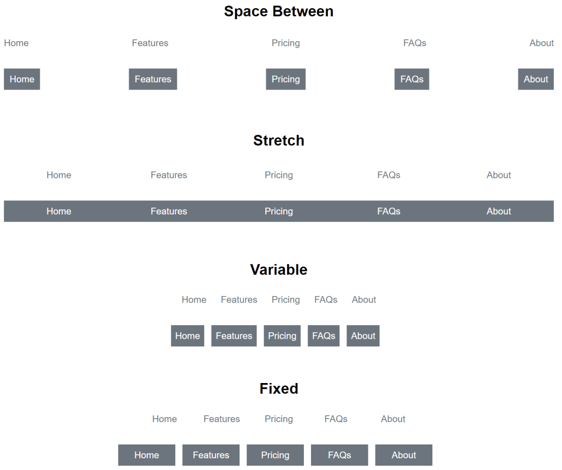
Demo:
https://wysiwygwebbuilder.com/support/wb18tryouts/wb18_cssmenu.html
- Added support for predefined styles.
Demo:
https://www.wysiwygwebbuilder.com/support/wb18tryouts/wb18_styles_navigation.html
- Added 'space between' size mode. The items are evenly distributed. The spacing between each pair of adjacent items is the same.
Demo:
https://wysiwygwebbuilder.com/support/wb18tryouts/wb18_cssmenu.html
- Added support for predefined styles.
Demo:
https://www.wysiwygwebbuilder.com/support/wb18tryouts/wb18_styles_navigation.html
Mega Menu
Mega Menu
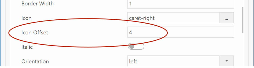
- Added 'Icon Offset' property for sub menu items. This specifies the offset from the left (or right) side of the menu item. Note that if you increase this value then you may also need to increase the padding otherwise the icon will overlap the text.
Demo:
https://wysiwygwebbuilder.com/support/wb18tryouts/wb18_megamenu.html
- The properties dialog of the Mega Menu has been redesigned to be more consistent with other menus, for quicker access to properties and making them easier findable.
- Added support for predefined styles.
Demo:
https://www.wysiwygwebbuilder.com/support/wb18tryouts/wb18_styles_navigation.html
Themeable Button
Themeable Button
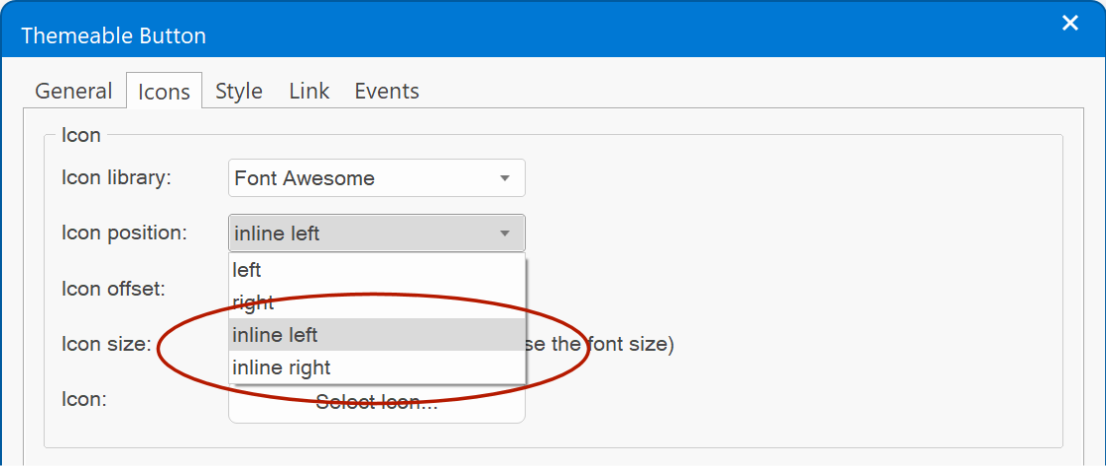
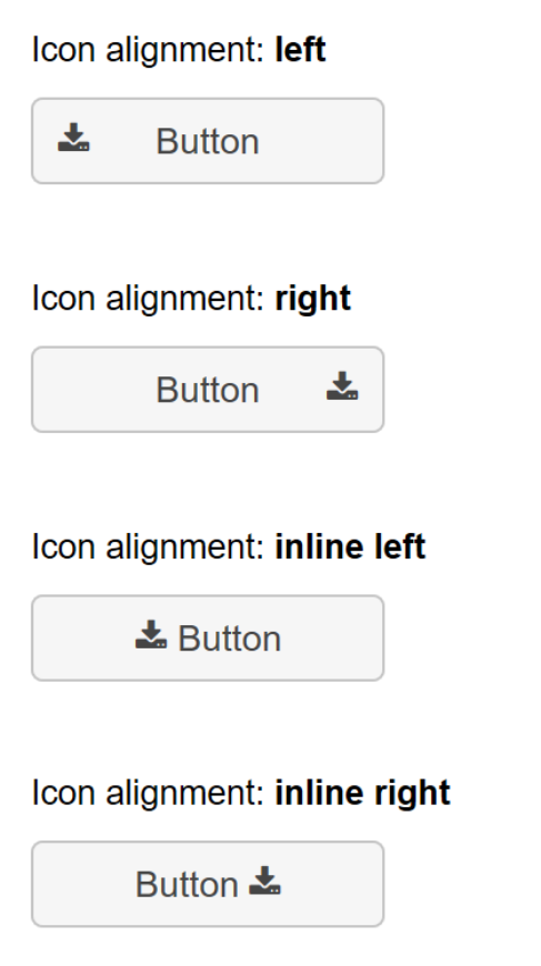
- Added 2 new icon align options: inline left and inline right. This will align the icon inline with the text instead of at the left or right side of the button.
Demo:
https://wysiwygwebbuilder.com/support/wb18tryouts/wb18_themablebutton.html
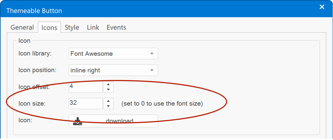
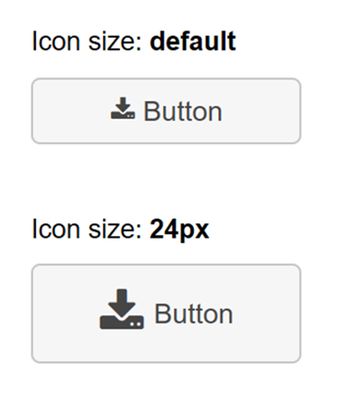
- Added the ability to set the 'icon size'. Previously the icon size was the same as the text size. Now the icon can have a different size.
- Button icons can now also be published as SVG (Tools -> Options -> HTML -> Publish navigation icons as SVG).
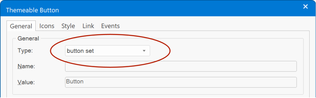
- 'button set' type no longer uses jQuery's control group, it uses flexbox instead, resulting in cleaner and faster code.
- Added 2 new icon align options: inline left and inline right. This will align the icon inline with the text instead of at the left or right side of the button.
Demo:
https://wysiwygwebbuilder.com/support/wb18tryouts/wb18_themablebutton.html
- Added the ability to set the 'icon size'. Previously the icon size was the same as the text size. Now the icon can have a different size.
- Button icons can now also be published as SVG (Tools -> Options -> HTML -> Publish navigation icons as SVG).
- 'button set' type no longer uses jQuery's control group, it uses flexbox instead, resulting in cleaner and faster code.
"Light Bulb" template preview
This is a preview of a new template for WWB18: "Light Bulb".
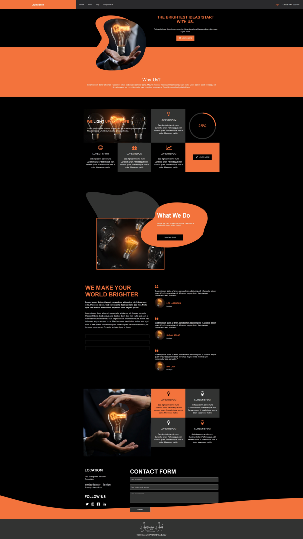
The light bulb demonstrates a few of the new progress bar variants and also uses sections for the overlapping shapes.
Preview:
https://www.wysiwygwebbuilder.com/support/wb18tryouts/wb18_lightbulb.html
The light bulb demonstrates a few of the new progress bar variants and also uses sections for the overlapping shapes.
Preview:
https://www.wysiwygwebbuilder.com/support/wb18tryouts/wb18_lightbulb.html
Animations
Animations
- Added 'Alias' functionality. This makes it possible to give animations an easier to remember name. Over the years we have added many new animations. Most animations have technical names like 'transform-lightspeed-in' or 'transform-swing'. By using an alias, they can now be displayed as 'Lightspeed In' and 'Swing'. Internally, the software will still use the original name (because renaming the animation name would break existing websites, that use that animation).
So, an alias is only to make it easier to identify the animation. It does not affect the published page.
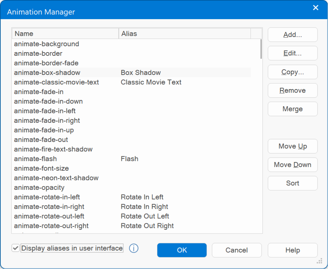
Note: when 'display aliases in user interface' is enabled then animations without an alias will not be displayed. Which can also be useful to hide less frequently used animations without removing them completely!
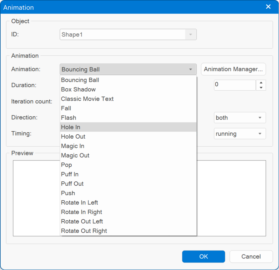
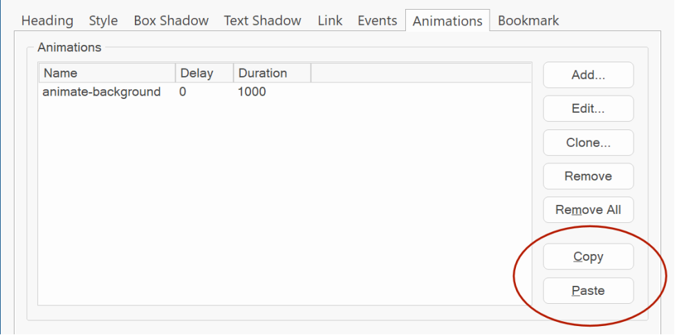
- Added 'Copy / Paste' functionality. This makes it possible to copy/ paste animations and transitions between objects.
- Added 'Alias' functionality. This makes it possible to give animations an easier to remember name. Over the years we have added many new animations. Most animations have technical names like 'transform-lightspeed-in' or 'transform-swing'. By using an alias, they can now be displayed as 'Lightspeed In' and 'Swing'. Internally, the software will still use the original name (because renaming the animation name would break existing websites, that use that animation).
So, an alias is only to make it easier to identify the animation. It does not affect the published page.
Note: when 'display aliases in user interface' is enabled then animations without an alias will not be displayed. Which can also be useful to hide less frequently used animations without removing them completely!
- Added 'Copy / Paste' functionality. This makes it possible to copy/ paste animations and transitions between objects.
Google Fonts
Google Fonts
- Added more than 350 new fonts!
- Added the ability to host Google fonts locally for better performance and privacy.
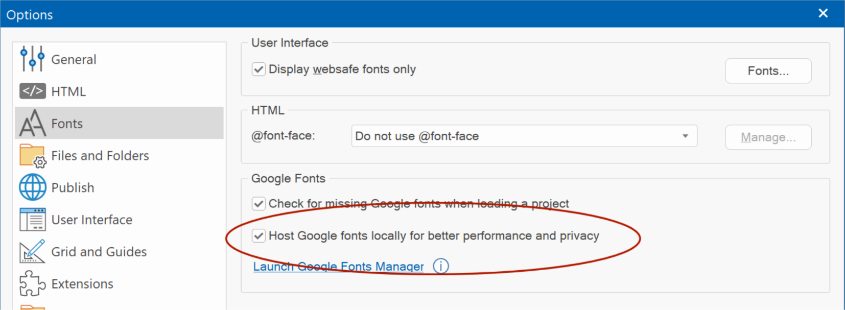
Normally, Google Fonts are loaded from Google servers. This means that an extra CSS file needs to be loaded and two extra DNS lookups (fonts.googleapis.com and font.gstatic.com).
When you do host Google Fonts locally, all the requests will come from the same domain as your other assets.
Also, there may be privacy concerns when using Google services as described here: https://blog.runcloud.io/google-fonts-gdpr/
By hosting the fonts locally, Google will not be able to track your visitors.
Note that this feature is pretty complicated behind the scenes, so using local fonts may not always work exactly the same as when using Google Font services. For example, Google generates a stylesheet that only contains the fonts specifically for the browser the page is viewed in. Obviously, WWB does not know which browser the visitor of the website has at design time. So, therefor it generates CSS for different font types (woff, woff2).
During publishing WWB will scan the page for used Google Fonts. It will first download the CSS to figure out the font files for different browsers. Then the CSS files of these different types are combined. Next, WWB will download the fonts locally and update the location(s) in the HTML file. The (local) fonts will be published together with the page. All files are cached, so this process is only done once for each font variation.
- Added more than 350 new fonts!
- Added the ability to host Google fonts locally for better performance and privacy.
Normally, Google Fonts are loaded from Google servers. This means that an extra CSS file needs to be loaded and two extra DNS lookups (fonts.googleapis.com and font.gstatic.com).
When you do host Google Fonts locally, all the requests will come from the same domain as your other assets.
Also, there may be privacy concerns when using Google services as described here: https://blog.runcloud.io/google-fonts-gdpr/
By hosting the fonts locally, Google will not be able to track your visitors.
Note that this feature is pretty complicated behind the scenes, so using local fonts may not always work exactly the same as when using Google Font services. For example, Google generates a stylesheet that only contains the fonts specifically for the browser the page is viewed in. Obviously, WWB does not know which browser the visitor of the website has at design time. So, therefor it generates CSS for different font types (woff, woff2).
During publishing WWB will scan the page for used Google Fonts. It will first download the CSS to figure out the font files for different browsers. Then the CSS files of these different types are combined. Next, WWB will download the fonts locally and update the location(s) in the HTML file. The (local) fonts will be published together with the page. All files are cached, so this process is only done once for each font variation.
Events
Events
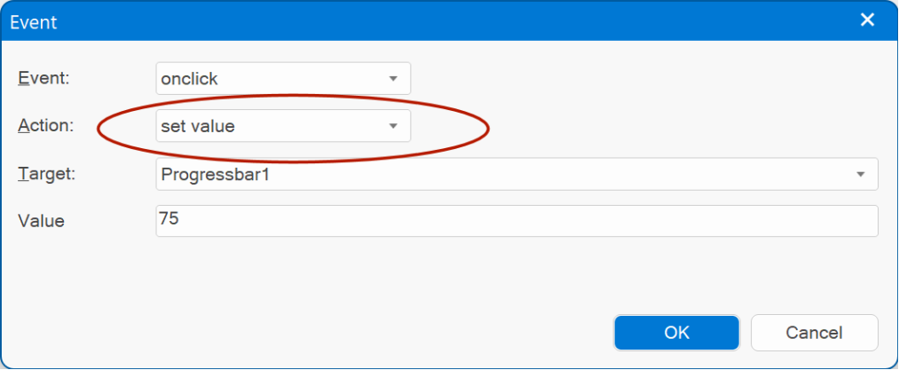
- Added 'Set Value' action. This can be used to set the value of a specific object. For example, set the value of a progressbar or input box.
'Set value' currently supports the following objects: Editbox, Text Area, Select, Checkbox, Radio Button, FlipSwitch, Spinner, Slider, Range, Button text, Heading text, Label text.
Demo:
https://wysiwygwebbuilder.com/support/wb18tryouts/wb18_events_setvalue.html
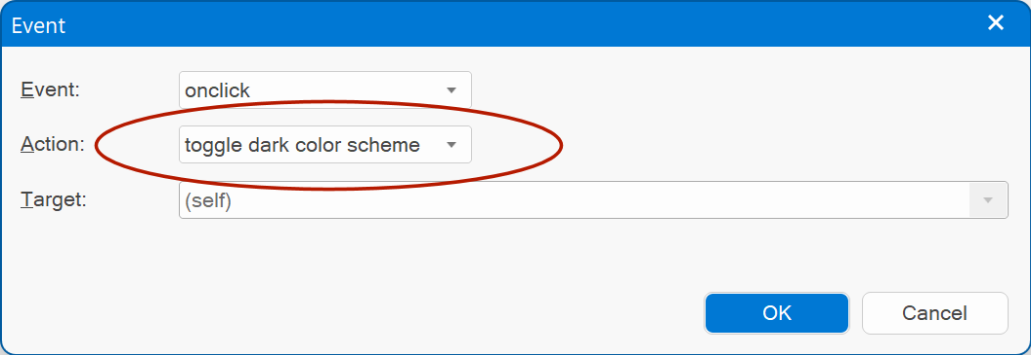
- Added 'Toggle Dark Theme' action. This makes it possible for the user to toggle between dark and light mode. For this to work, dark theme mode (in Tools -> Options -> HTML) should be set to 'manual'.
Demo:
https://wysiwygwebbuilder.com/support/wb18tryouts/wb18_events_darkmode.html
- The 'Set Class' action (previously named 'Set Style') has been redesigned. It now applies the class to the same element as the 'class' property, which makes working with styles easier and more logical.
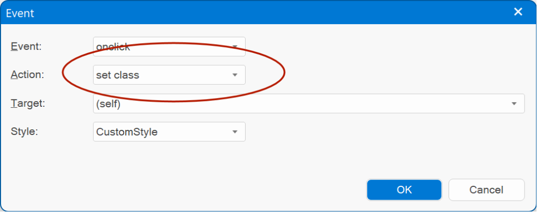
Demos:
https://wysiwygwebbuilder.com/support/wb18tryouts/wb18_style_switcher_buttons.html
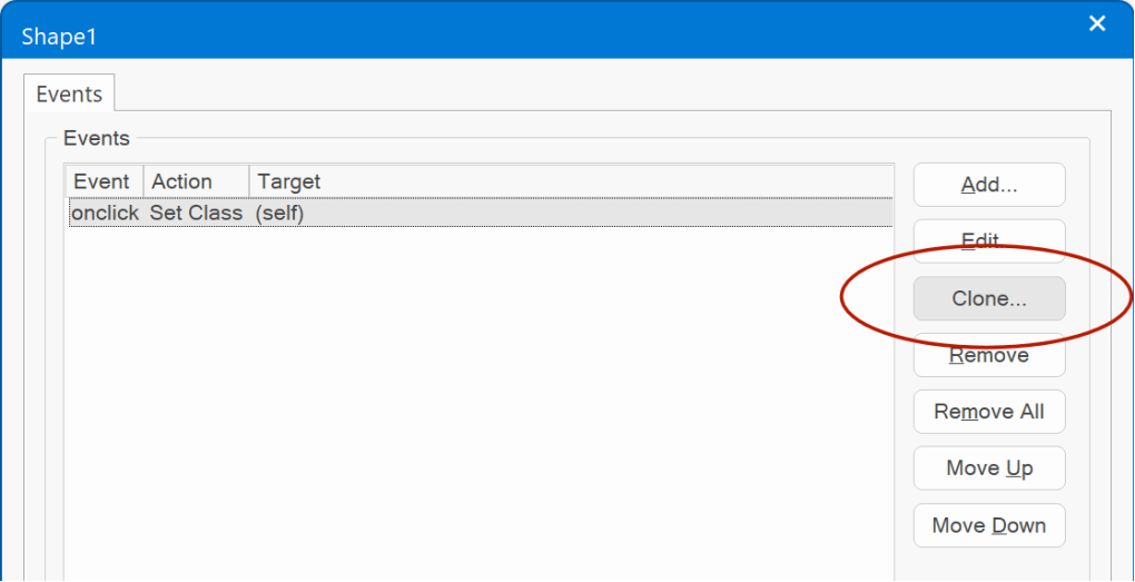
- Added 'Clone' button to quickly add a copy of the selected event.
- Added 'Set Value' action. This can be used to set the value of a specific object. For example, set the value of a progressbar or input box.
'Set value' currently supports the following objects: Editbox, Text Area, Select, Checkbox, Radio Button, FlipSwitch, Spinner, Slider, Range, Button text, Heading text, Label text.
Demo:
https://wysiwygwebbuilder.com/support/wb18tryouts/wb18_events_setvalue.html
- Added 'Toggle Dark Theme' action. This makes it possible for the user to toggle between dark and light mode. For this to work, dark theme mode (in Tools -> Options -> HTML) should be set to 'manual'.
Demo:
https://wysiwygwebbuilder.com/support/wb18tryouts/wb18_events_darkmode.html
- The 'Set Class' action (previously named 'Set Style') has been redesigned. It now applies the class to the same element as the 'class' property, which makes working with styles easier and more logical.
Demos:
https://wysiwygwebbuilder.com/support/wb18tryouts/wb18_style_switcher_buttons.html
- Added 'Clone' button to quickly add a copy of the selected event.
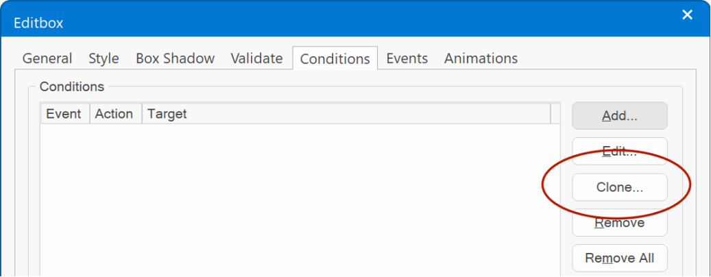
Conditions
Conditions
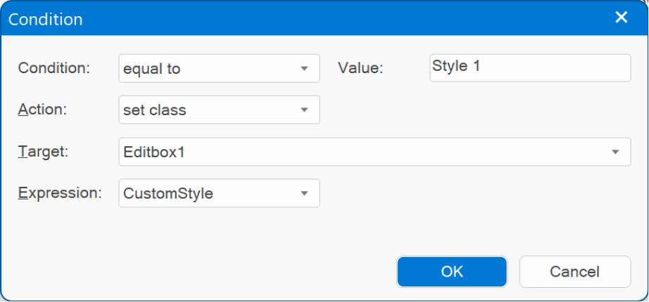
- Added 'Set Class' action. This can be used to set a class (style) for specific conditions. For example, based on the selected item in a 'select' object in case of a "style switcher".
Demo:
https://wysiwygwebbuilder.com/support/wb18tryouts/wb18_conditions.html
- Added 'Clone' button to quickly add a copy of the selected condition.
"Vintage" template preview
This is a preview of a new template for WWB18: "Vintage".
The "Vintage" template was inspired by a retro website that I stumbled on. I specially liked the old school color scheme.
It demonstrates two undocumented features of WWB18:
- The layout grid of the 'feature' cards has two different background colors at the top and bottom. This makes it look like the cards in the layout grid overlap to the next layout grid. The effect was implemented using a new 'rectangle' shape divider.
- The social media icons at the bottom have a double border. The outer border was created with (negative) box shadow blur. A negative blur radius, uses 'spread' instead of 'blur'.
Preview:
https://www.wysiwygwebbuilder.com/support/wb18tryouts/wb18_vintage.html
HTML Widget
HTML Widget
- Added the ability to set the font size of the editor.
- Added the ability to set the font size of the editor.
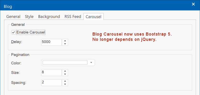
Blog
Blog
- Blog Carousel now uses Bootstrap 5. No longer depends on jQuery.
- Blog Carousel now uses Bootstrap 5. No longer depends on jQuery.
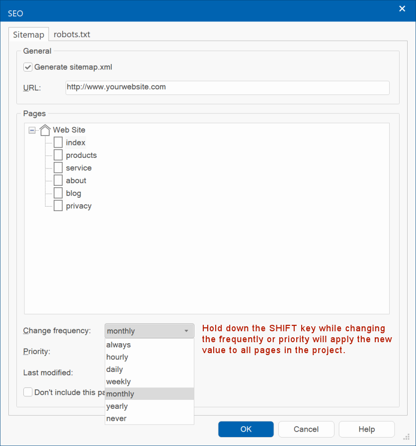
Sitemap SHIFT-trick
Sitemap
- Holding down the SHIFT key while changing the frequently or priority will apply the new value to all pages in the project.
This may be useful if you want to change the value for all pages without having to update it for each page individually.
- Holding down the SHIFT key while changing the frequently or priority will apply the new value to all pages in the project.
This may be useful if you want to change the value for all pages without having to update it for each page individually.
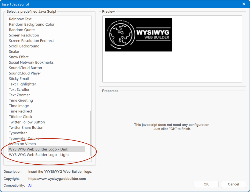
Ready-to-use-Javascripts
Ready-to-use-Javascripts
- Added 'WYSIWYG Web Builder' logos (light and dark).
- Added 'WYSIWYG Web Builder' logos (light and dark).
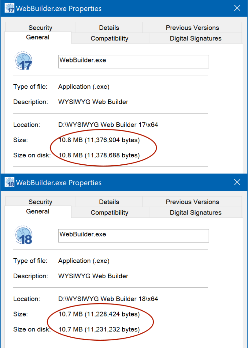
Internal optimizations
- Version 18 also has many internal optimizations. And although this release has more than 150 new features, the size of the executable has not increased!
"Tell Me" search box
When using the new Office 2022 theme, the 'tell me' search box is located on the Ribbon caption.
The input field will be minimized when it does not have the input focus.
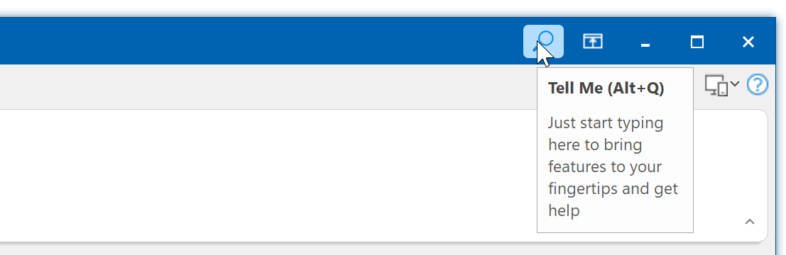
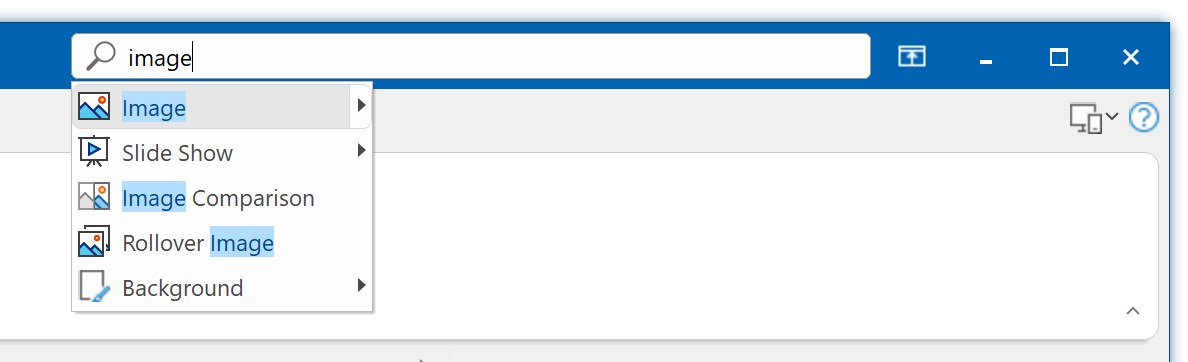
The input field will be minimized when it does not have the input focus.
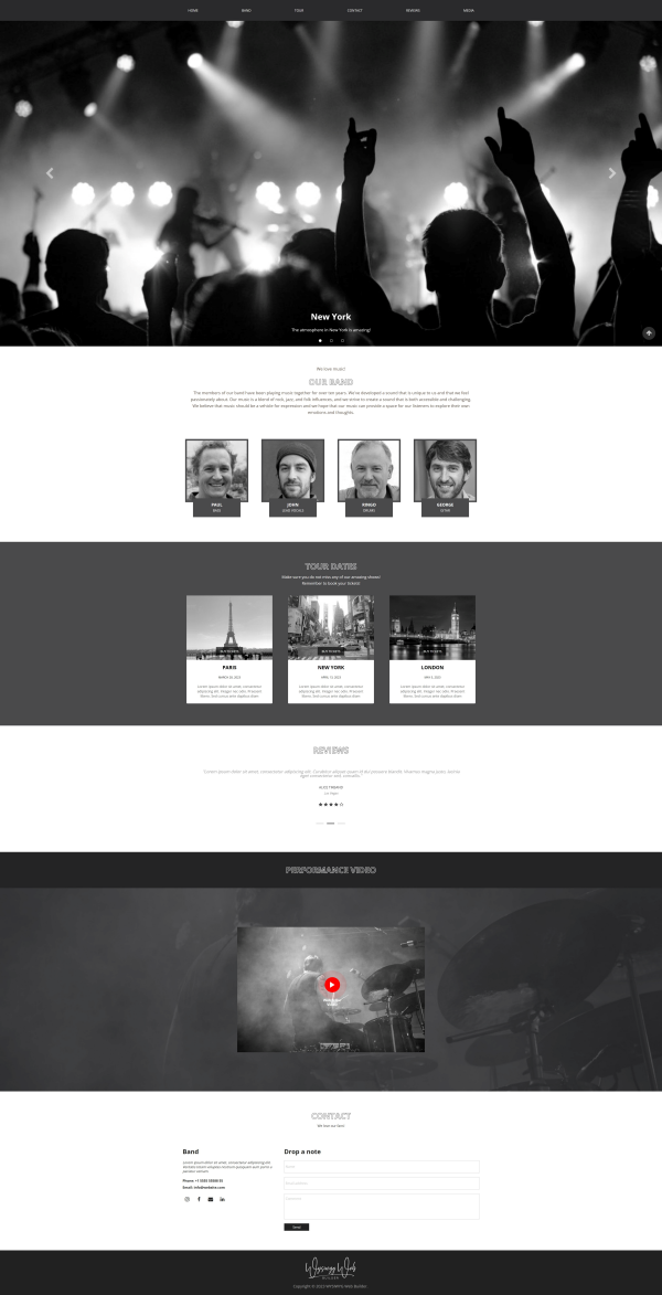
"Band" template preview
This is a preview of a new template for WWB18: "Band".
This template demonstrates the new "space between' mode of the CSS menu.
A simple way to implement a scalable menu without the need for breakpoints.
Preview:
https://www.wysiwygwebbuilder.com/support/wb18tryouts/wb18_band.html
This template demonstrates the new "space between' mode of the CSS menu.
A simple way to implement a scalable menu without the need for breakpoints.
Preview:
https://www.wysiwygwebbuilder.com/support/wb18tryouts/wb18_band.html
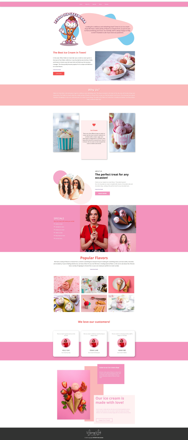
"Ice Cream" template preview
This is a preview of a new template for WWB18: "Ice Cream".
Another template to demonstrate the use of sections.
The ice cream template was inspired by a dutch ice cream truck named 'Pablo's ijscobar'
The colorful ice cream images are from the Freepik website: https://www.freepik.com/
The ice cream logo was specially created for this template...
Preview:
https://www.wysiwygwebbuilder.com/support/wb18tryouts/wb18_icecream.html
"Artificial Art" template preview
This is a preview of a new template for WWB18: "Artificial Art".
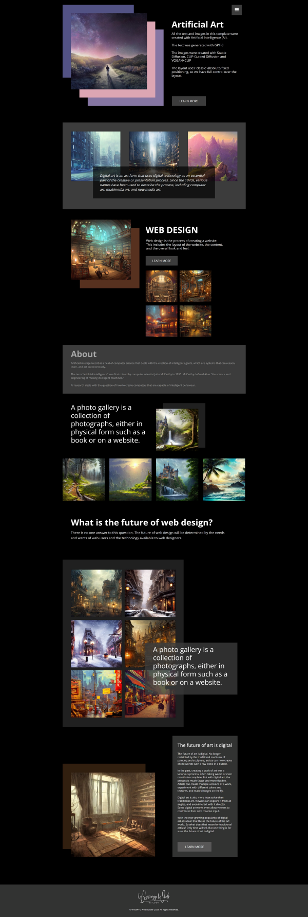
As you may have seen in another templates, I have done some experiments with AI for both text and images.
Unfortunately, the technique is currently too expensive to integrate in the software, but this is certainly something that is considered for future development!
All the text and images in this template were created with Artificial Intelligence (AI).
The text was generated with GPT-3, as alternative for Lorem Ipsum text.
The images were created with Stable Diffusion and DALI-E 2
The layout uses 'classic' absolute/fixed positioning with breakpoints, to have full control over the layout.
Preview:
https://www.wysiwygwebbuilder.com/support/wb18tryouts/wb18_artificial_art.html
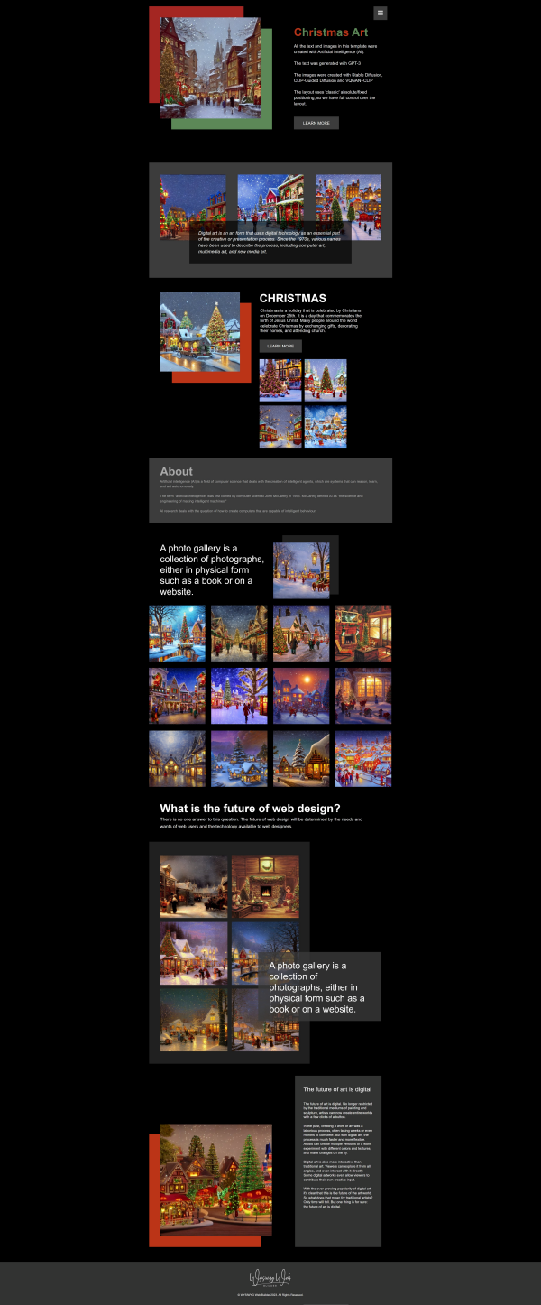
"Christmas Art" template preview
This is another variant of the "Artificial Art" template: "Christmas Art"
The main difference is that this one is using Christmas themed images...
Preview:
https://www.wysiwygwebbuilder.com/support/wb18tryouts/wb18_christmas_art.html
The main difference is that this one is using Christmas themed images...
Preview:
https://www.wysiwygwebbuilder.com/support/wb18tryouts/wb18_christmas_art.html
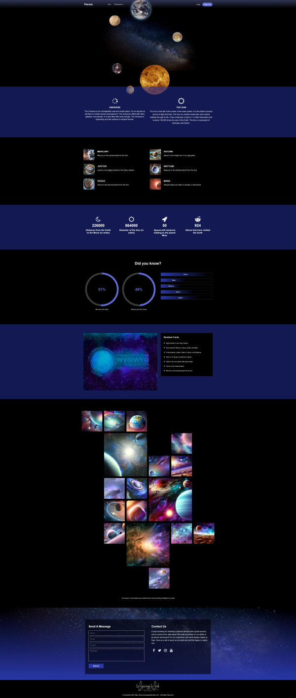
"Planets" template preview
This is a preview of a new template for WWB18: "Planets".
This template is an extended version of the 'planets' demo that was created to demonstrate mouse effects in sections.
Preview:
https://www.wysiwygwebbuilder.com/support/wb18tryouts/wb18_planets.html
This template is an extended version of the 'planets' demo that was created to demonstrate mouse effects in sections.
Preview:
https://www.wysiwygwebbuilder.com/support/wb18tryouts/wb18_planets.html
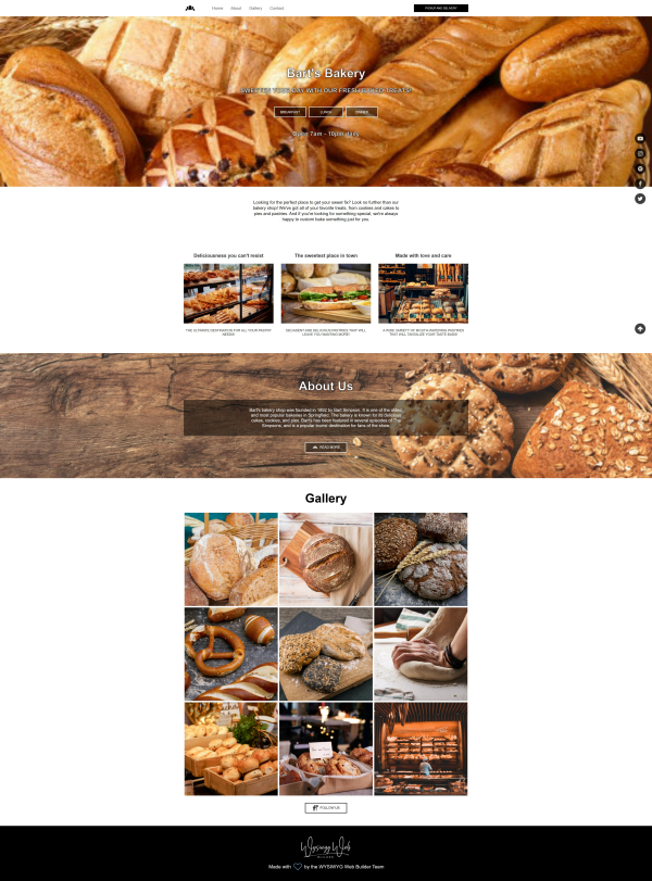
"Bakery" template preview
This is a preview of a new template for WWB18: "Bakery".
This multi-page template is based around bakery images from Unsplash.
The text (like in most other templates) was generated with GPT-3: https://openai.com/api/
Preview:
https://www.wysiwygwebbuilder.com/support/wb18tryouts/wb18_bakery.html
This multi-page template is based around bakery images from Unsplash.
The text (like in most other templates) was generated with GPT-3: https://openai.com/api/
Preview:
https://www.wysiwygwebbuilder.com/support/wb18tryouts/wb18_bakery.html
"Coffee and Cakes" template preview
A preview of a new template for WWB18: "Coffee and Cakes".
This template is based on AI generated coffee and cakes images...
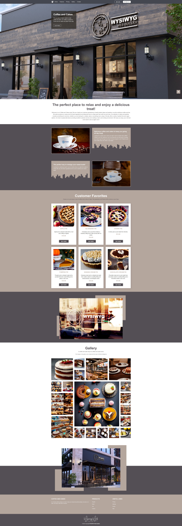
Preview:
https://www.wysiwygwebbuilder.com/support/wb18tryouts/wb18_coffee_and_cakes.html
This template is based on AI generated coffee and cakes images...
Preview:
https://www.wysiwygwebbuilder.com/support/wb18tryouts/wb18_coffee_and_cakes.html
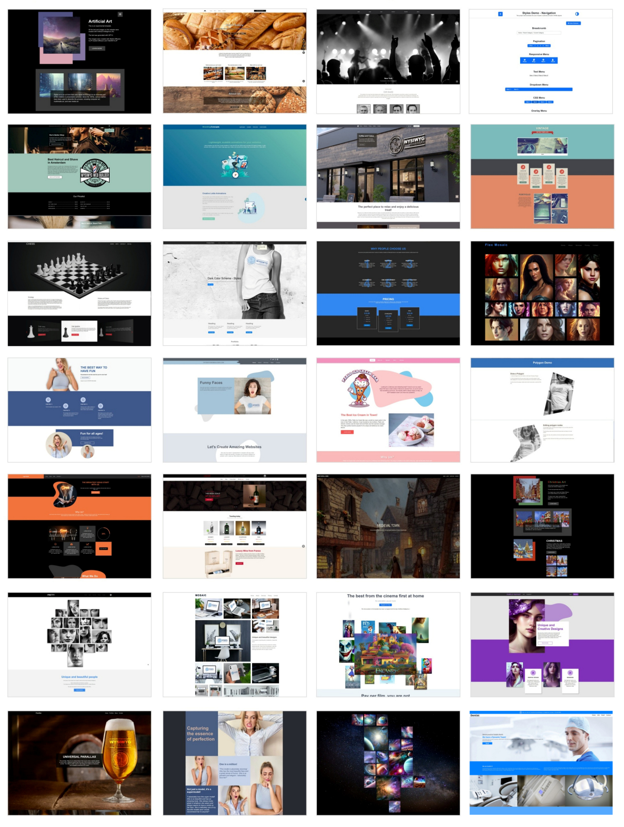
Templates
More than 25 new templates for WYSIWYG Web Builder 18 will available at the release date.
As usual these are just some random ideas, to showcase what you can do with the new tools...
As usual these are just some random ideas, to showcase what you can do with the new tools...
Tutorials
Here is an overview of new tutorials for version 18:
https://www.wysiwygwebbuilder.com/autocomplete.html
https://www.wysiwygwebbuilder.com/customscrollbars.html
https://www.wysiwygwebbuilder.com/darkcolorscheme.html
https://www.wysiwygwebbuilder.com/dialog.html
https://www.wysiwygwebbuilder.com/login_embedded_db.html
https://www.wysiwygwebbuilder.com/mouseeffects.html
https://www.wysiwygwebbuilder.com/progressbar.html
https://www.wysiwygwebbuilder.com/protected_content.html
https://www.wysiwygwebbuilder.com/section.html
https://www.wysiwygwebbuilder.com/style_switcher.html
https://www.wysiwygwebbuilder.com/tooltip.html
The following tutorials have been updated:
https://www.wysiwygwebbuilder.com/paypal_shoppingcart.html
https://www.wysiwygwebbuilder.com/ribbon.html
https://www.wysiwygwebbuilder.com/seo_assistant.html
Almost 18... (teaser)
And to conclude this teaser, here's the (almost) complete list of new features for WYSIWYG Web Builder 18.
https://www.wysiwygwebbuilder.com/support/wb18.html
WYSIWYG Web Builder 18 will be available soon...
https://www.wysiwygwebbuilder.com/support/wb18.html
WYSIWYG Web Builder 18 will be available soon...