An Introduction to Flex Grid
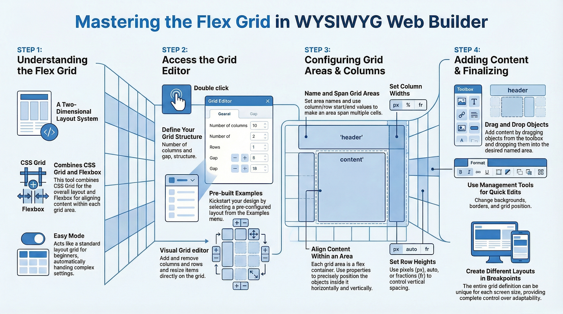
The flex grid is a layout system that allows web developers to create flexible, responsive web layouts easily using CSS Grid Layout. It divides a web page into columns and rows, and each of these areas can be assigned a name and customized with padding, border, background, and alignment properties.
The flex grid has a grid editor that lets you visually define the layout and behavior of the grid. You can specify the number of columns and rows, the size of the gaps between them, and the maximum width of the grid. There are also templates available to use as a starting point for your layout.
Each area in the grid can be given a unique name and positioned using column and row lines. You can also set alignment properties for each area, just like you would with a flex container. The flex grid uses a unit called "fr" to specify the size of columns and rows. "Fr" stands for "fraction of available space", and it allows you to create layouts that were not possible with standard HTML and CSS.
The flex grid has a grid editor that lets you visually define the layout and behavior of the grid. You can specify the number of columns and rows, the size of the gaps between them, and the maximum width of the grid. There are also templates available to use as a starting point for your layout.
Each area in the grid can be given a unique name and positioned using column and row lines. You can also set alignment properties for each area, just like you would with a flex container. The flex grid uses a unit called "fr" to specify the size of columns and rows. "Fr" stands for "fraction of available space", and it allows you to create layouts that were not possible with standard HTML and CSS.
Note
CSS Grid Layout requires a modern browser. It does not work with Internet Explorer or older mobile browsers!
Please visit https://caniuse.com/#feat=css-grid to check out the current browser support.
CSS Grid Layout requires a modern browser. It does not work with Internet Explorer or older mobile browsers!
Please visit https://caniuse.com/#feat=css-grid to check out the current browser support.
To prevent confusion with the existing Layout Grid object, we have named the new object ‘Flex Grid’, because it is a combination of CSS Grid Layout and Flexbox.
This is a two part tutorial. This first part will give an overview of the available options. The second part describes how to create a responsive layout with Flex Grid from scratch.
This is a two part tutorial. This first part will give an overview of the available options. The second part describes how to create a responsive layout with Flex Grid from scratch.
Flex Grid
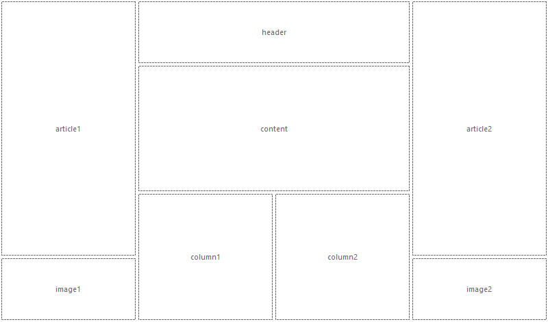
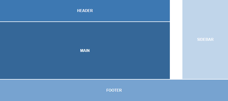
The idea behind the Flex Grid is to divide a web page into columns and rows. The columns and rows have named areas where you can drag & drop objects to. The layout can be different in breakpoints. Each grid area supports its own padding, (flexbox) alignment, border and background styling.
Grid Editor
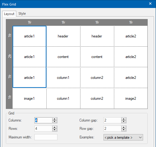
The Flex Grid object has a grid editor so you can visually define the layout (grid areas) and behavior of the grid.
Double click the Flex Grid to open the grid editor.
Double click the Flex Grid to open the grid editor.
Columns
Specifies the number of columns in the grid.
Rows
Specifies the number of rows in the grid.
Column gap
Specifies the size of the gap between the columns in a grid layout.
Row gap
Specifies the size of the gap between the rows in a grid layout.
Maximum width
Specifies the maximum width of the flex grid in the browser window. This can be useful to prevent items from being stretched to wide.
If the browser window is wider than the specified width then the grid will be centered.
Templates
This drop down menu has a few example layouts, which can be used as template for your own layouts. Selecting an item in the list will overwrite the current settings.
To clear the names of all items, select the 'Clear' template.
Select the 'Stacked' template to create a stacked layout based on the current layout. This is a convenient way to quickly create a mobile layout with the same items.
Specifies the number of columns in the grid.
Rows
Specifies the number of rows in the grid.
Column gap
Specifies the size of the gap between the columns in a grid layout.
Row gap
Specifies the size of the gap between the rows in a grid layout.
Maximum width
Specifies the maximum width of the flex grid in the browser window. This can be useful to prevent items from being stretched to wide.
If the browser window is wider than the specified width then the grid will be centered.
Templates
This drop down menu has a few example layouts, which can be used as template for your own layouts. Selecting an item in the list will overwrite the current settings.
To clear the names of all items, select the 'Clear' template.
Select the 'Stacked' template to create a stacked layout based on the current layout. This is a convenient way to quickly create a mobile layout with the same items.
Item Properties
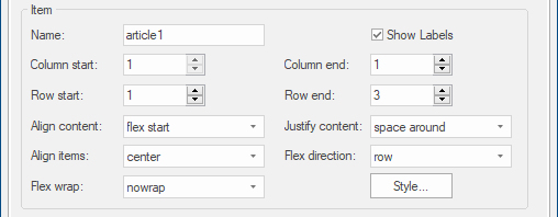
Clicking a cell inside the grid will display the properties of the selected area (header, footer, sidebar etc).
Name
Specifies the name of the selected area. This name must be unique for each area.
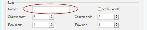
For example: header, footer, sidebar, content, navigation. Only contiguous grid cells can have the same name. So there cannot be two sidebars (left / right) with the same name. A grid item can also be empty. To create an empty grid item use a dot as name.
Specifies the name of the selected area. This name must be unique for each area.
For example: header, footer, sidebar, content, navigation. Only contiguous grid cells can have the same name. So there cannot be two sidebars (left / right) with the same name. A grid item can also be empty. To create an empty grid item use a dot as name.
Very Important
- Names must be unique. You cannot use the same name for different areas (including in other flex grids)
- Do not use spaces, '&', '+', '-', '!', '?', dots, quotes, brackets or other special characters in the name, keep them simple (alphanumeric).
- The only time you may use a dot is to indicate that the grid area is empty.
Column start
Specifies on which column-line the item will start.
Column end
Specifies on which column-line the item will end. This value must be greater than the start value.
Row start
Specifies on which row-line the item will start.
Row end
Specifies on which row-line the item will end. This value must be greater than the start value.
Align Content, Align Items, Justify Content, Flex Wrap, Flex Direction
Each item in a Flex Grid is a flex container, so it supports the same alignment properties as the Flex Container object!
For a description of these properties please see this related tutorial: https://www.wysiwygwebbuilder.com/flexbox.html
Show Labels
Specifies whether to display the names of the grid items in the workspace. This does not affect the published page.
Specifies on which column-line the item will start.
Column end
Specifies on which column-line the item will end. This value must be greater than the start value.
Row start
Specifies on which row-line the item will start.
Row end
Specifies on which row-line the item will end. This value must be greater than the start value.
Align Content, Align Items, Justify Content, Flex Wrap, Flex Direction
Each item in a Flex Grid is a flex container, so it supports the same alignment properties as the Flex Container object!
For a description of these properties please see this related tutorial: https://www.wysiwygwebbuilder.com/flexbox.html
Show Labels
Specifies whether to display the names of the grid items in the workspace. This does not affect the published page.
Column Properties
Clicking in the horizontal header of the grid will display the properties of the selected column.
The width of the column is either a single value or a range (min/max). Enable useminmax() to activate the range.
The width of the column is either a single value or a range (min/max). Enable useminmax() to activate the range.
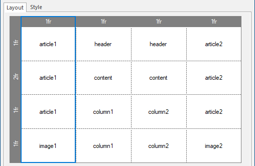

Sizes can be set in pixels, percentages or the ‘fr’ unit. The Min value can have a different size unit as the Max size. For example, the minimum value can be in pixels and the maximum value a flex factor (fr).
‘fr’ stands for ‘fraction of available space’. You can think of this as percentages for available space after you've taken off fixed-sized and content-based columns/rows. This allows you to create layout that previously were not possible with standard HTML/CSS!
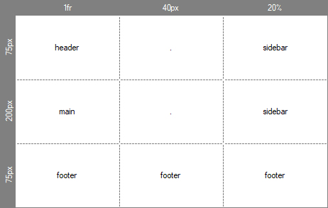
For example, when using 1fr, 40px, 20%, the right column is 20%, the center column is 40px and the remain space (left column) is used by 1fr. The row height is usually defined in ‘pixels’ or ‘auto’, where the height is defined by the content.
‘fr’ stands for ‘fraction of available space’. You can think of this as percentages for available space after you've taken off fixed-sized and content-based columns/rows. This allows you to create layout that previously were not possible with standard HTML/CSS!
For example, when using 1fr, 40px, 20%, the right column is 20%, the center column is 40px and the remain space (left column) is used by 1fr. The row height is usually defined in ‘pixels’ or ‘auto’, where the height is defined by the content.
Row Properties
Clicking in the vertical header of the grid will display the properties of the selected row.
The height of the row is either a single value or a range (min/max). Enable useminmax() to activate the range.
The height of the row is either a single value or a range (min/max). Enable useminmax() to activate the range.
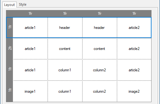

Sizes can be set in pixels, percentages, the ‘fr’ unit or auto.
The row height is usually defined in ‘pixels’ for a fixed height or ‘auto’, where the height depends on the content.
The row height is usually defined in ‘pixels’ for a fixed height or ‘auto’, where the height depends on the content.
Visual Edit Mode
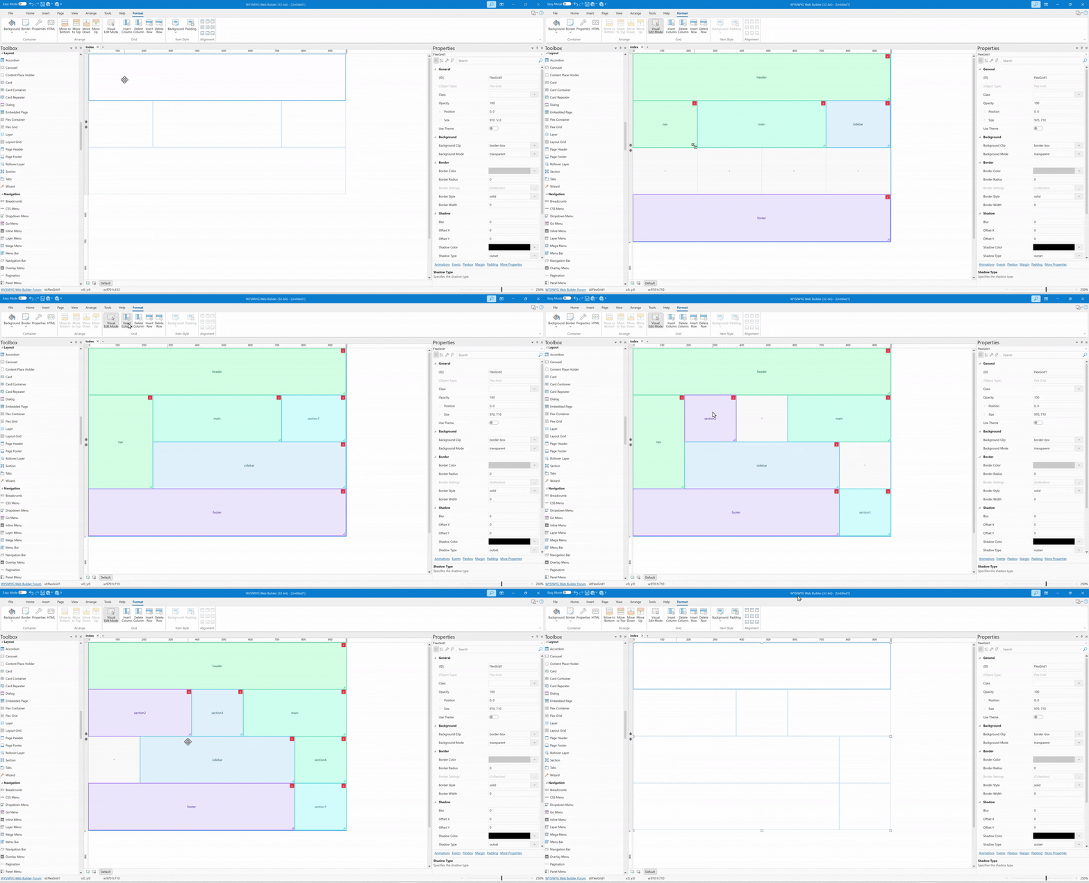
Flex Grid layouts can also be edited directly on the workspace. Select a Flex Grid and choose Visual Edit Mode from the Ribbon or menu to switch to the new interactive Grid Edit Mode. The workspace displays the grid structure with dashed track lines, track-size labels, empty-cell markers, and color-coded sections so the layout is easy to understand at a glance.
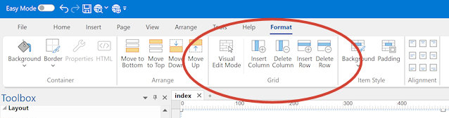
In Visual Edit Mode, you can create new sections by clicking and dragging across empty cells. Existing sections can be moved by dragging them to another position, resized from the bottom-right corner, or removed using the delete button shown on the section. Changes are saved back to the grid template automatically when you leave edit mode.
To help prevent layout mistakes, the editor shows a live preview while dragging or resizing sections. If the target area overlaps another section or falls outside the grid, the preview is highlighted in red and the change is not applied when you release the mouse. The Ribbon also has options to add and remove columns.
To help prevent layout mistakes, the editor shows a live preview while dragging or resizing sections. If the target area overlaps another section or falls outside the grid, the preview is highlighted in red and the change is not applied when you release the mouse. The Ribbon also has options to add and remove columns.