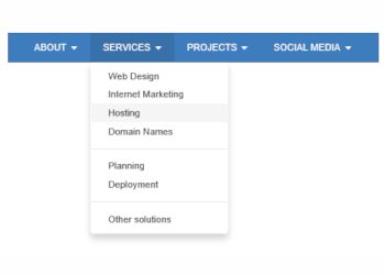
Bootstrap Menu
The Bootstrap Menu uses Bootstrap’s ‘collapse.js’ and ‘dropdown.js’ scripts to implement a multi-level, responsive menu optimized for desktop computers and mobile (touch) devices. On desktop computer the menu will display a standard drop down menu and on mobile devices it will display a multi-level stacked menu with the familiar ‘hamburger’ icon. The breakpoint is user definable.
Unlike most other drop down menus, this menu requires a click to open the sub menus instead of mouse over. This makes the menu work the same way on desktops and touch devices.
Unlike most other drop down menus, this menu requires a click to open the sub menus instead of mouse over. This makes the menu work the same way on desktops and touch devices.

Download
Bootstrap Menu Extension
Bootstrap Menu Extension