What is new in WYSIWYG Web Builder 10?
After months of hard work, we plan to release the next version of WYSIWYG Web Builder in October 2014. This document gives a brief overview of what you can expect in this major new release. WYSIWYG Web Builder 10 has more than 100 new features/improvements! Thousands of new options and possibilities! Here’s a list of some of these new features.
Note: the screenshots are based on the BETA version. The final release may look slightly different.
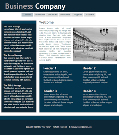
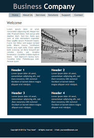
Responsive Web Design
With the increase in popularity of browsing on mobile phones and tablets it is becoming essential to create web sites that are optimized to the needs of these users. Previously you had to create different versions of the website and use scripts to redirect the visitor to the mobile version of the page.
WYSIWYG Web Builder 10 introduces 'Responsive Web Design' which allows you to create a single HTML page containing different variants of the layout, each optimized for specific device widths. Your website will dynamically respond to the screen size of the visitor and display the layout most appropriate to their device. These different variants are called 'breakpoints' and this concept is based on CSS3's media queries.
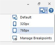
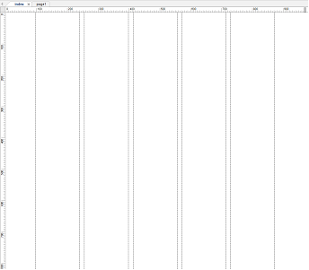
A breakpoint is separate 'view' of the page in WYSIWYG Web Builder. A page can have multiple breakpoints, each one optimized for a specific screen width. For example, you can have the standard desktop layout, one for tablets (1024 px) and another one for mobile phones (320 px).

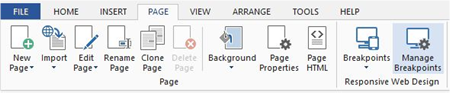
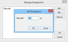
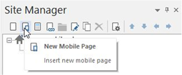
To add or edit breakpoints
click the 'Manage Breakpoints' option in the Page menu.
To switch between breakpoints click the 'Breakpoints' drop down menu and select the breakpoint width. To go back to the default layout, select 'Default'. There is also quick menu for switching breakpoints available in the upper right corner of the Ribbon.
Mobile Web Design
WYSIWYG Web Builder now has a built-in designer for mobile web pages. This makes it easy to create a mobile version of your website without the need for external software.
Mobile pages are based on jQuery Mobile (http://jquerymobile.com/), which is a framework for creating mobile web applications. jQuery Mobile works on all popular smart phones and tablets.
To make a web page 'responsive' it needs to be constructed in a different way. Unlike in standard WYSIWYG Web Builder layouts where you can drag & drop objects anywhere and where objects have a fixed size and position, mobile objects need to adjust to the width of the screen. In most cases this means that the object will use the full width of the page. But it's also possible to set 'full width' to false in which case the objects will be 'inline', so they have a fixed width. By default all objects are placed next to each other (they are floating in the document), but there is also a layout grid available to arrange objects in rows and columns.
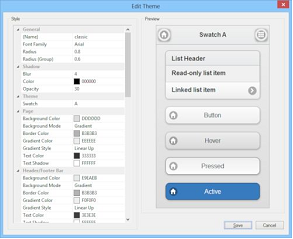
Another difference is the styling of objects. Unlike in a standard page, all jQuery mobile objects are styled by themes and swatches. A swatch is one of several color schemes provided by your theme. A theme can support up to 26 swatches, each identified with a single-letter (A, B, C, D etc). The built-in jQuery Mobile Theme Manager allows you to create and edit swatches for a custom theme.
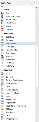
Many new jQuery Mobile specific objects have been added to help you create amazing mobile websites:
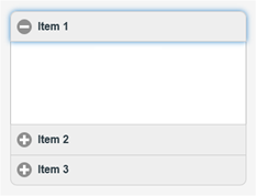
Collapsible
Collapsible creates a collapsible block of content. The Collapsible object can have multiple panels which are containers for other objects. These panels can be expanded or collapsed by clicking on the header icon.
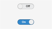
Flip Switch
The flip switch is an alternative look to the checkbox. It can be toggled by a click or a swipe.
Footer
A footer is a toolbar at the bottom of the page and it typically contains a combination of text and (navigation) buttons.
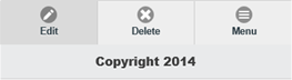
Header
The header is a toolbar at the top of the page that usually contains the page title text and optional buttons positioned to the left and/or right of the title for navigation or actions.
Headers can optionally be positioned as fixed so they remain at the top of the screen at all times instead of scrolling with the page.
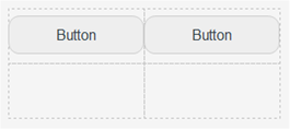
Layout Grid
You can use a layout grid to place objects next to each other in your web page. The layout grid creates column cells with equal width. For example if the layout grid has two columns then they both will be 50% of the page width.
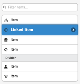
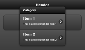
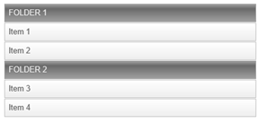
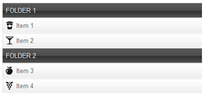
Listview
A listview is a themed list of items which can have images, links and even a search filter.
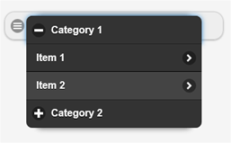
Nested Menu
Initially the nested menu displays a single button on the page. When the user clicks the button a popup menu will appear. This is a combination of the Collapsible and Listview objects.
The menu items can be categorized and each category can be collapsed/expanded.
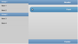
Panel
A Panel is initially invisible, but can slide from the right or left side of the page by clicking the menu button. The content of the panel can either be a listview/menu or another page!
Popup Menu
Initially the popup menu displays a single button on the page. When the user clicks the button a popup menu will appear. The menu can also include dividers to create groups.
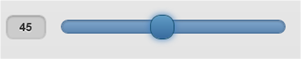
Slider
Slider is an alternative look to the editbox for numeric values.
Specify min and max attribute values to set the slider's range. If you want to constrain input to specific increments, then set the step attribute.
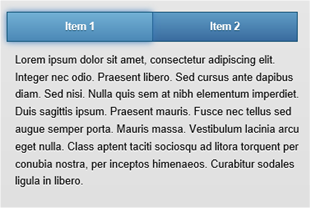
Tabs
Tabs is a single content area with multiple panels, each associated with a header in a list.
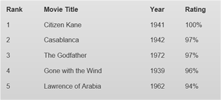
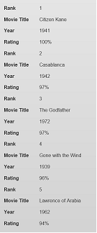
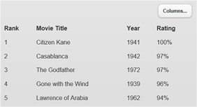
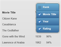
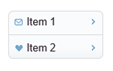
Responsive Table
One of the biggest challenges in responsive web design (RWD) is presenting tabular data. Large tables with lots of columns don't fit on smaller screens and there isn't a simple way to re-format the table content with CSS and media queries for an acceptable presentation. To address this, the jQuery Mobile framework offers two different options for presenting tables responsively: Reflow and Column toggle. Each has benefits and tradeoffs, the right choice will depend on the data being presented.
Reflow example:
Column toggle example:
The following objects have been redesigned to work with jQuery Mobile. Their appearance is also affected by the jQuery Mobile theme.
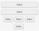
Button

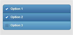
Checkbox (supports multiple items)
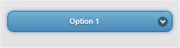
Combobox
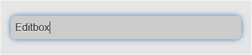
Editbox
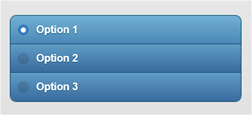
Radio Button (supports multiple items)
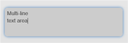
Text Area
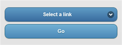
Go Menu
Navigation Bar
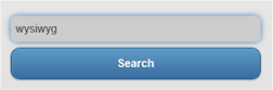
Site Search
Text Menu
Login
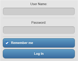
Logout

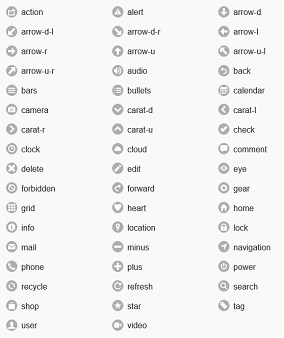
Icons
jQuery Mobile provides a number of icons that can be used by objects that support them like Buttons, Listviews, Collapsible etc.
CSS3 Animations
- New Feature: Added the ability to use multiple animations per object. Animations can run at the same time or 'scheduled' one after another.
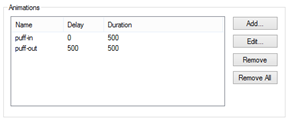
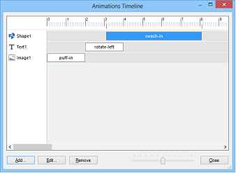
- New Feature: Added 'Animation timeline'. This can be used to display all animations on the page, so you can easily add, edit, remove animations and control the timing.
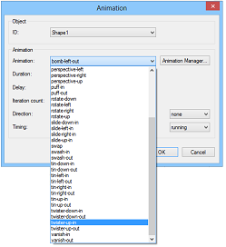
- New Feature: Added
40 new predefined animations to the Animation Manager.
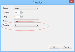
- New Feature: Added 'All' property to transitions. This can be useful to control the transition timing for all properties. For example if you implement media queries/breakpoints to animate between views.
Header / Footer
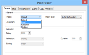
- New Feature: Page Header object. This is an easy way to add a full width header to your website. Supports 'fixed' and 'full screen with animations' mode.
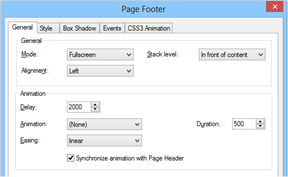
- New Feature: Page Footer object. This is an easy way to add a full width footer to your website. Supports 'fixed' and 'full screen with animations' mode.
Wrapping Text
- New feature: Added 'Wrapping text' object. This object makes it possible to wrap text around objects!

Navigation
- New feature: Added gradient support to the SlideMenu.
- New feature: Added the possibility to use images in the Slidemenu.
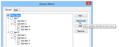
- New feature: Added 'Add Divider' option to jQuery Menu (only works for vertical mode).
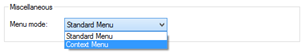
- New feature: Added 'Context Menu' option to jQuery Menu, makes it possible to create a popup menu on right click!
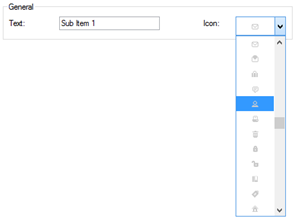
- New feature: Added support for jQuery UI icons in menu item of the jQuery Menu.
- New Feature: Added 'Use hover state style to indicate the current page' to Text Menu.
- New Feature: Added 'Use hover state style to indicate the current page' to Slide Menu.
- New Feature: Added 'Use active state style to indicate the current page' to Mega Menu.
- New feature: Added 'stretch' mode to CSS Menu. This will make the width of the buttons variable based on the width of the menu.
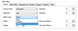
- New feature: We have also added an (experimental) 'Responsive' layout mode. If you select this option then the menu will automatically switch from horizontal to vertical mode if the screen width is smaller than 320 pixels. This can be useful when the CSS menu is used in Responsive Web Design.
- New feature: Added 'Panel Menu'. A Panel Menu is initially invisible, but can slide from the right or left side of the page by clicking the menu button. Many modern web sites use this type menu.

User Interface Features
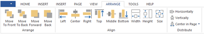
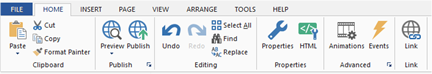
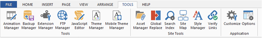
- Improved: Arrange commands now all have their own icons on the Ribbon for quicker access to these frequently used options.
- Improved: Animations in Rollover Image and Rollover Text are now sorted.
- Improved: Alternative image of the Flash object is now rendered in the workspace.
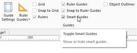
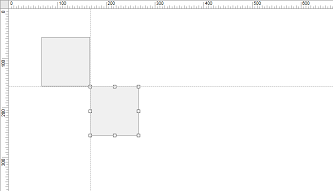
- New feature: Added 'Smart Guides'. Smart guides are guidelines that appear when you move objects into alignment with each other.
- New Feature: 'Animations' and 'Events' buttons to Ribbon 'Home' tab for quick access.

- New Feature: Added 'Zoom' functionality to the statusbar. The statusbar now also has a direct link to the support forum.
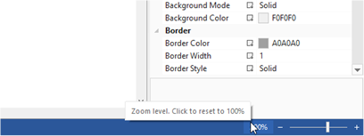
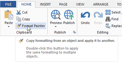
- New feature: Added 'Format painter' option. Use the Format Painter to quickly copy formatting (color, font, border) from one object to another.
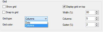
- New feature: Added new type of grid: Columns. You can set the width (in percentages), number of columns and gutter (spacing).
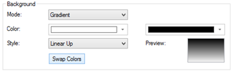
- New feature: Added 'Swap colors' button in background properties to quickly swap gradient colors.
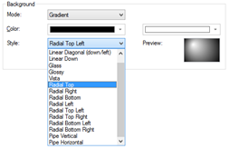
- New feature: Added 10 new gradient styles: Radial Top, Radial Right, Radial Bottom, Radial Left, Radial Top Left, Radial Top Right, Radial Bottom Left, Radial Bottom Right, Pipe Vertical,Pipe Horizontal
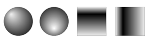
- New feature: Added 14 new predefined gradient colors.
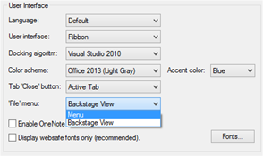
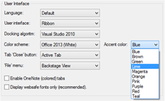
- New feature: Added 'Backstage view'. Backstage view may be familiar to MS Office 2013 users, it provides a full screen menu with options for open, save, preview, publish, help and other options. You can switch back to the traditional menu in Tools->Options->User Interface->File menu->Menu
- New feature: Added 'Recent places' available in backstage view. You can 'pin' projects and places so they appear on the top of the recently used project list.
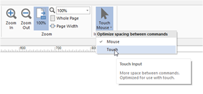
- New feature: Touch/Mouse input modes. When you enable touch mode, there are a little more space around the ribbon icons and user will be able to easily access ribbon buttons on the touch screen.
- New feature: New 'flat' icons in the toolbars, Toolbox and Ribbon.
- New feature: Added Office 2013 (white, light gray and darkgray) and Visual Studio 2013 (light gray, darkgray, blue) color schemes, with customizable accent color.
- Improved: Find & Replace is now much faster. Also only pages that
actually contain the search text will be opened during the search.
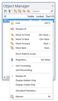
- New feature: Added 'Display hidden objects only' and 'Display visible objects only' to Object Manager.
- New feature: Added
'Margin’ option to Arrange menu. The margin clears an area around an element
(outside the border). Unlike padding, the margin does not have a background color,
and is completely transparent. This can useful for mobile pages, objects in
wrapping text and floating layout to add some spacing around objects.
Page features
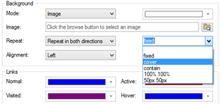
- New feature: Added support for background-size (CSS3) in Page Properties. This makes it possible to size/stretch background images of the page. Supports contain, cover, pixels and percentages!
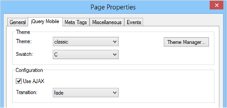
- New feature: Theme (mobile pages only). Specifies the jQuery Mobile theme for the current page and all objects on that page. Themes can be edited with the Mobile Theme Manager.
- New feature: Swatch (mobile pages only). Each theme can have up to 26 variations (swatches).
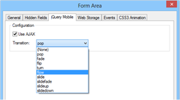
- New feature: Use AJAX (mobile pages only). jQuery Mobile will automatically handle link clicks and form submissions through Ajax, when possible. If false, URL hash listening will be disabled as well, and URLs will load as ordinary HTTP requests.
- New feature: Transition (mobile pages only). Specifies the page transition. Page transitions only work when AJAX is enabled.
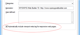
- New feature: Added ‘Automatically include viewport meta tag for responsive web pages’ option the Meta Tags. This will add <meta name="viewport" content="width=device-width; initial-scale=1.0"> to the HTML if it contains breakpoints.
Forms
- New Feature: Added the ability to include form results in success page by using variables. See the help for more details.
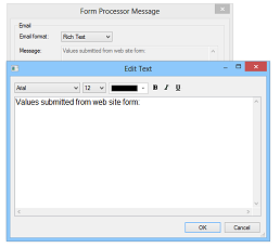
- New Feature: Added support for Rich text and HTML message formats to Form Processor.
- New feature: Use AJAX (mobile pages only). jQuery Mobile will automatically handle form submissions through Ajax, when possible. If false, the form will be submitted with ordinary HTTP requests.
- New feature: Transition (mobile pages only). Specifies the page transition. Page transitions only work if AJAX is enabled.
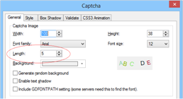
- New feature: Added 'Length' option to Captcha to set the number of characters in the image.
- New Feature: All PHP scripts now use the MySQLi extension functions. You can still use (deprecated) MySQL functions by selecting 'PHP4' in the page properties.
Photo Gallery
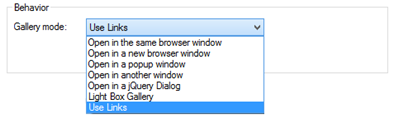
- New Feature: Added 'Use Links' gallery mode to Photo Gallery. Allows you to assign links to images, instead of opening the image.
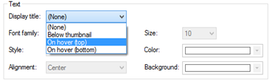
- New Feature: Added 'Display title on hover' option to Photo Gallery. Display the title on top or at the bottom of the image on mouse over.

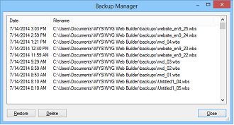
Backup Manager
- New Feature: Added 'Backup Manager'. With the Backup Manager you can restore and delete automatically created backups.
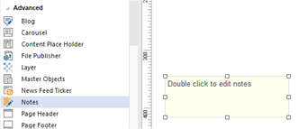
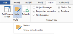
Notes
- New Feature: Added 'Notes' object. An easy way to 'drop' notes/comments on the page. The object will not be included on the published page. You can quickly show/hide all notes with the 'Notes' option in the view menu.
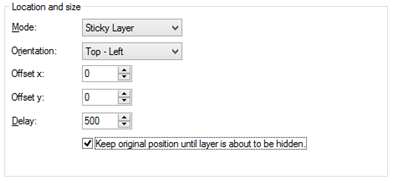
Layer
- New feature: Added 'Keep original position until layer is about to be hidden' to sticky layer.
When this option is enabled the layer will only move to the specified position if it is about to be scrolled outside of the view.
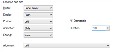
- New feature: Added
'Panel Layer' option to Layer.
A Panel Layer is initially invisible, but can slide from the right or left side
of the page by using events (show/hide).
Ready-to-use-JavaScripts
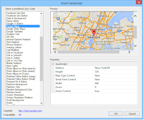
- New feature: Added predefined script for Google Maps.
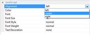
- New feature: Added
alignment (left/center/right) to all text based scripts in Ready-to-use-JavaScripts.
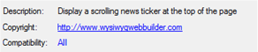
- New feature: Added descriptions to Ready-to-use-JavaScripts.
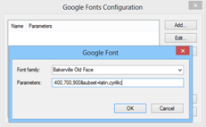
Web fonts
- New feature: Added support for Google Web Fonts parameters. In Options->HTML->@font-face you can manage the parameters for specific fonts.
Image
- New feature: Added 'Extract Color' effect for images. Convert image to grayscale while keeping only specific colors.

- New feature: Added
'Pastel' effect for images. Pastel color filter for images.

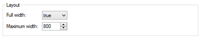
- New feature: Added 'Full width' option (mobile pages only)
- New feature: Added 'Max width' option (mobile pages only). Specifies the maximum width if full width is enabled.
YouTube
- New feature: Added 'Show Controls' option. Uncheck this to hide the player controls.
- New feature: Added 'Fill entire browser window' option to use the YouTube video as page background.
Banner
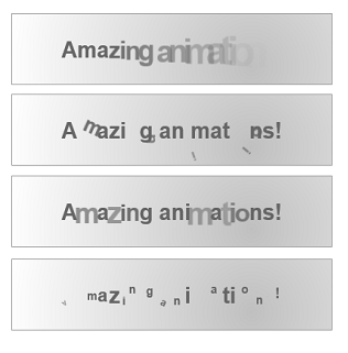
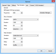
- New feature: Added 'Text animation' to Banner object. This makes it possible to animate the individual characters of the Banner object to create cool banners. This feature using built-in CSS3 animations, so you can define your own animations with the Animation Manager!
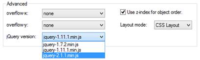
jQuery
- New feature: Included (optional) support for jQuery 2.0. This version of jQuery is faster and smaller, but does not support Internet Explorer 6, 7, or 8. jQuery 1.11 and 1.7.1 are also still supported.
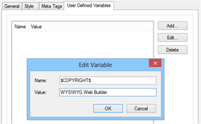
User defined variables
- New feature: Added 'User defined variables' in Site Properties. Variables will be replaced during publishing by the specified value. Great to quickly update the copyright or other value that regularly change.
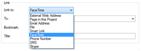
Links
- New feature: Added FaceTime link option. Launch the FaceTime app and initiate a call to the specified user.
- New feature: Added Phone Number link option. Call the specified number.
- New feature: Added SMS link option. Send an SMS.
- New feature: Added Skype link option. Launch the Skype app and initiate a call to the specified user.
Events
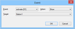
- New feature: Added support for the 'activate' event to Carousel, jQuery Tab and jQuery Accordion. This event will be triggered when another page becomes active. This can be useful to show/hide objects, start animations and timers or synchronize with objects.
- New feature: Added support for jQuery mobile events (in mobile pages only)
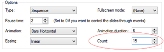
Slideshow
- New feature: Added
'Curtain' animation to Slideshow.

- New feature: Added 'Fountain' animation to Slideshow.
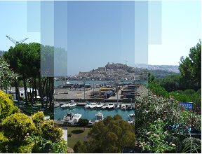
- New feature: Added 'Random Bars' animation to Slideshow.
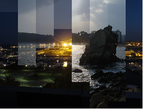
- New feature: Added 'Wave' animation to Slideshow.

- New feature: Added 'Explode' animation to Slideshow.
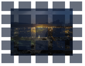
- New feature: Added 'Bounce' animation to Slideshow.

- New feature: Added 'Count' option to Horizontal Bars/Vertical Bars/Curtain/Foutain/Random Bars/Wave animations. Specifies the number of bars that will be used for the effect.
More features:
If you are upgrading from a version prior to version 9 then also check out what we’ve added in version 9 (and 8)!
http://www.wysiwygwebbuilder.com/new_wb80.html
and
http://www.wysiwygwebbuilder.com/new_wb85.html
and
http://www.wysiwygwebbuilder.com/new_wb9.html
Special offer:
If you buy version 9 today you will get version 10 for free when it
becomes available!
This offer is also valid for all licenses purchased within 60 days before the official release date.
http://www.wysiwygwebbuilder.com/purchase.html
Other registered users of WYSIWYG Web Builder will get a discount when
upgrading to the new version.