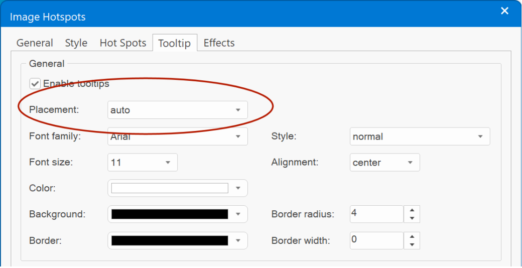
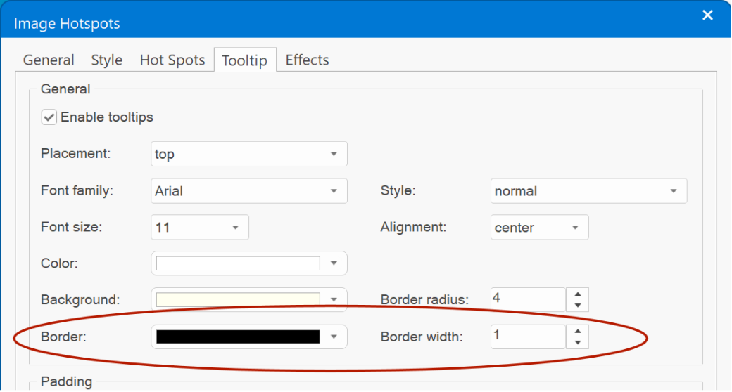
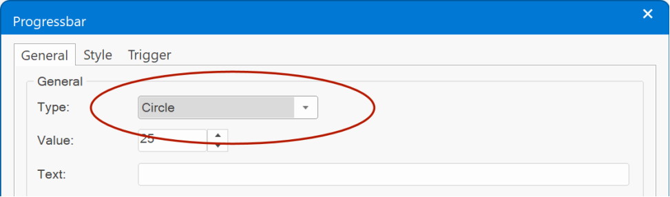
Tooltip
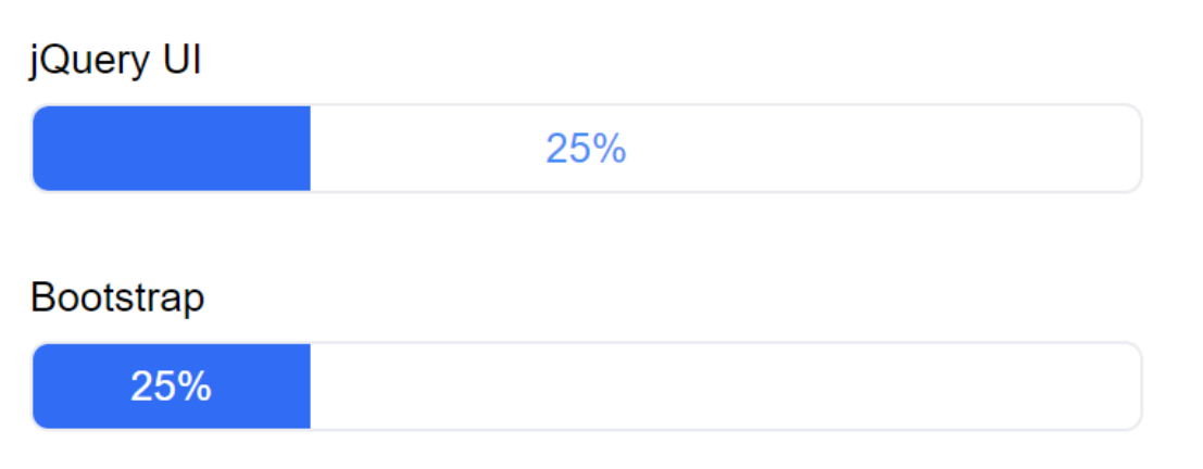
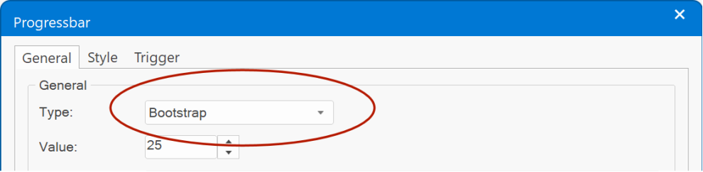
- Added support for Bootstrap tooltips as alternative for jQuery UI.
https://getbootstrap.com/docs/5.2/components/tooltips/
- Bootstrap tooltips can be triggered via hover, click, focus or manually. With more than 35 available 'show' animations!
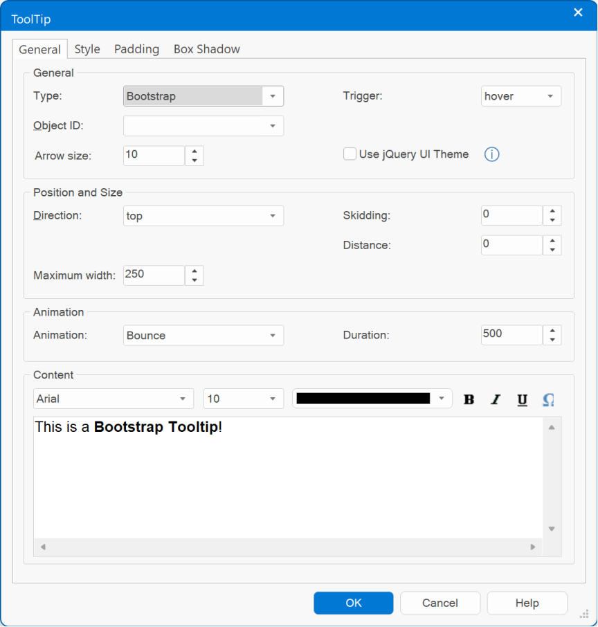
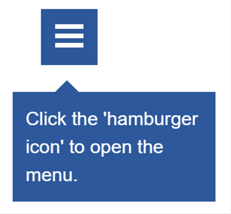
- Added the ability to show/hide/toggle tooltips via events.
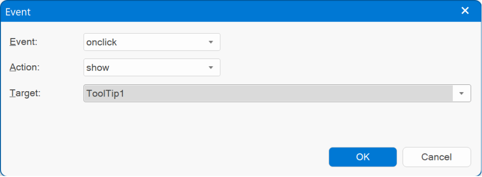
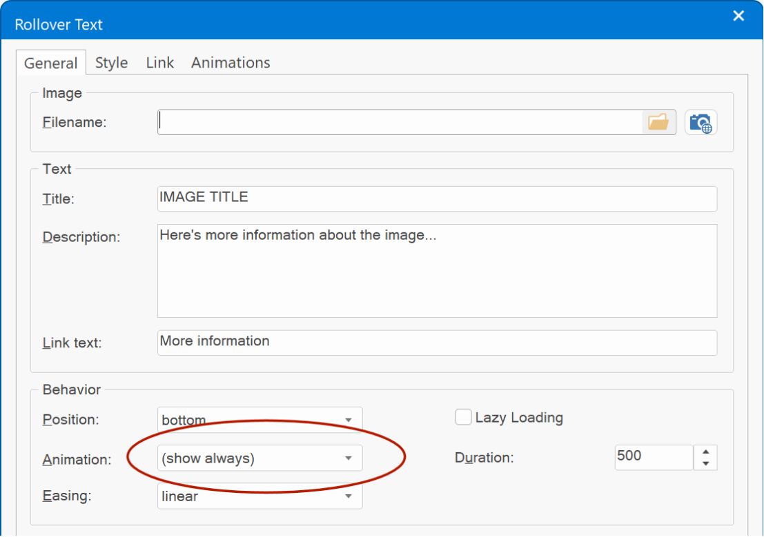
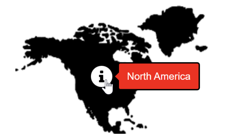
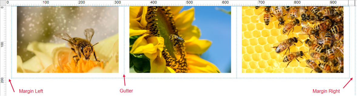
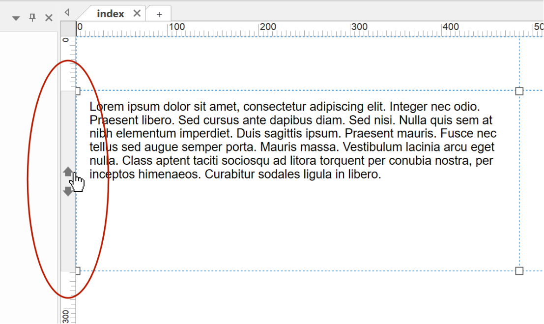
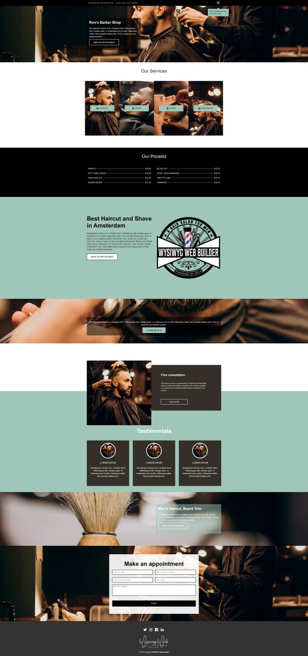
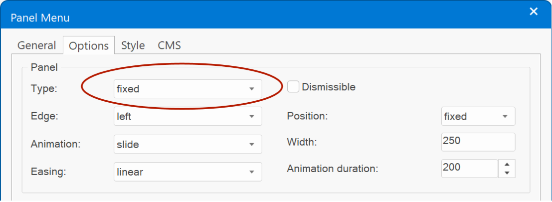
This option can be useful, for example, to show a hint on how to display the menu. You may have already seen this feature in action in some of the template previews...
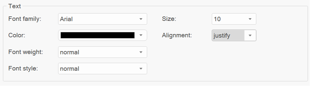
- Added 'justify' to alignment options.
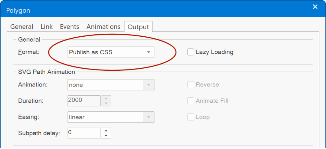
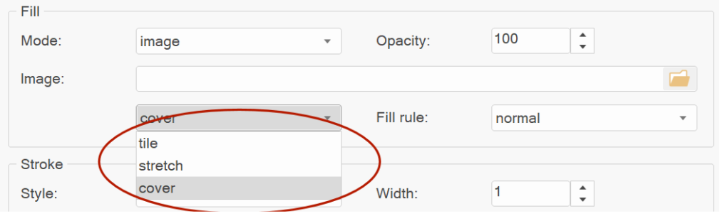
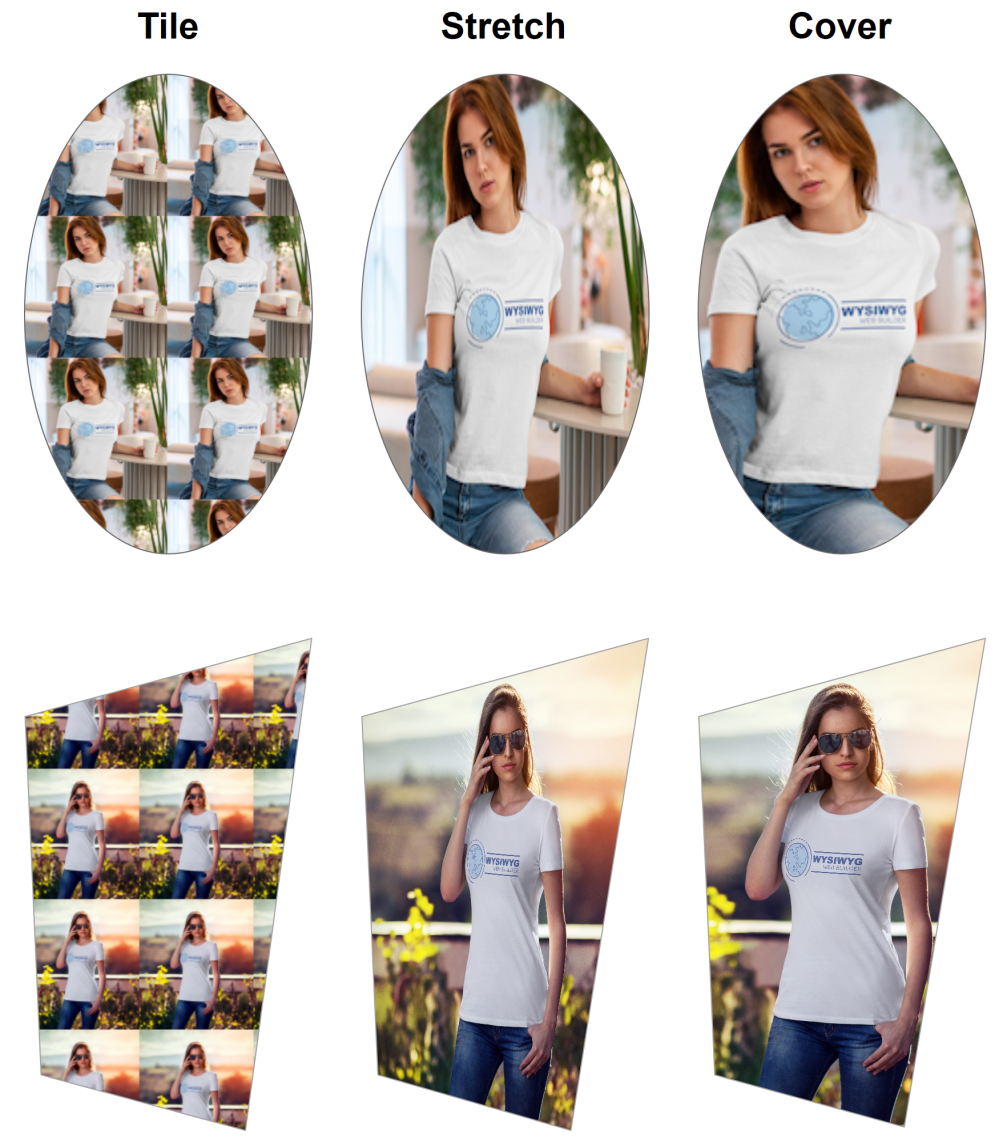
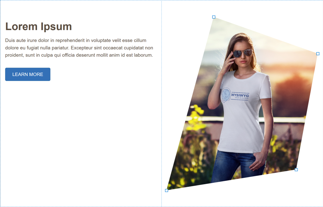
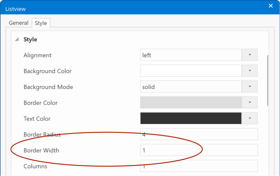
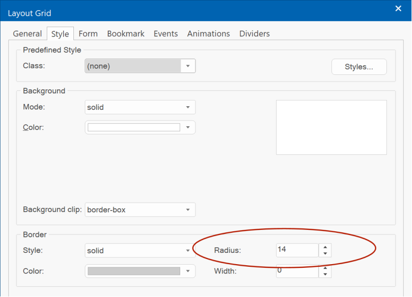
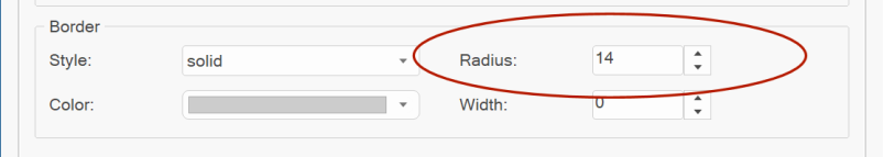
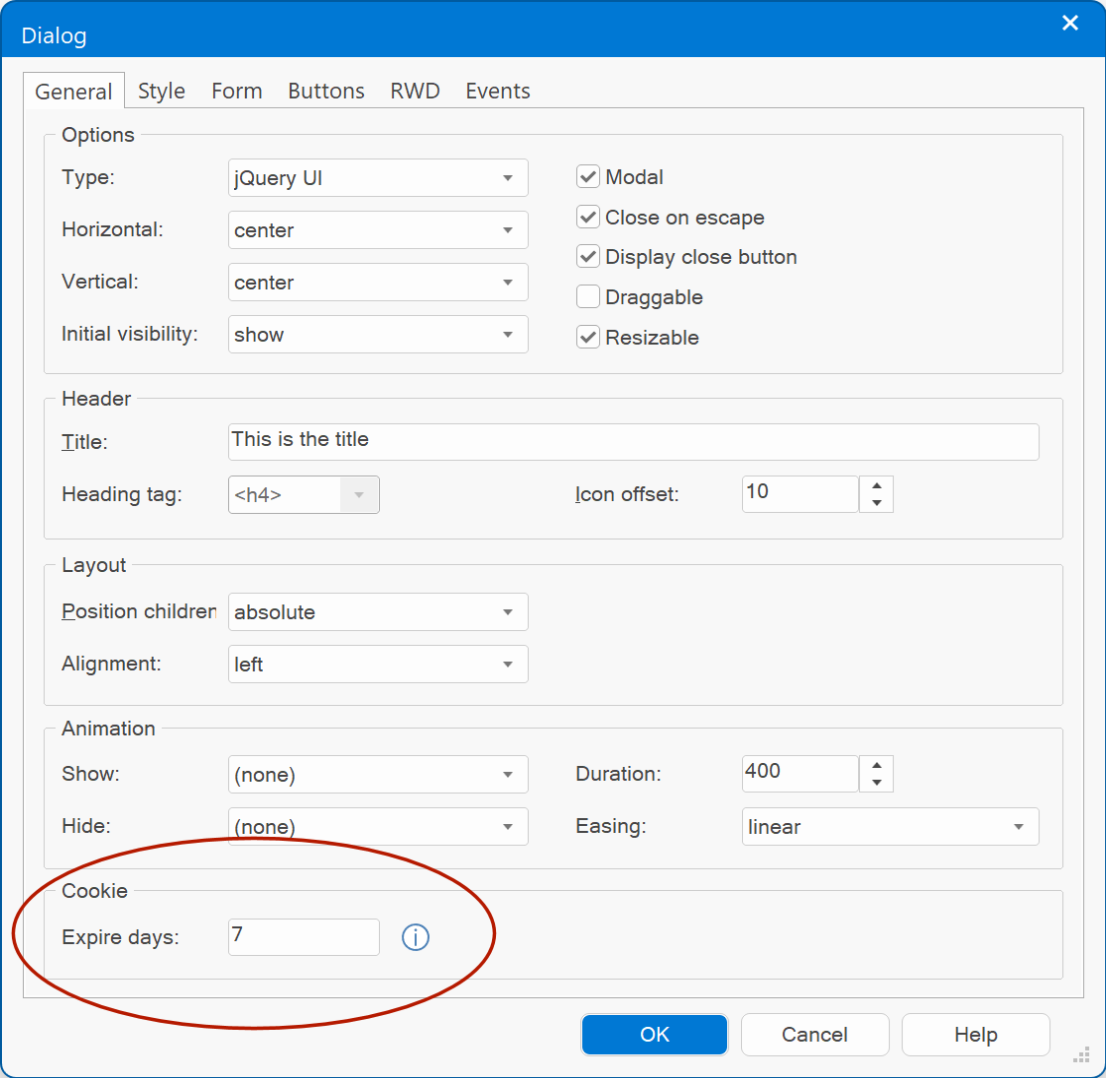
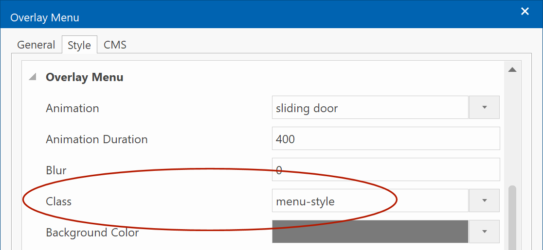
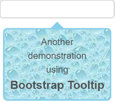
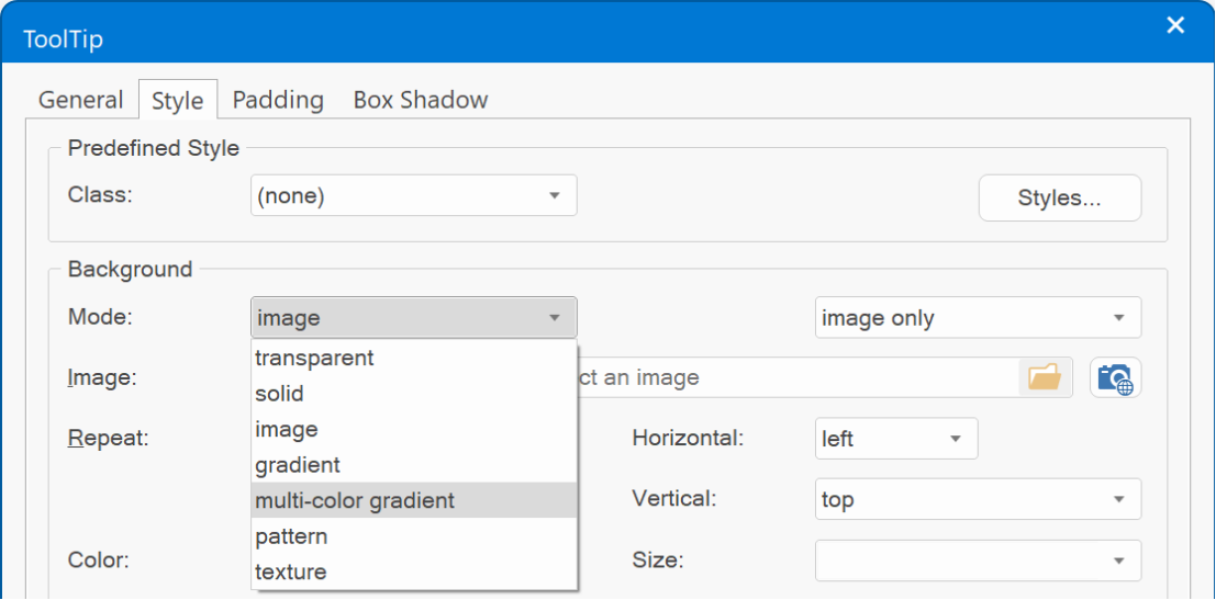
- Added the ability to set the background mode (transparent, solid, gradient, image, pattern, texture). Previously only solid was supported.
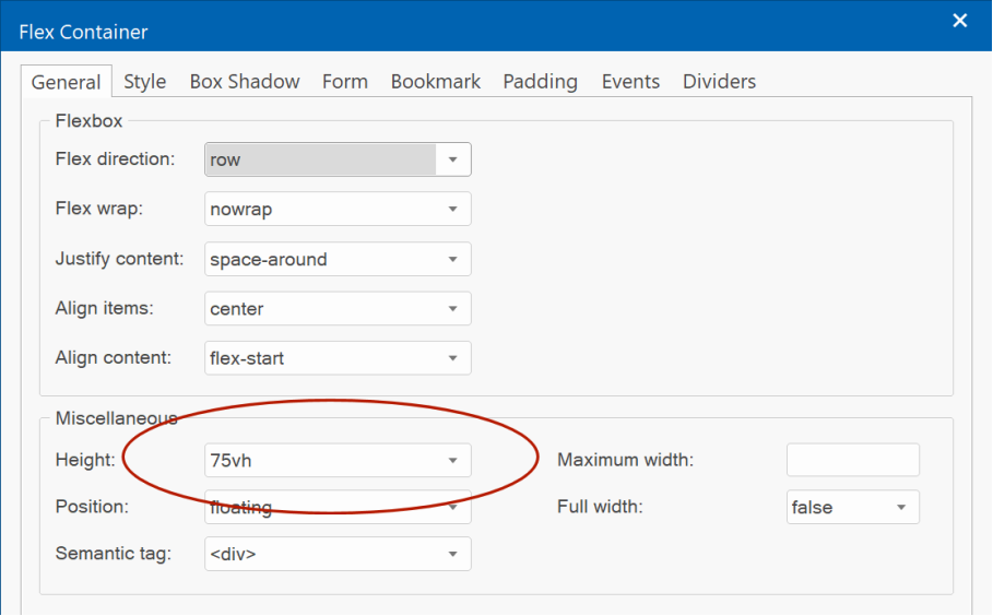
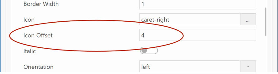
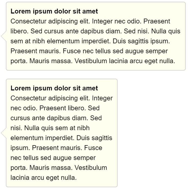
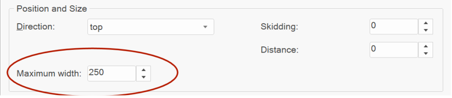
- Added 'Maximum width' property. This specifies the maximum width of the tooltip (before text wraps to the next row).
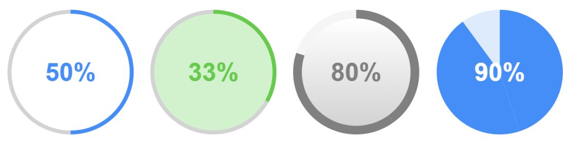
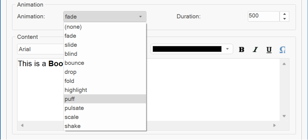
- Added 9 new animations to jQuery UI tooltip: blind, bounce, drop, fold, highlight, puff, pulsate, scale, shake. Also, the slide animation is now direction aware, which means that it moves in the direction of the tooltip's arrow.
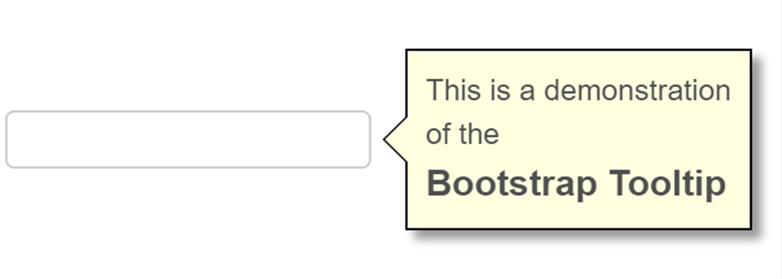
Demo:
https://wysiwygwebbuilder.com/support/wb18tryouts/wb18_tooltips.html