ClipArt / TextArt / Shape
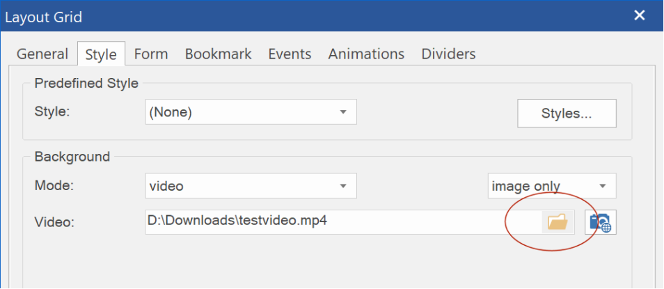
- New feature: Added the ability to use a video as the background for shapes, clipart and textart!
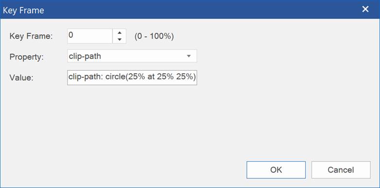
This uses CSS's clip-path (
https://caniuse.com/css-clip-path) to clip the video inside the path.
Supported video's include YouTube, Vimeo, Pixabay and HTML5 video (mp4, webm).
Demo:
https://www.wysiwygwebbuilder.com/support/wb17tryouts/wb17_shapevideo.html
 - New feature:
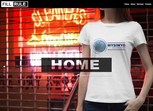
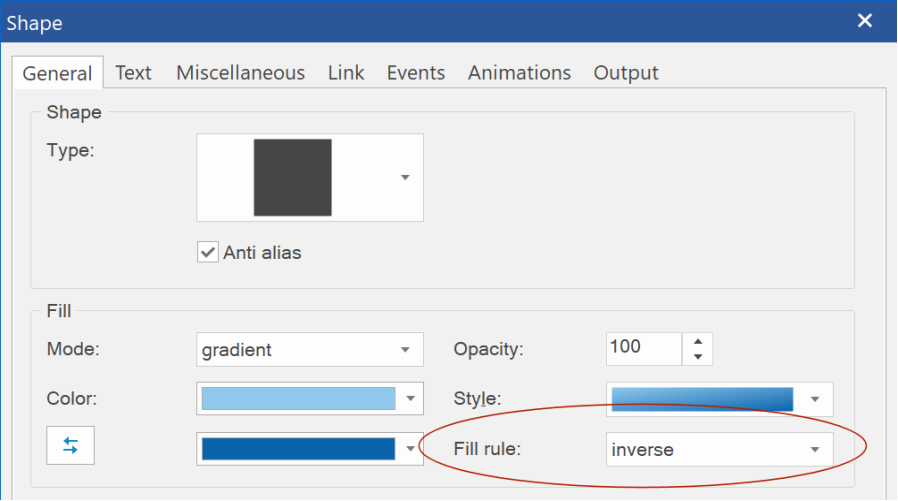
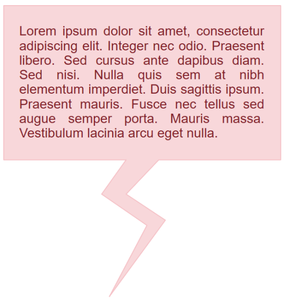
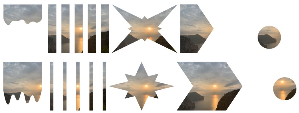
 Added 'fill rule' option (normal / inverse).
This makes it possible to create 'cutout' shapes, clipart and text where the shape or text is transparent, instead of the background.

 - New feature:
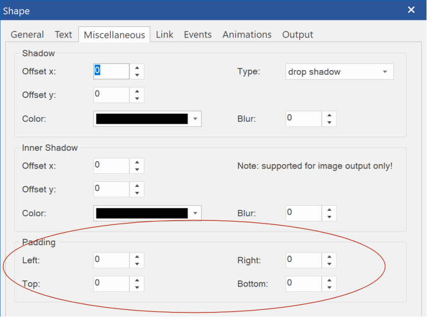
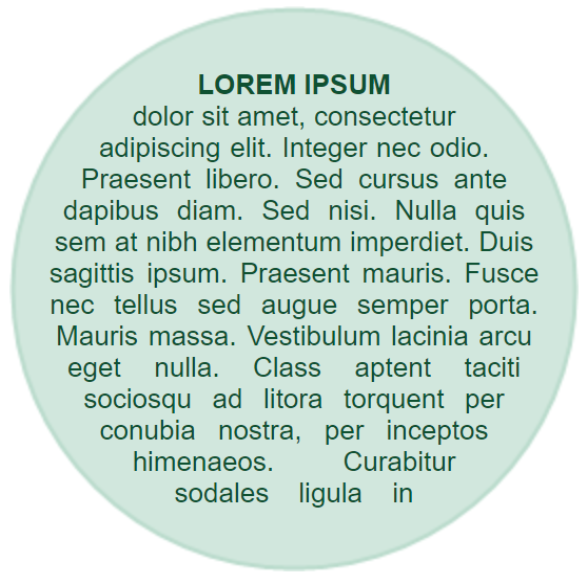
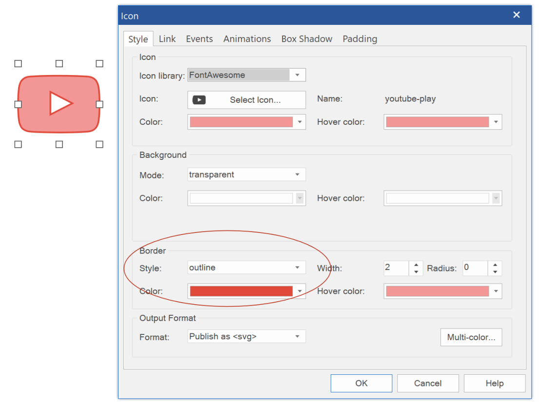
 Added the ability to add padding to the shape, clipart or text.
This is especially useful when fill rule is set to 'inverse', so you can set some spacing around the shape.
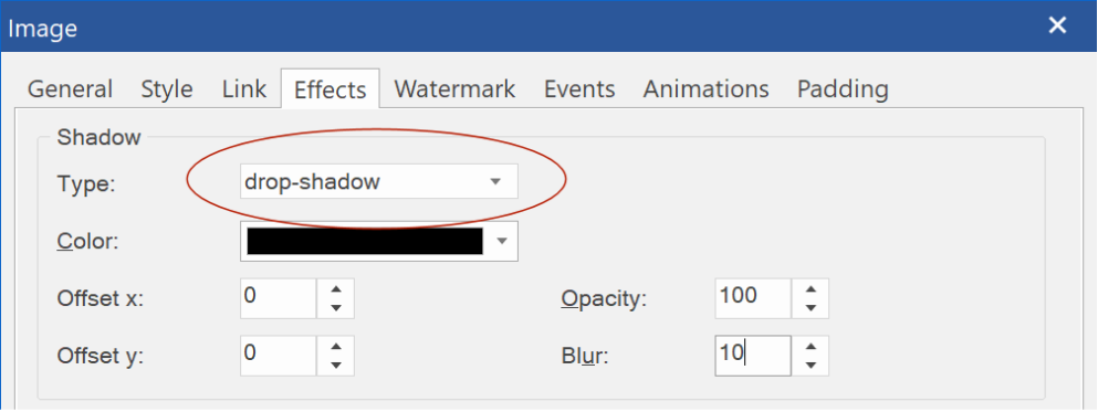
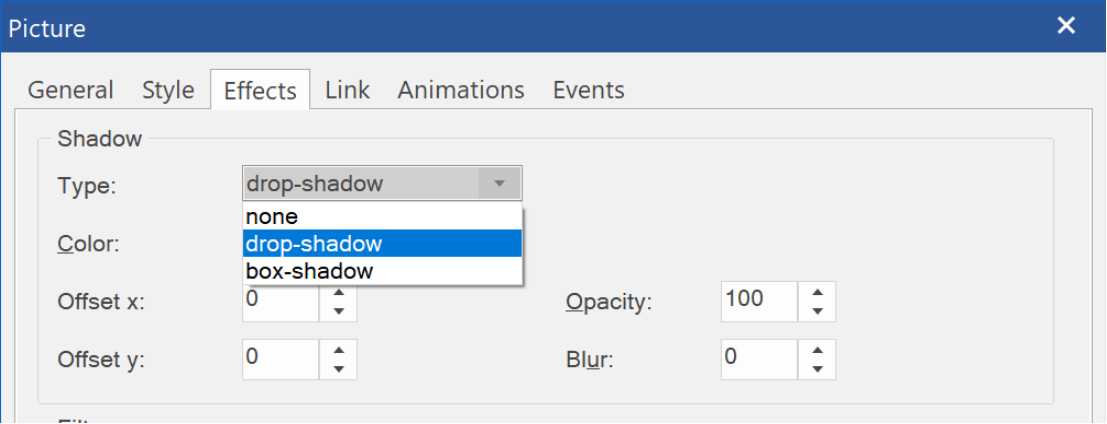
 - Improved:
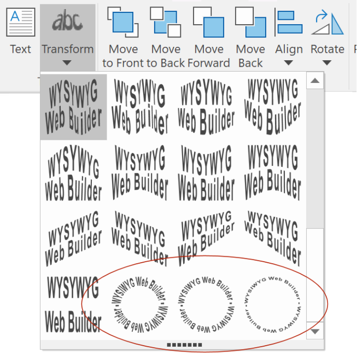
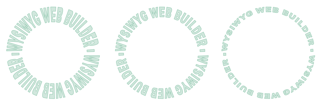
 ClipArt, TextArt, Shape objects are now responsive when the output format is set to SVG!
So, finally shapes can have different sizes in breakpoints even in fixed/absolute layouts.
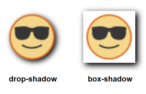
- Improved: Shadow now uses native CSS filters instead of simulated effect.
This improves the size, quality and performance of the shape.
Also, image/svg remains responsive and the effect is animatable (via transition and animations).


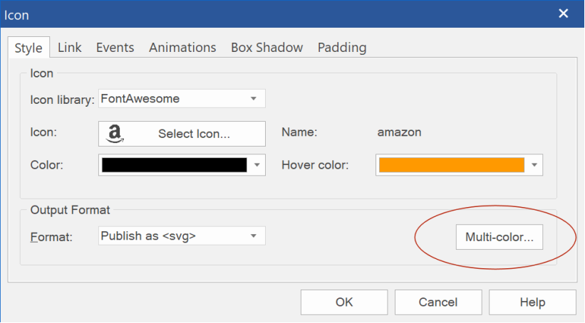
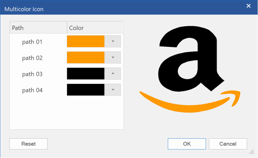
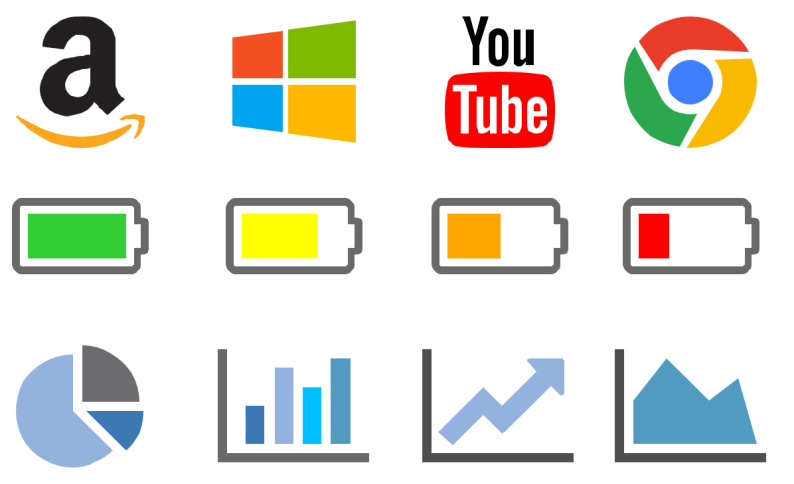

