The Ultimate Toolbox for creating
amazing web sites!
Advanced Layout Grid Features
WYSIWYG Web Builder 12 introduces a couple of powerful new features for the Layout Grid.
If you are not familiar with the basic Layout Grid functionality then please read these related tutorials first:
http://www.wysiwygwebbuilder.com/layoutgrid_part1.html
http://www.wysiwygwebbuilder.com/layoutgrid_part2.html
Use different column widths in breakpoints
To set a different column width, simply switch to the breakpoint, open the Layout Grid properties and change the column width.
Use different column counts in breakpoints / hide columns
To use a different number of columns, switch to the breakpoint, open the Layout Grid properties and add or remove columns.
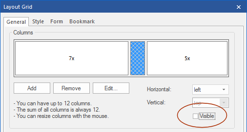
It is also possible to hide columns in breakpoints. To hide a column, first select it and then uncheck the 'visible' option.
Note that hidden column is still visible in the grid editor (so you can unhide it) but it wil not take up any space on the page.
WYSIWYG Web Builder 12 introduces a couple of powerful new features for the Layout Grid.
If you are not familiar with the basic Layout Grid functionality then please read these related tutorials first:
http://www.wysiwygwebbuilder.com/layoutgrid_part1.html
http://www.wysiwygwebbuilder.com/layoutgrid_part2.html
Use different column widths in breakpoints
To set a different column width, simply switch to the breakpoint, open the Layout Grid properties and change the column width.
Use different column counts in breakpoints / hide columns
To use a different number of columns, switch to the breakpoint, open the Layout Grid properties and add or remove columns.
It is also possible to hide columns in breakpoints. To hide a column, first select it and then uncheck the 'visible' option.
Note that hidden column is still visible in the grid editor (so you can unhide it) but it wil not take up any space on the page.
You can view a live demo here:
http://www.wysiwygwebbuilder.com/support/layoutgridadvanced.html
Download the demo project:
http://www.wysiwygwebbuilder.com/support/layoutgridadvanced.zip
Related tutorials:
http://www.wysiwygwebbuilder.com/layoutgrid_part1.html
http://www.wysiwygwebbuilder.com/layoutgrid_part2.html
http://www.wysiwygwebbuilder.com/support/layoutgridadvanced.html
Download the demo project:
http://www.wysiwygwebbuilder.com/support/layoutgridadvanced.zip
Related tutorials:
http://www.wysiwygwebbuilder.com/layoutgrid_part1.html
http://www.wysiwygwebbuilder.com/layoutgrid_part2.html
Overflow
When you have a different number of columns in breakpoints then some breakpoints will can have more columns that another. So you will need to tell the application what to do with the columns that do not fit in a single row. The overflow option controls what will happen when columns do not fit in the current row. Overflow columns can be hidden, 100% or have custom value.
When you have a different number of columns in breakpoints then some breakpoints will can have more columns that another. So you will need to tell the application what to do with the columns that do not fit in a single row. The overflow option controls what will happen when columns do not fit in the current row. Overflow columns can be hidden, 100% or have custom value.
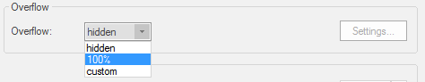
hidden
Overflow columns will not be visible in the current view.
100%
Overflow columns will overflow to the next row and have a 100% width. Multiple over columns will result in multiple rows.
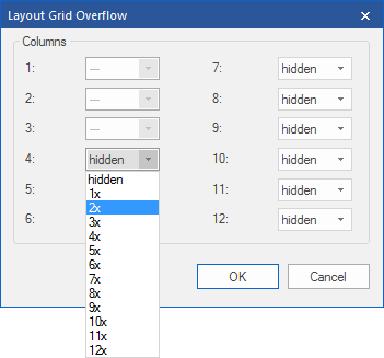
custom
This allows you to specify the width of each overflow column.
Overflow columns will not be visible in the current view.
100%
Overflow columns will overflow to the next row and have a 100% width. Multiple over columns will result in multiple rows.
custom
This allows you to specify the width of each overflow column.
Use Flexbox
When this option is enabled, the grid will use CSS flexbox layout. This results in cleaner code and also enables some extra features like vertical alignment and entire column will be filled with the background. Note that this is a relative new CSS feature, it is not supported by older browsers (< IE11). Please check this website to see which browsers currently support flexbox: http://caniuse.com/#feat=flexbox
Use CSS Grid
This will use CSS's native Grid Layout. Note that this is only supported by modern browsers. It is not supported by Internet Explorer and older mobile browsers! https://caniuse.com/#search=grid%20layout
Note:
To enable responsive columns, the overflow property should not be set 'none'. When 'none' is selected, then the number of columns will be the same in all breakpoints (just like in WWB11). In that case, the 'breakpoint' property of the layout grid specifies when it grid will switch to stacked (single column) mode.
To enable responsive columns, the overflow property should not be set 'none'. When 'none' is selected, then the number of columns will be the same in all breakpoints (just like in WWB11). In that case, the 'breakpoint' property of the layout grid specifies when it grid will switch to stacked (single column) mode.