Getting started with FlexBox

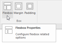
Flexbox is a new CSS layout mode that introduces a powerful way to lay out, align and distribute objects. Flexbox consists of flex containers and flex items. Flex items (the objects inside a flex container) can be laid out horizontally or vertically, aligned and distributed in various ways. It is also possible to stretch or shrink objects to fill the available empty space. Besides the settings in the flex container, each object also has its own flexbox settings which can be set via Menu -> Arrange -> Flexbox.
To get started with Flexbox you will need to add a Flex Container to the page. This works just like a layer or Layout Grid, just drag & drop the object to the container. Note that the Flex Container itself is a floating element so it will be inserted at the free row on the page.
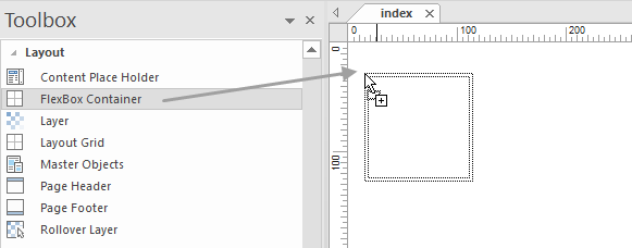
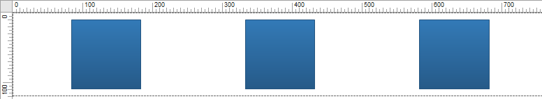
Next you can drop objects inside the Container to the page. You will notice that the objects will automatically be aligned based on the current settings of the Flex Container.
Flex Container Properties
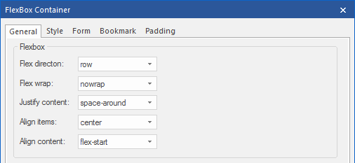
In the properties of the Flex Container you can control how the elements inside the container are aligned/distributed.
Flex Direction
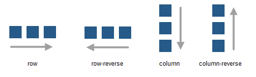
The flex-direction property specifies the direction of the flexible items inside the flex container.
row; The default value of flex-direction is row (left-to-right, top-to-bottom).
row-reverse; The flex items will be laid out right to left.
column; The flex items will be laid out vertically.
column-reverse; Same as column, but reversed.
Note that if you change the direction of the page in the Page Properties to right-to-left (rtl) then all directions will be reserved!
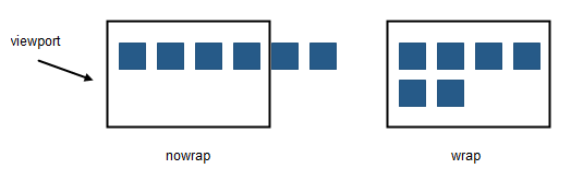
Flex wrap
The flex-wrap property specifies whether the flex items should wrap or not, if there is not enough room for them on one flex line.
nowrap; The flexible items will not wrap.
wrap; The flexible items will wrap if necessary.
nowrap; The flexible items will not wrap.
wrap; The flexible items will wrap if necessary.
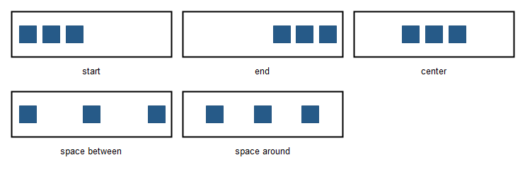
Justify content
The justify-content property horizontally aligns the flexible container's items when the items do not use all available space on the main-axis.
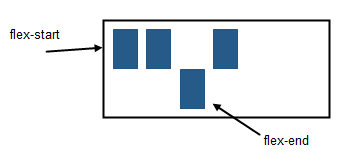
flex-start; Items are positioned at the beginning of the container.
flex-end; Items are positioned at the end of the container.
center Items are positioned at the center of the container.
space-between; Items are positioned with space between the lines.
space-around; Items are positioned with space before, between, and after the lines.
Align items
The align-items property vertically aligns the flexible container's items when the items do not use all available space on the cross-axis.
flex-start; Items are positioned at the top of the container.
flex-end; Items are positioned at the bottom of the container.
center; Items are positioned at the center of the container (vertically).
stretch; Items are stretched to fit the container.
flex-start; Items are positioned at the top of the container.
flex-end; Items are positioned at the bottom of the container.
center; Items are positioned at the center of the container (vertically).
stretch; Items are stretched to fit the container.

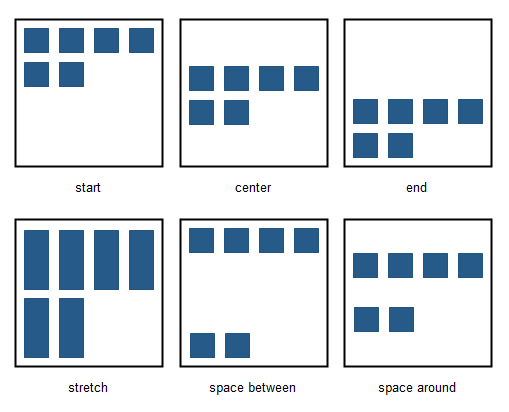
Align content
The align-content property modifies the behavior of the flex-wrap property. It is similar to align-items, but instead of aligning flex items, it aligns flex lines.
flex-start; Lines are packed toward the start of the flex container.
flex-end; Lines are packed toward the end of the flex container.
center; Lines are packed toward the center of the flex container.
space-between; Lines are evenly distributed in the flex container.
space-around; Lines are evenly distributed in the flex container, with half-size spaces on either end.
stretch; Lines stretch to take up the remaining space.
Size
The size mode determines whether or not the height of the container will be included.
undefined; When the size is undefined then the height will be determined by the flex items (content).
fixed; When the size is fixed then the design-time height will be used. This can be useful if you want tor vertically align objects.
Maximum width
Specifies the maximum width of the flex container in the browser window. This can be useful to prevent items from being stretched to wide. If the browser window is wider than the specified width then the flex container will be centered.
Flex Items Properties
Objects inside a Flex Container (flex Items) also have their own fled box properties which can be set via Menu->Arrange->Flexbox.
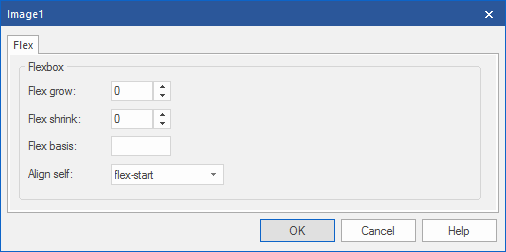
Flex grow
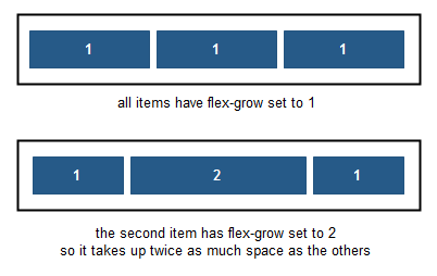
The flex-grow property specifies how much the object will grow relative to the rest of the flexible items inside the same flex container.
If all objects have flex-grow set to 1 then the remaining space in the container will be distributed equally to all objects. If one of the objects has a value of 2 then the remaining space will take up twice as much space as the other objects (if possible).
If all objects have flex-grow set to 1 then the remaining space in the container will be distributed equally to all objects. If one of the objects has a value of 2 then the remaining space will take up twice as much space as the other objects (if possible).
Flex shrink
The flex-shrink property specifies how the object will shrink relative to the rest of the flexible items inside the same flex container.
Flex basis
The flex-basis property specifies the initial size of an object before the remaining space is distributed.
The length can be in percentages or pixels. If set to 'auto', the extra space is distributed based on the flex-grow value.
The length can be in percentages or pixels. If set to 'auto', the extra space is distributed based on the flex-grow value.
Align self
The align-self property of flex items overrides the flex container's align-items property for that object.
flex-start, Items are positioned at the top of the container.
flex-end, Items are positioned at the bottom of the container.
center, Items are positioned at the center of the container (vertically).
stretch, Items are stretched to fit the container.
auto, Use the default alignment of the flex container.
You can view a live demo here:
https://www.wysiwygwebbuilder.com/support/flexbox.html
Download the demo project:
https://www.wysiwygwebbuilder.com/support/flexbox.zip
Related tutorials:
https://www.wysiwygwebbuilder.com/layoutgrid_part1.html
https://www.wysiwygwebbuilder.com/layoutgrid_part2.html
https://www.wysiwygwebbuilder.com/support/flexbox.html
Download the demo project:
https://www.wysiwygwebbuilder.com/support/flexbox.zip
Related tutorials:
https://www.wysiwygwebbuilder.com/layoutgrid_part1.html
https://www.wysiwygwebbuilder.com/layoutgrid_part2.html